Thanks to everyone who offered encouragement yesterday! And now, oh frabjous day! We’re starting our latest series of website reviews by me, Jordan McCollum, of here and Marketing Pilgrim, and Kathleen MacIver of KatieDid Design—today with C. Michelle Jefferies’s website.

Kathleen’s comments
Dear Ms. Jefferies,
I like this site! It clearly portrays the idea of stories and words, and the use of quotes establishes the genre, to a small extent. Your navigation is also clear and easy to follow.
Here are some suggestions that might help bring your site to life just a bit more:
- If you want to improve your site, I would try to add just a bit more color, perhaps, just to make the site not feel so cold.
- The Japanese/Chinese (I’m not sure which) characters effective hint at the genre, but it might be nice to know a little more. Are these YA? Adult? Romance? Adventure? Children’s? If you can find a way to portray that so your visitors can know if the first 3-5 seconds on your site (without looking for it), that might help.
- However, the “hit man” quote on the top of the Why Butterflies page didn’t fit the whole idea of Asian fantasy that I got from the front. That leads me to think that my Asian fantasy perception is not accurate…which means that you DO need to clarify your genre better.
- How about a great author photo?
- Your My Books page is hard to follow. Some paragraph breaks dividing each book and series would help. Some book covers would be great as well.
- Your Why Butterflies page confused me. Also, at the bottom you have the word, “Meramorphosis.” Is this a word I don’t know, or a typo?
I hope this helps, and God bless!
—Kathleen MacIver, KatieDid Design
Jordan’s comments
Hi Michelle! I do like your site design (though I’d like the gradient background on the right to repeat down the length of the page).
As always, I recommend getting a domain of your own, and putting your Blogger blog and website on that domain. Both michellejefferies.com and cmichellejefferies.com are both currently available—I’d tend toward the one without an initial since it’s that much easier to remember and get it right. But either are better than your current URL—all people would have to do is remember your name, not your name and a domain.
Search engine presence
Now, I do assume that many people won’t remember your first initial when searching for your name. Without the C, there is some  competition for your name, and Bing can’t find you at all (not terribly surprising). Google ranks your site as #5 and your blog as 8 (your Twitter profile is between those). Yahoo ranks your blog as #1 and your site at the 8th and 9th positions.
Now, with the C, your presence is better. Google and Yahoo have your blog and your site in the top 3. Even Bing finds your blog—putting it in the #3 and 4 slots. Other relevant results include your Twitter, Facebook and Listorious profiles.
This shows that you could probably work some more to build links to your blog and especially your site, but you have a decent start.
Pages
I agree with Kathleen on your My Books page—your site could be working harder to show off your works and your writing. The list of titles and statuses doesn’t tell us a whole lot  about the stories you’re writing. I agree that book covers will liven the page up (although I think designing one’s own covers for an unpublished site is hokey, I did it because a page of text is boring).
I also agree that a paragraph format would be helpful—but with that many WIPs, it could easily be overwhelming. In fact, it already is—fifteen novels in various stages of planning, writing and revising is simply too many for most people to wrap their heads around.
I think the best strategy would be to select the best works—the ones you’re actively pursuing publication on now, plus a few to show depth—to give a quick summary of and put together mock covers for. Also, while you have a very short excerpt on the front page, I think adding one or two short (up to 5-7 MS page) excerpts from your edited and polished works (on separate sub-pages) would let visitors get an even better taste of your works.
On your Biography page, I would add your awards. You use “Award winning author” as your tagline, but you only have an award mention buried in the My Books page. I would recommend highlighting that award prominently in your Biography page. That award will set you apart for readers and more importantly publishers. Finally, as always, I recommend adding some more social networking info—promoting at least your Twitter profile (probably on the Blog & Email page, which you might then rename Blog & Contact).
We hope that helps!
What do you think? How does your site highlight your works and your writing?
Photo credit: highlight&dmash;Daniël Cohen


Your web site reviews are fantabulous. I might have to do a shout-out about them b/c I’m so hooked. When you reviewed my blog awhile back, it gave me confidence and help criticism exactly where I needed it.
Thanks again!
–T
help: meant to type “helpful” — my fingers get ahead of my brain sometimes…
–T
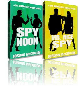
Jordan, I love your project page – what I great idea! I want to try something like that. How did you make the realistic-looking book covers?
Thanks, Becke! I’ve never really thought they were that great, but I haven’t dared to ask anyone. I used photos I found on sxc.hu and Flickr and made composites for the covers for most of them with the default image program on my computer.
The two big things I did to try to make them look “professional” were drop shadows behind the titles and the whole covers. The exact method for doing that can vary; a lot of programs have a way to do it automatically, but I prefer to do it by hand (copying the text and changing the color to gray, then moving it behind the original title and offsetting it a little, for the title; creating a gray rectangle the same size as the cover, offsetting it by 5 px, softening the edges and moving it behind the cover).
Clearly, you are more artistic and technically skilled than I am, but I still may give it a shot. I like the way you promote the titles that are still in work. Geesh, you’ve given me a lot of work to do – got to make sure I have tag lines and blurbs for all the stories I’m working on, and try to make mock-covers, too!
It’s funny, I am a visual person so I like to have some kind of graphic as a “cover” image when I’m working on a story. I hadn’t really thought that much about what the real covers would look like if I ever sell a book. My critique partner recently made her first sale and she just got her cover proof from the art department. It’s so gorgeous, I’m now totally jealous. I have covers on the brain. Maybe I should just get back to writing — avoidance much?
LOL, I totally understand avoidance!
On the other hand, as I told Michelle, I don’t think you have to have all of your works and WIPs on your site. I have at least five other things I could put up there (three ideas in various stages of development, two finished works), but right now I’m choosing not to. I was actually worried when I made the page that I wouldn’t have enough things to put on it!
Good luck!
excellent discussion going on here. Very enlightening.
Jordan ans Kathleen,
Thank you for the excellent website review. I have learned alot from it and the others. This is my first real shot at a website and when I saw that I could get a free one I jumped at the opportunity seeing the potential for practice and exposure. I don’t have a great picture unfortunately, another one of those things that has to wait for extra dollars like buying a domain site. But I am working on it.
I will fix the typos, change the books page, move the award and define my genre.
As for the initial I googled my name when I first started to write and found many Michelle Jefferies (which is odd because the spelling of my last name is rare). I added the C. because it made me diferent from the other Michelle’s out there. Facebook was even more inundated with Michelle Jefferies than the google search.
Again THANK YOU for the oportunity and the great critique. I apreciate it.
Michelle