Um, so I wasn’t thinking so hard when I only posted two critiques last week—so this week we’ll have four reviews, and then take a look at our favorite author websites.
First up this week, Becke Martin‘s beautiful site!

Kathleen’s comments
Dear Becke,
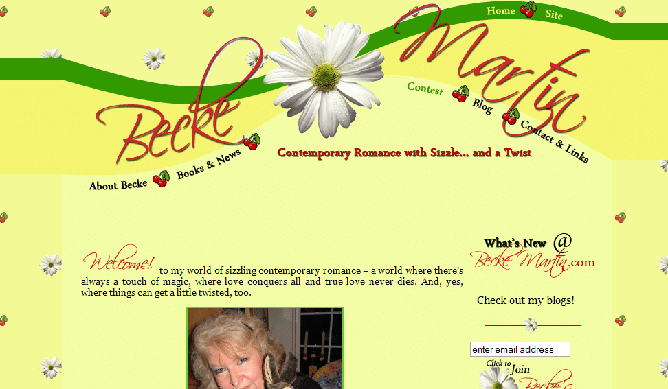
This is a fantastic, beautiful website! Your colors are pleasing and cheerful—but I’m not sure you’ve effectively portrayed and advertised what you write at first glance.
Both your catch phrase and your site’s graphics led me to believe that you wrote either humorous, passionate, romance, or light-hearted chic lit romance. Therefore, it caught me by surprise to read that your books have magic and mystery, and that you write romantic suspense. This means that your best potential readers, those looking for romantic suspense, might click away as soon as they see that big cheerful sunflower and get the impression that you DON’T write romantic suspense. Do you see the problem?
I think you’ll have an easier time reaching readers if you redesign the colors and graphics on the site to look less like a country kitchen and more like the world of your books.
I also think that you should adjust your catch phrase. Even adding the word “magical” twist would help, though it still makes it sound more like Sabrina the Teenage Witch than romantic suspense.
Finally, the image that (I think) replaces your “Welcome” word on the home page isn’t showing in Firefox. [Note: it’s showing on my Firefox . . . not sure why that would be different—Jordan]
Your content layout and blog integration are fantastic. So I think that once you match the look of the site to your genre, you’ll have a top notch website. God bless!
—Kathleen MacIver, KatieDid Design
Jordan’s comments
What a beautiful website! While I do agree with Kathleen, I also want to point out that you’re doing so much right here. You’ve made your website fun—including with an ongoing contest.
You’re using your books and news page to highlight not only your works but the awards you’ve won (and you even link here—I’m flattered). That’s a great way to show off your works and your awards to prospective agents, publishers and buyers. (As always, of course, I think 5-7 polished pages of a story can highlight your work really well, too.) As Kathleen mentioned, your blog is integrated perfectly with your site.
Your search engine presence is good—your site is #1 for your name on all three search engines. Your MySpace, Twitter, guest blog posts and other blog mentions also rank in the top ten. One thing you could do here is add a meta description to your site—often search engines use that description as the text underneath the link in their results.
A couple technical comments: when I view a blog post, the page looks really strange (the text is all off to the side very far). Also, on the homepage sidebar, where it says “Check out my blogs,” I expected it to be a link. On a few pages, I’d like to see the text (or lists of links) categorized or accompanied by explanatory graphics—long lists of links or blocks of text can make web readers’ eyes glaze over.
I see that your website was done professionally, and I assume you had input in the process—so you tell me, Becke. What were you going for with your site design?
Hope this helps!
Jordan
What do you think?


I’m madly scribbling notes here — thank you so much!
First, when Liz Bemis designed this website for me a year and a half ago, I was mainly writing light, contemporary romance with a twist of paranormal. Not chick lit, but close. While those stories are still out there, my more recent stories have moved toward the dark side, as you noted. More romantic suspense than contemporary romance. And a couple were so different that I created a whole new pen name/blog/website (not professional) to spotlight those stories.
I chose the colors, the daisies and the tiny cherries because daisies are my favorite flower as well as a common motif in my life, and because the cherries are a shout-out to Jenny Crusie’s Cherries. (She inspired me to start writing fiction.) Also, I’m a garden writer in my day job, so I wanted a flower connection of some kind. The site is a reflection of my personality more than my books, now that you point it out.
Liz asked me to look at 100 websites of romance authors and to make a list of the ones I liked best and least. She asked me to make notes about what I liked and didn’t like about them, specifically. Kristan Higgins’ was one of my favorites; Sophie Kinsella’s was another (hers has been redesigned since then to reflect her new book).
Okay, I have a question — since I write both light and dark stories, how do you think my website should reflect that? One page designed to highlight the romantic suspense, another look for the contemporary? I guess I have a sort of split personality (see my interview at Past the Print today: http://pasttheprint.blogspot.com/), but I’m not sure how to portray that visually.
I will ask Liz to stop by and comment here, too. She should get credit for the beautiful look of my website – the colors never fail to cheer me up!
Hi Becke!
I was wondering if it might be something like that! (Also I noticed the garden writer resume and wondered if that was contributing, too 😉 ).
Handling two different subgenres can be tough. Kathleen’s website handles this in a unique way, but that may not be the right solution for everyone. Some authors use different names for different genres (J.D. Robb/Nora Roberts, for example—she has separate sites for each and they have a very different feel).
Oh, that reminds me—I meant to say that you’re doing a good job of promoting yourself and your works around the Internet (which you highlight again on your comment), and tying those back into your blog and your Books & News page.
You’ve given me lots of ideas! I’m buzzing with images that would show the dual nature of my writing. Yin/Yang, black/white, day/night, etc. I even considered a picture of me looking into a mirror — normal me on one side, spooky me in the mirror. Unfortunately, I have no artistic skills so I am going to troll the internet for images I might be able to work with.
Thanks for the comment about promotion. I think the platform is in place; now to get the stories completed/revised/polished and focus on submitting them!
I’ll have to figure out a way to redesign the website so it better reflects my writing, and I might add more pages so I can go into more detail about the completed stories. I’ve asked Liz to check out your comments so we’re on the same page. She picked up what I was looking for right away the first time around; now I’ll have to figure out what I want before I ask her to change anything.
I’m so glad I heard about your offer to critique websites. This has been a fantastic opportunity and I really appreciate your comments and helpful advice. I’ll be checking back regularly now!
Becke, I fell in love with your website the first moment I saw it. It’s fun, classy, interesting, and your name comes popping up on all the right search engines. Nice work!!
Becke,
Hi! It sounds like you had a fabulous designer that went about designing your site in the PERFECT way. 🙂 I totally understand how your genre has changed… mine has/is, too. 🙂
If you want to keep one site under your name, then I’d recommend coming up with a design that echoes exactly what you said…a split personality. One possibility that come to mind is a ribbon twisting across the page somehow… on one side of the ribbon is your current design (which would be familiar to current visitors and help them know they’re still “home”) and the other side of the ribbon would be darker colors and graphics. Several different ways to incorporate that are popping into my mind, but I’m sure your fabulous designer will have even more ideas.
The pages that are then focused on the chic lit could be primarily as they are now, with just the edges of the darker ribbon showing down one side, or across one top corner. Then, the darker pages would be the reverse. That way, no matter which page a visitor lands on, they’ll see that hint of another genre, because both are featured, yet distinct.
Have fun!
-Katie/Kathleen
I spent ages going through image files on the internet, looking for visuals. I like the ribbon idea, and the sort of split-screen effect. I was trying to think of different backgrounds – day/night, black/white. I thought one cool idea might be to have my photo as a negative image on the “dark side” page(s). I added images to highlight the story notes, and I’m going to write query-type summaries for the other stories that are in work so I can post them, too. You’ve giving me a much-needed push.
I do like the idea of keeping at least part of the existing, familiar design. Not sure how to do a contrast, unless it’s with a dead daisy (!) and more of the “negative image” effect.
Mary – I forgot to thank you for commenting. Thanks for checking out my website, too!
LOL! I didn’t quite mean a dead daisy. 🙂 I meant more of a contrast of theme. Whatever darker images echo your romantic suspense… (a gun? a knife? smoke? blood? someone on the run? a dark half-open door?) …any of those are going to be a contrast to your cheerful daisy and cherries. As long as the graphics are divided, as opposed to blended, it’ll give the impression of “two sides to this author and her work.” That’s what I’d go for. (Unless you decide to do two separate sites for two different pen names.)
Hello, All! Thanks for the kind comments regarding Becke’s site. I admit, it’s one of my “cartoon-ier” sites, but it really seems to fit Becke’s personality (if not necessarily what she’s writing now!)
For anyone who’s getting ready for a new site (or a site re-design) regardless of whether or not you’re working with a designer who knows you well, whom you’ve never met, or if you’re embarking on a do-it-yourself project, I highly recommend looking at a 100 sites, finding the five you most love and then listing on paper what it is that you love about them… as well as what doesn’t work for you. I ask all of my clients to do this, because with those 5 sites, you begin to see a trend as far as colors, themes, styles and layout go.
As for Becke, I look forward to the redesign! It should be great fun!
Liz Bemis, Creative Director
Bemis Promotions
Katie/Kathleen – I don’t know, I’m starting to like the dead daisy! 🙂
I agree, the two styles need to be divided rather than blended. This will be a real challenge!
Liz – I don’t even know where to begin with the redesign. At this point I have too many ideas.
I’ve noticed that some authors have different pages that reflect the mood of their different books. Would that be too choppy? Should websites only have a certain number of pages?
I could do something like WHO IS BECKE? And then do “Becke Martin, Contemporary Romance,” “Becke’s Dark Side: Romantic Suspense,” “Becke’s Wild Side: Anya Davis Hot Paranormals,” and maybe even “Becke Davis: Blogger, Moderator and Garden Writer.”
Going back to your comments — I’m not sure how to set up a meta description. Is that something I could do, or do I need to ask Liz for her help?
I’ll add that link to the blog page, and I’ll sort out the links and add graphics to break it up.
Oh, and I need to come up with a new catch phrase, too. I was thinking, I could even have double-sided business cards made, with the cheerful contemporary look on one side, and the darker image on the reverse.
Double-sided business cards—what an awesome idea!
This is such a great discussion—it’s great that you’re thinking about this now, Becke. I’m sure you can give it some time and your ideas will solidify in time for a fantastic dual site.
Personally, I do think that if the whole site design changes when I click a navigation link, something’s gone wrong. So I’m partial to the more separated idea Katie was talking about. I think you could probably group your RS and your paranormal together, too, especially if your paranormal is darker in tone (though using a pen name for that might make that a bit harder).
In the end, it’s up to you—it’s your image and your career. You’ll know what feels best for you and your books.
Good luck!
Becke… if you want pages to look different, depending on the content, that can work well IF you follow a few basic guidelines:
1) Keep your main navigation the same color, layout, and location. Sub-menus can be different, but the main navigation should never change.
2) Keep a main logo/graphic/your name the same on every page. You need an identifier (along with the menu) that grounds your visitor so they never doubt that they’re on the same site.
3) Make sure you have a basic text-only navigational tree down at the bottom of every page…and that should be identical. That also helps ground your visitors…and many of us know to look down there if we’re looking for something specific that’s not in the main menu.
And I’ll second Liz’s advice, for I always advise my clients to do the exact same thing for several hours, until they have clear ideas of what they like about sites and what they don’t. In my opinion, you’re never going to be happy with your site if you DON’T do that first, no matter who you are and what the site is going to be for.
Oh, I forgot to answer your question on meta descriptions, Becke! It depends on what kind of software your site is running on. It would involve editing part of the HTML code for your site, most likely, so it may be best left to Liz. You can ask her, though; she’ll know!
Thank you, thank you, thank you! I’m glad this will be accessible later so I don’t have to memorize it all. I doubt I’ll be able to do anything with the website for a little while, and I think Liz is swamped, so that will give me time to look at other sites and really think about how to do this.
One site I found recently that is just gorgeous is Veronica Wolff’s: http://www.veronicawolff.com/
Something tells me it was expensive to develop, though.
Ooh, that is lovely. I’ll have to show it to DH when he gets home (he lived in Scotland for two years as a missionary—came home with a couple kilts, including the one in our clan tartan that he wore in our wedding a few years later).
Don’t tell Rosie (Gabriella Edwards). She goes a little nuts when the word “kilt” is mentioned!
I love the color, the joy that comes through with the cherries and the daisies. It just makes me happy (which in this world is a good thing).
If you really want to go to the dark side, how about having a button of some kind like they do in the animated e-cards. (Press here) then you press it and the daisy dies and it takes you to another page where your darker stuff is explained.
But Becke, I’ve read some of your stories. I’m betting that even your “dark” ones are full of fun and humor. That’s just who you are and why we all love you so much.
Geez, Jordan mentioned a kilt. Whew! If she only knew.
Mary – I loved that idea that you click the daisy and it dies!! How funny would that be??