In case you’ve missed it, there’s a great discussion going on in the comments from yesterday’s post about what to do with your website design when you change genres.
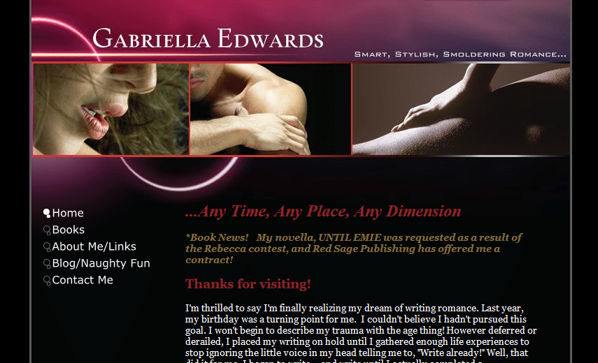
And today we have another treat! Gabriella Edwards‘s site is up for review.

Like Becke, she has a great site—visually appealing, hitting all the right notes and featuring all the right information already. (So our suggestions are very focused.)
Kathleen’s comments
Dear Gabriella,
Fantastic website! As I read your Books page, it seems that your website reflects what you write quite well. The only part that had me confused was when you discussed your love of Scottish males. It led me to think that your stories were set in Scotland, although neither the website graphics nor the book blurbs reflect this. I would either cut that paragraph, or (if one or some of your books DO take place in Scotland) add some other Scottish accents here or there, and let your blurbs show the setting of those books.
I say this because Scottish/Irish romance is almost a sub genre of its own. Readers who love it read it voraciously, and readers who don’t won’t touch it. So if you’ve got it, advertise it! If you don’t, don’t scare off those who don’t like it. Does that make sense? (And if only a few of your books have that setting, then try to accurately reflect that as well.)
Otherwise, your site is simple, but great-looking . . . just waiting for some cover art and links when Red Sage makes those available to you! Congratulations on your contract!
—Kathleen MacIver, KatieDid Design
Jordan’s comments
 Hi Gabriella!
Let me echo Katie’s well wishes: congratulations on your contract! I’m so jealous—I read a blog by two of Red Sage’s amazing editors (Edittorrent by Alicia Rasley and Theresa Stevens), and I know they’re fantastic. (Sadly, I don’t write in that genre.)
You’re doing good at promoting your success—be sure to look at suggestions on promoting your book once you get your cover.
Pages
You have some impressive honors in your awards section—don’t bury them “below the fold”! It’s great to advertise your recent successes on your homepage, but when they fall that far down, they risk not being read. Do you have an option to add another page for your awards (I know some hosts only include five pages for a site)? If not, you might also consider putting them on your books page (you could put them lower on that page, with a link at the top of the page to let us know they’re there).
On your Books page, be sure to tell us which book is under contract. I know you have it on the homepage, but not everyone will read that whole line or remember the title from page to page. Plus, don’t you want to say it again? 😉
On the homepage, you do a good job breaking up text with images—don’t forget to do that on your Books page (this will be easier once you get your cover, too).
With your link to Facebook (About page) and your link to guest post on Anya Davis’s blog (Blog page), be sure to link directly to your profile/the post rather than the main page—it makes the relevant pages easier to find.
Don’t forget, especially if you’re planning on doing publicity once your book is out, to include a nice, quality picture of you on your About page. (Hi res ones are a must for any appearance in print, too.)
 Check plus for using a form on your Contact page. You might consider adding a note to your contact page that you have social media links on your About page, or just copying them there, too.
Search engine presence
Your search engine presence is pretty good—your site is #1 and #2 on Google and Yahoo (Bing only gives you the #1 spot). It doesn’t look like anyone else is actively targeting your name, so you have a great opportunity here to “own” the search results—the more mentions of your name around the web, the more results linking back to you! Guest posting and social media profiles (your Facebook shows up in the top ten, but not your Twitter or MySpace) are two good ways to do that.
Another note that might help your search engine presence—on a search for your name, all three search engines use your meta description as their “snippet” below the link to your site:
Gabriella Edwards – Cincinnati, OH. Smart, Stylish, Smoldering Romance Any Time, Any Place, Any Dime. Industry Not Listed
That’s kind of funny to me 😉 . If you can edit this, I’d recommend getting the Cincinnati, OH and Industry Not Listed out, so your full tagline can show. Otherwise, it might give off a slightly different impression….
Note for the future: if you ever start a blog of your own, I recommend hosting it at blog.gabriellaedwards.com (or gabriellaedwards.com/blog)—another opportunity to “own” the search results, and to garner links for your site, adding authority to your domain in search engines’ eyes.
Your site is doing a good job, Gabriella, and with just a few tweaks it could work even harder for you.
Hope this helps!
Jordan
What do you think? Other than an author’s web page, what kind of search results are you most likely to click on?
Photo credits: fireworks—Harold Neal; thumbs up—Joel Telling


Lovely website. Thanks for sharing it, Gabriella.
I think Gabriella’s site is gorgeous! I know she worked really hard on it, and it shows.
I agree — those contest finals and wins need to be shouted from the rooftops. Gabriella’s stories have a tremendous track record on the contest route.
Even when she doesn’t write about shirtless Scottish guys in kilts, you know they are there — hovering on the edge of her imagination. Her heroes might not all hail from Scotland, but I’m willing to bet they’d all look great in kilts!
Wow! And I did it all by my lonesome! Thanks so much for the review. You’ve made some great observations I would never have thought about. I’m happy to say I’ll have a cover of my book to pop on the site soon, so I’ll make sure I follow your advice 🙂 The blurb about the Scottish guys isn’t something I’m attached to and see your point. It was filler for my original one page starter site. Your comment just made me LOL. It’s gone as soon as I get to it.
Ladies, I’m thrilled! I was so afraid the site would look cheap and unprofessional because…well…um, it’s very inexpensive and I’m not a web builder/maker/doer. It was amazingly easy to put together. Again, thanks to both of you for your time and wisdom on this.
BTW, thanks, Joylene! Nice of you to say. Becke, love ya for that. You are awesome!
LOL! I forgot to mention, I’m writing as Gabriella Edwards.
Rosie—I was going to ask if you’d had a professional do it. That’s fantastic! Just more proof that you can have a beautiful, professional-looking site without paying a lot. Great work!
Gabriella Edwards your site is HOT! Personally I think the photos are so compelling, the text won’t matter that much. Any reader is going to immediately connect, or not! If they like sexy, steamy… they know they have hit the motherload. Congratulations! When does your book come out?
Thanks, Mary! I don’t have a release date, yet. You know you’ll be one of the first to know. 🙂