Tag Archives: covers

Book cover SMACKDOWN!

My friend, author Ranee’ S. Clark, is hosting a super fun event on her blog this month. In honor of March Madness, she’s hosting a Book Cover Tournament! Each week, two book covers face off in a cover-only voting contest. The winners will vie for the ultimate title. Fill out a bracket and enter the giveaway for more chances for you to win (and more fun)!

Today, my cover for Saints & Spies is up! Go check me out and vote for this beauty (scroll down to find my matchup):

SaintsSpies_CVR_MED

The Top 10 Fonts You Should Never Use on a Book Cover (and 15 better alternatives)

I’ve liked typography since high school. I’ve even made my own fonts. I believe there’s a time and a place for almost every font—but not your book cover.

font top 10

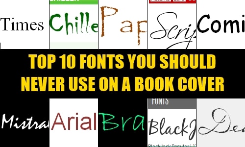
Your cover’s job is to convince us to read your book, that it’s worth our time and money more than the other 500,000 books out there. Most of these fonts are going to do the opposite: they’re so overused or generic, they have no place on your cover.

font arial
Arial and a number of its sans serif cohorts (Helvetica, Tahoma, Lucida Sans) have become the go-to fonts when we want a clean, sans serif look. Admittedly, they can sometimes work, but Arial . . . unless you want your book to look like somebody’s web page, just leave it alone.

font black jack
I wish I had a collection of all the places I’ve seen this font, starting with my blog header from seven years ago. There’s nothing inherently wrong with this font, I guess, but I’ve seen it on book covers, company logos, signs and more. It was a good font once. Let it die.

font bradley
This one might be leaning a little toward personal preference, but it comes down to this: if your font came bundled with Microsoft Word, it’s probably already overused.

font mistral
This is the font we used to look like you were handwriting something . . . in elementary school.

Along these same lines, Brush Script. Just don’t do it.

font papyrus
Okay, when your font is mentioned by name in a parody, it’s over. This font has been used to “represent” so many times and places that it’s lost all inherent meaning. Ancient Egypt? British Navy? Werewolves? WHY NOT? A local restaurant thinks it screams “contemporary Mexican,” especially in red text over a green hacienda. It screams, “Totally illegible” to me.

font scriptina
This font was already starting to be overused about eight years ago. You want swirly and you want statements, but you don’t want “Oh yeah, that’s the same kind of writing my friend’s blog used ten years ago.”

font chiller
This font is not scary; it’s illegible. This font does not make your book look frightening or suspenseful. It makes it look amateurish.

font tnr
I love Times New Roman. I do. I reset every word processor I use to write in Times New Roman. But the default font of business communications has no place on (or in!) your book. At all.

Possible exception: you’re writing a history of Times New Roman. Then sure.

font dearest
And all other 18th- and 19th-century handwriting fonts. They do not make your book look intriguing, historical or cool. They make your book look cliché.

Possible exceptions: your book is actually set in the 18th or 19th century and involves handwritten notes. Or you’re a pirate.

You, sir, are no pirate.

font comic sans
Just no.

(If I have to explain why, please just take this as a sign that you need to hire a cover designer.)

Viable alternatives

Naturally, in a year or two or five, these could all well become candidates for the list, but here are some legitimate, free alternatives to the above!

Handwriting fonts

Step aside, Mistral & Bradley Hand. Check out these handdrawn fonts from FontSquirrel.com. Of particular note, I like Harabara Hand, Jinky (unless you’ve got a capital J in your name or title . . . totally thought that said “linky”), and Journal. (Caution on Rock Salt, though. Anything Google offers as an option for Blogger headers is probably at the tipping point.)

Sans serif

You can do better than Arial et al. Sans serif fonts at FontSquirrel are a good place to start. My faves are more stylized (Lintel) or sophisticated (Linux Biolinium, Proza, Tenderness).

Serif

Yep, you can use serif fonts on covers. Again, Times New Roman is out (and as this article points out, Trajan and Copperplate are overdone in this department, too). It’s almost hard to go wrong other than that.

For interiors, steer clear of Times New Roman, too. Book Antiqua, Palatino and Garamond are all standard choices, while Bembo, Baskerville and the like are what professionals gravitate toward. Me? I’m partial to Linux Libertine: legible with LOTS of extended special characters. FontSquirrel has more serif options, too.

Script

Let’s do away with BlackJack in favor of some more original alternatives! Try Dancing script or Euphoria script. Going a little fancier? CAC Champagne has served me well, and Great vibes is lovely.

You want something with extra flourish? Pass by Scriptina and consider Miama or Promocyja. Legible and fancy. If you’re feeling daring, skirt the edge of readability with Lovers quarrel.

Choosing fonts

When choosing a font, always remember to look at your title (or name or whatever) in that font. I usually choose my fonts based on those specific glyphs—like the font in my header (from P22 type foundry). I chose it for the J glyph; I actually had to alter the M to get what I really wanted.

If you’re really, really picky, or you want something even more specialized, I suggest shopping at MyFonts.

Matching a font you’ve seen elsewhere? Try Identifont (describing it according to a limited set of letters) or MyFont’s WhatTheFont! (upload image).

No affiliate links here, folks. I’m that committed to typography.

Want to win $30? Enter the review contest!

Announcing Mr. Nice Spy!

Yep, that’s right—I’m debuting another book! Mr. Nice Spy is a prequel novella to I, Spy, and it will be available in eBook format only. Join my mailing list for a chance to get a review copy!

About the novella

Canada is probably the last place you’d expect to find an American spy. CIA operative Elliott Monteith has made it work, just like he’s made things work with his longtime fiancée Shanna. Until Shanna lays out an ultimatum: move forward or move on. Meanwhile, Elliott and his best friend and fellow operative, Talia Reynolds, try to track an elusive leak at the American embassy.

But something changes between Elliott and Talia as they close in on the man selling out his country. Professional and personal lines blur and Elliott has to choose—his fiancée or his best friend.

Read an excerpt from Mr. Nice Spy

And now for the cover!

MrNiceSpy_CVR_LRG

More about Mr. Nice Spy
Join my mailing list for a chance to get a review copy!

What’s in a name?

Although the very first draft is “done,” I haven’t totally settled on a working title for my Nano novel. I’ve got two titles in mind. I’m using one because I like it better, but I kind of feel like the other one suits the book better.

The two candidates? Slash and Burn and Scorched Earth.

About the book

A quick synopsis of the premise:

The war for Earth is over. But the battle’s just begun.

In a depopulated post-apocalyptic California, 17-year-old Adrienne Lucas has finally found some semblance of normalcy in a collective farm led by her father. Then newcomers arrive, promising a return to the comforts from Before. Adrienne’s father represents the voice of reason against the newcomers’ siren song—until they silence him forever.

Adrienne’s devastating loss is compounded when she discovers the man she’s loved for years, the man who saw her father as practically his own, the man who lives in her home as part of her family is also the man who betrayed her father and sentenced him to death.

Now Adrienne will destroy them all. Starting with him.

Or, in video form:

Don’t see anything? Click through to view the trailer!

You can read a little more about the project here.

What the titles mean to me

I was discussing this with a wise writing friend (who will GO PLACES), Wendy Swore, at a retreat last month. She asked a very incisive question: What do the titles mean to you?

Naturally, my interpretations of both of the titles have a lot to do with the origins of the phrases, but there’s a lot more to the psychological processes drawing me to them.

Scorched Earth refers to a war-making policy of attacking civilians and burning down everything in your path. Sherman’s March to the Sea is often used as an example (and I’m Southern, though not Georgian).

But I think the reason why this popped into my mind was a blog post I read earlier this year that stuck with me. Nathan Bransford very candidly discussed the implications of divorce in the Internet era, and he mentioned his ex-wife had pursued a “scorched Earth” policy in social media, deleting her Facebook account and blog and starting over. While he avoids rancor in his post, the image stood out in my mind.

To me, “scorched earth” brings to mind images of leaving a wide, blackened swath in your wake.

Slash and Burn has some similar connotations, of course. It denotes a agricultural technique for clearing land: slashing and burning the existing underbrush. (Sounds kinda dangerous.) The agricultural angle is kind of nice, since the main characters live on a collective farm.

“Slash and burn” is a little more proactive, in a way. You’re not just burning as part of total war, a reaction to your enemy. You have a purpose, a goal, and you’re taking the initiative. In reality, it isn’t as violent as it sounds, and the blackened swath here becomes the fertile fields of future growth. But it leaves the same image of destruction, which is very appropriate for the novel. Or, at least, I want it to be and hope it will be after revisions 😉 .

The covers!

I made up a book cover this year, because I love looking at my mock covers for a little burst of inspiration. As always, it’s a very rough draft, but here’s the idea:

Come vote!

What do you think? Which title attracts your attention more?

What images and connotations do these titles bring to mind for you? Come share your thoughts!

Photo credit—Burning Fields IV by Gary Scott
COVER IMAGES: Girl: Self-portrait by Kelsey; Fire by Marion Doss;
Blood drips: Pooling Blood by Joleene Naylor; all via CC

NaNo inspiration: covers

Happy Halloween! Let’s keep counting down to Nano with some more sources of inspiration!

Once upon a time, I was anti-mock covers. I thought it was a little weird to put up a fake book cover on your site for a book you’re drafting or trying to sell. Then I wrote up my projects page, and it looked . . . bare. So I made up some passable mock covers (some obviously more time consuming than others).

Usually, I’ve waited until I was done or nearly so to make these. But since October is a “planning” month for NaNo, and I was only doing 50,000 other things, I spent a day (or four) making the “ideal” version of the cover. Here’s last year’s:

Not 100% perfect (or, you know, licensed), but pretty dang good. Just looking at it gets me excited to write!

Obviously you don’t want to take off a day in the middle of NaNo to play around with a graphics program to make a cover no one else might ever see—but in about 20 minutes, you can throw together something that can inspire you.

Seriously, I tried it. I used a picture I pinned of one character, and Googled screencaps from a movie the other character was in (screencaps found here). Then I turned to Flickr for pictures of a rune stone (by Paul W. Locke). Some Magic Wand tool, cut/paste, resize, color balance, and add text, and voila! I put together a crude version of the above.

Inspiration in twenty minutes? That’s a bargain.

I’ll share the cover for this year’s Nano novel in December!

How do you find inspiration quickly?

Photo credits: Maggie Lawson by unknown (via listal), Garrett Hedlund from TRON: Legacy (found here), Viking coin by Ancient Art, Kensington runestone monument by Paul W. Locke

Using your web browser as a writing tool

It’s not just for research (and procrastinating) anymore!

Back in November, we ran a whole series on little ways to psych yourself up for your story. Since then, I’ve found another way I really like.

I recently switched my browser from Mozilla Firefox to Google Chrome. It’s a few months in and I’m still getting used to it, but there is at least one feature I really like: an add-on called Incredible StartPage. Whenever you open a new tab or empty web browser, it loads a set of links/information that you might need: your bookmarks, your Chrome apps, your recently closed tabs, a set of notepads, links to your email and calendar, and a picture.

You can use the default picture from Flickr, or you can set up a custom picture. I decided to set up my Incredible StartPage to help fire me up to write. Since I like making covers for my WIPs, I resized the cover for the book I was writing or revising at the time:

Notice the little note to self: Shouldn’t you be working? It shows up every time I open another tab for more research.

There are lots of other ways to use your browser to get you back to writing. When I was on Firefox, I used an extension called LeechBlock to limit the time I spent on time-sucking websites. I loved how flexible it was: you could allot yourself a certain number of minutes per hour to use your web-based email or social networking sites (you specify which sites to block!), pick the days of the week, select the time of day, or block certain sites altogether!

I haven’t tried any of the similar apps in Chrome, but StayFocusd comes highly recommended.

What little tricks do you use to get excited for your story every day?

PS: a special reveal today. This month as part of the Authors Incognito March-a-thon, I set a goal to write a new book. And of course, I made a cover. So here’s a tiny peek at the book I should be finishing tomorrow!

Because I can

Okay, yes, (hooray!) I have a book coming out (in a while). But I just like to make covers.

So this is NOT OFFICIAL, NOT MY REAL BOOK COVER, JUST SOMETHING I DID FOR FUN, but I made a book cover. Because I can.

Just what I need for that little extra burst of motivation and inspiration for the next round of edits!

This is the book that was accepted, coming out next year. It is not an official cover. It’s not even the official title. (If you want, you can read more about the LDS FBI agent undercover as a Catholic priest in the excerpt from the first chapter.)

The actors here are physical models I (loosely) used for my characters, although they’re still a few years older than my characters are. Not too bad, since they started out ten to fifteen years older. But Photoshop (well, Paint.net) can only do so much.

Altar photo (behind the title) by H. W. Morse

NaNo inspiration: covers

This entry is part 8 of 16 in the series NaNoWriMo success and inspiration

Once upon a time, I was anti-mock covers. I thought it was a little weird to put up a fake book cover on your site for a book you’re drafting or trying to sell. Then I wrote up my projects page, and it looked . . . bare. So I made up some passable mock covers (some obviously more time consuming than others).

Usually, I’ve waited until I was done or nearly so to make these. But since October was a “planning” month for NaNo, and I was only doing 50,000 other things, I spent a day making the “ideal” version of the cover:

Not 100% perfect (or, you know, licensed), but pretty dang good. Just looking at it gets me excited to write!

Obviously you don’t want to take off a day in the middle of NaNo to play around with a graphics program to make a cover no one else might ever see—but in about 20 minutes, you can throw together something that can inspire you.

Seriously, I tried it. I used a picture I pinned of one character, and Googled screencaps from a movie the other character was in (screencaps found here). Then I turned to Flickr for pictures of a rune stone (by Paul W. Locke). Some Magic Wand tool, cut/paste, resize, color balance, and add text, and voila! I put together a crude version of the above.

Inspiration in twenty minutes? That’s a bargain.

How do you find inspiration quickly?

Photo credits: Maggie Lawson by unknown (via listal), Garrett Hedlund from TRON: Legacy (found here), Viking coin by Ancient Art, Kensington runestone monument by Paul W. Locke