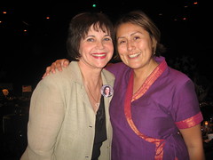
We’re on our last review today, from published author Cindy R. Williams.

Kathleen’s comments
Dear Cindy,
I like your “author, harpist, and dreamer” catchphrase. Even though harpist and dreamer don’t necessarily have to do with writing, together they evoke an image of who you are . . . and that is a good thing.
Your overall site design, menu links, and graphics don’t necessarily portray your books, but they’re still nice. And since you’re probably not courting the attentions of children on the Internet, what you have is probably sufficient.
What I’d recommend working on, however, is your text colors and font choices. Right now you have many color changes and a number of font changes, and each one is harder and harder on the eyes. With very few exceptions, black, dark gray, or a color so dark it may as well be black are the color choices for text. Why? Because you want people to notice the pictures your words portray, not the actual letters themselves. To be perfectly honest, multi-colored text is generally considered a hallmark of an amateur website.
The good news is that it’s easy to fix! Change your text on the home page to a black or very, very dark gray (like #333333). Take out the color change code first, before you change all the rest. That way you’re not just adding one color change on top of another. If you have headings, you may choose a bright color for them . . . just use the same color for ALL headings throughout the site, and make sure it’s a color that is easy to read. Use your home page text to focus on your book.
On your books page, use a nice font and color for the titles of your books, if you wish, but use the same dark color and simple font for the rest of the text. Try to keep your text all left-justified as well.
On your news page, it would be okay to use different colors for different sections of news. I would limit it to only two alternating colors, though.
Do similar color simplification throughout the site, and you’ll have a much easier to read and more professional-looking site to enjoy!
God bless!
—Kathleen MacIver, KatieDid Design
Jordan’s comments
Hi Cindy!
Let’s start off with some of the things you’re doing really well: you have your book prominently placed on your site with several options for purchasing. You’re obviously working hard to promote your book and further your career with many appearances. And your site is pretty 
But of course, there are also a few things you could do to help your site work harder for you. On several pages of your site, I have a hard time understanding what I should be focusing on. I see so many different types of news that I can’t focus on any one thing.
Now, I realize some pages can be kind of a catch-all, but organization can help to guide your website visitors and show them what’s most important. Pretend you’re a first time visitor to your site (I know it’s hard) and look at your site. What do you want to see on the News/Books/Contact page? What is most helpful to you in learning about the book and the author? What might help move you toward buying Chase McKay (or your next book)?
Here’s an example. As a first time visitor, I come to your main page. On my desktop (as shown above), the full title of your book isn’t visible. (On my laptop, it cuts off in the middle of the next line.) If I’m interested enough to scroll down, I wonder what the Arizona Glyph Award is. I see a lot of information about appearances, conferences, a bunch of different options to buy. I see your Thundertail book mentioned as a novel, but without reading the full history of its development, I don’t know what level it’s geared to. Then some more awards, a mention of interviews with you, and a lot of blank space at the end of the page.
Now what do I do? Unless I came to your site with a specific mission, I don’t know. Help us know how to use your site, and what your site can do for us as visitors. (As another example, it would be good on the Contact page to start with the contact form rather than your mailing address—it’s highly likely that people will see just a mailing address and give up without scrolling to the end of the page to find an online way to contact you.)
 Your search engine presence (searching for [Cindy R. Williams]) isn’t bad, especially considering you’re facing some pretty serious competition from this Cindy Williams. (She’s Cindy Williams, but Shirley of Laverne & Shirley has at least a little bit of info about her on the web.)
Actually, for [Cindy Williams], Yahoo has your site ranked at #7. (Bing and Google don’t have you in their top ten.) For [Cindy R. Williams], your site is #1 on all three major search engines. However, for some odd reason, Bing lists your Privacy Policy and Copyright pages only. Google lists your site and several mentions of you and your book from around the web. Most of Yahoo’s results are about you, but the actress does still get quite a bit of attention.
So what can you do there? Keep doing what you’re doing—get mentions of your book and your blog around the web, and get more links back to your website.
You’re clearly working hard to promote your books online and off. A few simple changes can help your website work even harder for you.
We hope that helps!
What do you think? What do you expect to see on an author’s home page? Books page? News page? What layouts on those pages help you process that information well?
Photo credit: Cindy Williams—Roberta Romero


This has been a good series again with lots of advice and suggestions all of us can benefit from. Thanks, Jordan and Kathleen.
Thank you so much for taking time out of your busy lives to do this. Both of you made total sense in every comment, both good and the suggestions to improve upon. I will get to work on adding your suggestions! Thanks again, I really apreciate it. I also learned a ton reading the other reviews. You two rock!
I just want to say, when I stopped by to see what was going on here today, my first reaction was “Ooooh! Pretty website!” It made me want to see more.