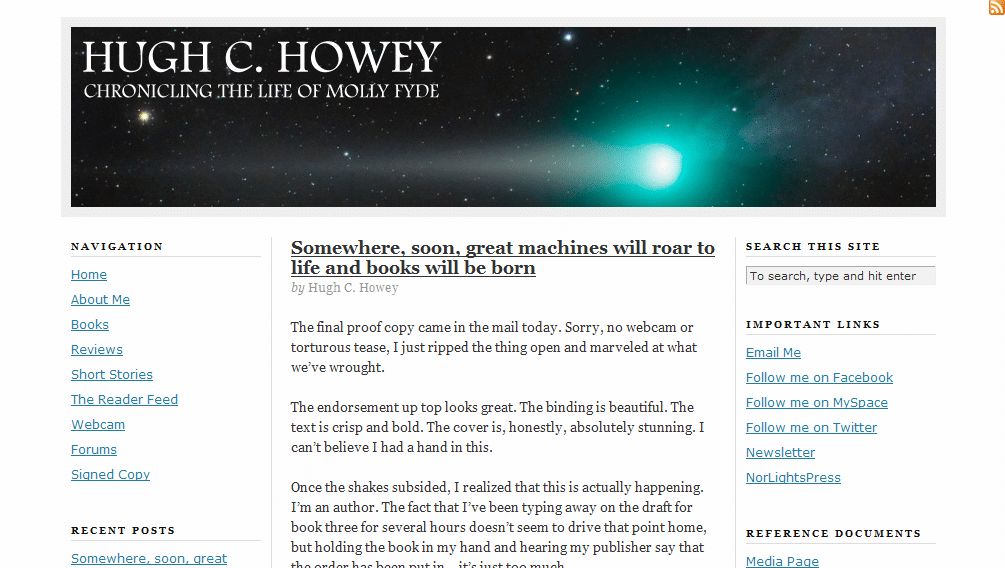
First off, we need to start with a huge congratulations! Hugh Howey, our next volunteer, is from North Carolina! That’s so freakin’ awesome! (I’m North Carolina born and raised 

Jordan’s comments
It’s time to promote the heck out of your book. Why not add a prominent purchase link to your sidebar? (Note: if you want to free up a little space in the sidebar, you could probably put the links to your pages across the top of your blog, just above or below the header image.) You could also sign up for Amazon Affiliates (yay $0.41—hey, sometimes that’s double the royalties you’d see from that book!). I’d also recommend adding a little summary or the back cover copy to your Books page to help entice us to buy.
Connecting with site visitors and readers
 Think about why your readers will be coming to your website. Will it be because they’re interested in your book and want to learn a little more before they buy? Will it be to learn more about the author? (You could probably help them out a little more there
To make your blog posts a little more user friendly, you could make your posts more scannable. Few people sit and read online like they would read a book—but if we break up our text and highlight the main points, people can still “read” it and understand our points instead of glancing over the whole thing and reading nothing.
To do this, you can use bold, white space, headings, lists, block quotes, pictures (even stock images, such as from sxc.hu and Creative Commons–licensed ones from Flickr) and more. I see that you’ve done this in a few places, and that’s a great start. ProBlogger has a great post on making your content scannable that goes into more depth on the topic.
While you don’t have a dedicated contact page that I saw, having the contact info in the sidebar of each page might actually be enough. It’s high enough to be prominent—it displays on every page above the fold. I might suggest adding a link to subscribe to the blog there, too.
You have a newsletter! That’s excellent! I would recommend expanding the newsletter page so your potential subscribers know what they’re getting into—maybe archived issues?
Obviously you already have an active community around your site—you have forums, and they’re not just languishing in nothingness. Excellent. Now, how can you further involve these friends and neighbors? Can you make a badge for your book for them to carry on their blogs? Can you ask them to review your book? Get creative!
Search engine presence
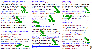
 For [Hugh Howey], your site ranks #1 and #2 on Google, and #1 and #3 on Yahoo. Awesome! Bing, as always, is evil. They have your Facebook profile first, followed by LinkedIn, Facebook again, Twitter, your publisher, two articles about another Hugh Howey, and your profile on Asimovs. So apparently they don’t just hate Blogger blogs.
For [Molly Fyde] (your character’s name, I take it?), however, only Google has your site in the top ten (and that’s at #10). MollyFyde.blogspot.com also appears in the top ten in Google (at #3)—I assume this is also your site. Is there a reason why you’re keeping both this blog and your blog at HughHowey.com? (I’m assuming you haven’t moved this content over to HughHowey.com, right?)
The rest of the top ten results are YouTube videos, posts on forums and social sites (which appear mostly to be yours; don’t worry, no one’s stealing your character), and pages from Amazon and your publisher. If you’re okay with those results, then it’s not a big deal. But if you want your site to place for those results, you might want to recruit more links to your site using the text [Molly Fyde]. See if those old forum and social network posts can link back to your website.
Since you’re on self-hosted WordPress, I have a few more specific guidelines to give, too. One thing to make your site a bit more attractive to search engines: use “pretty” permalinks. That way, instead of your About Me page being at http://www.hughhowey.com/?page_id=5/ , it would be at http://www.hughhowey.com/about-me/ (this can also be helpful to users if they’re looking at the URL).
BUT before you go changing anything, first you’ll need a plugin so you don’t break every link you’ve ever made. (That doesn’t always happen, but it can—and it would be less than fun.) I use Redirection by Urban Giraffe. Just install it and activate it, and then you can change the permalink structure in WordPress (it’s under Settings>Permalinks). You can set the exact structure that you like, but I suggest something with the post name ( %postname% ) in it.
Kathleen’s comments
Dear Hugh,
Nice nebula picture at the top! That, combined with the fact that I knew you were an author, instantly made me think sci-fi, so good! I’d also like to say that your writing voice is loud and strong on your blog posts. That’s fantastic.
I’m wondering, however, if a visitor who didn’t already know that you were an author would be able to figure that out. Your header text . . . “Chronicling the life of Molly Fyde” hints at that, but I’m wondering if you can make it a little stronger? Maybe add “in the science fiction world of ______” or something like that.
As it is right now, your website is dominated by a humorous story/sales pitch for a backpack. It’s well written, but it doesn’t tell us anything about your upcoming release. And when we click your “About Me” link, the text is slightly confusing. I mean, it says you want to be a science fiction writer, but it gives the impression that Molly Fyde is a real person. Is she? (I hope I’m not making an awful blunder by even asking. I’m not a sci-fi aficionada.) Your Books link doesn’t even portray that you’re an author, because many review sites and/d subject-matter sites have links called “Books.” Maybe change it to “My Books”?
 Finally, what else can you do to bring your visitors into your world? Make your website a window into the world of your books. Draw them in, so they just can’t help wanting to know about the characters in your world. This might mean re-designing a new home page that focuses on your characters and your world, instead of your blog…that way, when you post reviews on other products and books, your visitor’s first impression is still on YOUR book, instead of someone else’s. Feature your book covers on your home page…maybe overlap that nebula image with a small photo of each of your books tilted on edge, so there’s an instant sales pitch in one glance. If not there, get those covers somewhere on the home page!
And what about your characters? Your blog description says it’s about “the life of Molly Fyde.” What is special about Molly Fyde’s life? How can you quickly and simply portray that, so your visitors are itching to get their hands on your book so they can read Molly’s story? Give us a chance to meet the most fascinating side of Molly, so she comes to life on our screens, and follow it up with a link to buy your books.
Have fun!
–Kathleen MacIver / KatieDid Design
What do you think? How would you promote your published books? How would you invite your website visitors into your characters’ world?
Photo credit: globe—Sanja Gjenero

