Tag Archives: Aspiring author websites

Your blog’s niche: careann.wordpress.com

Another website review for you today! Carol/Careann of Careann.wordpress.com is another one of those bloggers I feel like I’ve seen just everywhere. We’ll look at how she can find and apply a niche to help grow her blog.

carol1

Kathleen’s comments

Hello Careann!

Yours is another blog that I’m honestly not sure what to talk about! Your title and picture accurately represent the content, and it’s laid out in an easy-to-follow and eye-pleasing way!

I’m going to ask you the same question I’ve asked a few others. What is the goal of your blog? If it’s self-expression and telling people who you are, then I really don’t see anything to change! I don’t think it’s to promote the articles you’ve written, as they’re already published in magazines, and you won’t get paid more if they go find an old issue. (Or will you?)

Are you wanting to interest people in your unpublished novels? I don’t think so, since you don’t mention them that often . . . which is fine. Some of us like to do that, while others wait to be published. Neither approach is wrong. Once you DO have novels to promote, you’ll want to change the whole focus of your blog and site . . . but that’s not right now.

The final possibility is that you’re like last Friday’s blogger . . . you’re just looking for community online, and your blog is a part of that. If that’s the case, then I’ll copy something I shared with her in the comments.

In order for something to succeed in today’s world—where the whole world is essentially connected and available to everyone—it has to fit a niche . . . a smaller target or focus. We all can’t “afford” to be interested in everything and involved in everything on the entire Internet, so we “weed out” what is slightly less important. We look for that thing that interests us 101%.

Your website/blog will be more likely to succeed if you find SOMETHING to center it around . . . something a little more specific than just “writing.” If you don’t want to center it around a genre, then you can center it around your location and try to find writers near you, or who are interested in your location. [This might be what you want to do, Careann. All you’d have to do is highlight your location.] Or you could target writers in your age group. Or you could center it around writers-who-live-in-the-country. You could even pick yellow paintsomething quirky, like writers who love yellow or writers who love to go barefoot. Of course you’d welcome writers (and readers) who love pink a little more than yellow, or writers who really don’t go barefoot all that often . . . but just the fact that it’s got this “grabby” idea will make your visitors more interested, and also make your blog stick in their minds a little more.

Have some fun with ideas!

Kathleen MacIver, KatieDid Design

Jordan’s comments

Whoa! My next WIP was going to be set in the Fraser Valley Regional District (in a fictional city between Abbotsford and Chilliwack—I was going to call it Lackaway, but I wasn’t sure if that’d sound too rhymey to be believable as a neighbor to Chilliwack. Um . . . anyway. . . .). Awesome—if I ever go back to it, I’ll know who to call!

Pages

Your about page is good&madsh;personable, friendly and informative. It has links to connect with you and your email address. But if I didn’t already know it was there, I might not think to look on the About page before giving up (and, of course, I might). This is why it’s also good to have a dedicated contact page—it doesn’t have to be long or even say anything interesting. You can use a form or list your email address (but do keep it on the about page, too).

I like that your writing page has your writing credits with links to the articles where possible. That’s great! But, like Kathleen said, I’d like to see more about your fiction WIPs (if you’re comfortable with that). It doesn’t have to be an excerpt; even a pitch paragraph or log line description would be good.

I also like that you highlight your Flickr stream on your blog. You link to your Facebook profile on your About page as well; you could add a badge to your sidebar if you’re comfortable with that.

Search engine presence

You’ve got some competition for your name (without your middle initial)—apparently another Carol Garvin is a painter. Yahoo has your blog at #4 for [Carol Garvin], and Google has your about page as #10. Bing . . . well, let’s just move on.

With your middle initial, your blog is #1 on Yahoo and Google (well, #1 and #2 on Google), and #2 and #3 on Bing. Your IMDb page (that’s right, folks, she’s in the Internet Movie Database) outranks your site on Bing.

For [Careann], Yahoo has your blog at #1 and #2, Google has your Flickr stream at #1 and your blog at #2 and I’m about ready to slap Bing in the face.

As always, the standard advice to improve your rankings is to get more links. In addition to the usual sources (guest posts, etc.), you might ask the magazines with your articles online to include a link back to your blog, either in the byline or if they have a short author bio, using your name as the link anchor text.

missing puzzle pieceFinally, I just want to reiterate what Kathleen said about using a niche approach to blogging. Working to appeal to a specific, if narrow, audience can help to grow your blog more than trying to appeal to everyone. This is just like fiction—we don’t expect that everyone will love everything we write (well, okay, we do, but we don’t reasonably expect that 😉 ). We know that we have to write to our audience—our niche, our genre.

Also, check out some recent posts on my other blog for help on finding your blog niche and expressing your blog niche.

What do you think? Have you focused on a specific audience with your blog? How did you find your niche?

Photo credits: yellow paint—Tom; puzzle piece (get it—a niche?)— Andronicus Riyono

Integrating social media & sidebars: WordVessel.blogspot.com

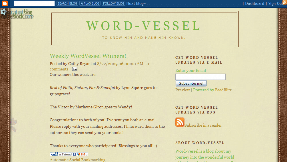
Today we have a great example of integrating social media from Cathy Bryant’s blog, WordVessel.blogspot.com. We’re also going to take a look at the ordering of her sidebar.

Jordan’s comments

Pages

I see you’ve contributed to a published book—congratulations! You could feature the purchase link a little higher in your sidebar, however—anywhere from the top to after the “About Me” section, depending on how prominent you want it to be.

You could also feature your current works a bit more, to let us see what genre you’re working in. You don’t have to put an excerpt up if you’re not comfortable with that, but some indication of what you’re working on, possibly in your about page or profile, can be helpful to help other authors connect with you, as well as other publishing professionals.

Your Blogger profile is good, and the about paragraph in your side bar is good. They’re personable, explain the purpose of your blog and who you are, and inject your personality into your blog. You could also create a post on your blog to give that information on your blog itself. (And then link to that page in the side bar or in a menu bar.)

You have your email on your Blogger profile, but you could have that on your website, too, either on an about page or a contact page. Again, these could be linked in a side bar or menu bar.

cathy6smallSpeaking of the side bar, you’ll note at right that I have the first thirteen screens of your blog here (with orange arrows highlighting the advice from me and Kathleen), and neither the content nor the sidebar is anywhere near the end. But it’s not until the eleventh page down that I found the purchase link for your book, and the ninth through twelfth that gave me the social media links. Even below that (not shown) is your search widget. With it that low, your visitors are going to need a search widget to find your search widget! 😉

Think about what you have in your sidebar—and what, of that, is most useful to your visitors. It’s fine to have awards and accomplishments there—it’s a great place to display your “trophies.” But when you order the stuff in your sidebar, consider what will help your visitors find what they’re here for? What will keep them coming back (ie subscription links)? What do you want them to notice most (ie published works)?

Search engine presence

You are all over the search engines—woot! You have social profiles from Facebook, Amazon, ShoutLife, Shelfari, Gather, GoodReads, NaNo and more. It’s good that you’re networking and using all these social sites. Your blog is ranked #5 on Google for [Cathy Bryant], but not in the top 10 on Bing or Yahoo.

Also good news: your blog ranks #1 on Google, Yahoo and Bing (yes, Bing!) for [word vessel]. Yahoo and Google also have additional posts from your blog on the first page of results. This is great—but it’s important to remember that if people are looking for you professionally, they’re more likely to search for your name than your blog name.

You can try to get links back to your blog with your name, and you can try to add links (that search engines recognize—Facebook, for one, doesn’t use that kind of link) to your blog with the anchor text “Cathy Bryant’s blog, Word-Vessel.” If your social network profiles have blogs of their own, you can sometimes have them import your blog or excerpts from your blog posts. If you have links in your posts back to other posts on your blog, that can help to increase your blog’s overall authority. Higher authority = higher rankings.

There are two caveats with that practice however. One: search engines penalize content that’s just copied off another web page, pushing it down in the rankings—so if your social network profiles are already outranking your blog, you might end up with your blog posts on your social networks outranking your blog posts on your real blog (which is why you might want to do excerpts only). Two: be careful about the social networks’ terms of service. I stopped importing my blogs to Facebook because I didn’t like the ToS, which implied at the time that they could keep or even claim your content.

Social media

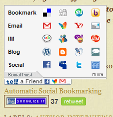
Mouse over—pops up lots of options for sharing

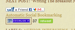
No mouse: small and unobtrusive

You’ve done an excellent job of integrating social media into your blog! At the bottom of each post, you have various options for sharing your posts through social media from Twitter (though it looks like the TweetMeme counts are off—all your posts link to the counter for a single specific post) to Facebook to email to blogging about it ourselves, with the above widget that appears easy to use. See how it doesn’t take up much room, but expands when you move your mouse over it to offer lots of options?

Also, you have links to your profiles on a host of social media sites in the sidebar, which allows users to share your content and connect with you. I might recommend moving this up a little bit, so it’s above the long archive list—a little more prominent, and more likely to be noticed.

It’s also good that you display your subscription options prominently above the fold, but you might be able to add a little bit here to explain more about what these are.

Kathleen’s comments

Cathy,

Hello! I love the look of your site. It’s cute and has character, which is always a good thing! Your “About Word-Vessel” paragraph is good, as well. It’s a short summary that explains the blog and welcomes people in a natural way, rather than in a here’s-a-list-of-things-I-want-you-to-check-out way.

However . . . those reasons for your blog really shouldn’t be necessary. They don’t hurt, because lots of people look for them. But you want them to look for that paragraph because they want to, not because they can’t figure out what your blog is about without it.

When I arrived at your blog, I noticed the background, and I noticed the nice clean look. I noticed that your sign-up widgets are in an excellent spot . . . but I didn’t know what content I would be signing up for!

I read your blog description, which told me that you are a fellow Christian, but it made me think that this is a ministry blog. But then I read the first paragraph of your current post, and it was about your writing. That’s why I went looking for the “About Word-Vessel” paragraph.

I’m thinking that your blog name and description is more a description of you, rather than of your blog. I’m wondering if you could find a variation of it that reflects the focus on writing that the blog actually has. I suppose “Word” could black_notebook_with_pencilreflect writing, but to me (and probably other Christians who would be interested in your blog), Word meant the Bible, which doesn’t have anything to do with your writing. You want both . . . both the Christianity that your blog definitely reflects, and the fact that YOU write fiction (or non-fiction, whichever). Another option would be to find/make/have made a header image that uses images to portray some of this. ie: a cross would tell people this is a Christian blog, a pen and paper would portray writing, a stack of books would portray books. You’d just want to make sure the image is as well-done and tasteful as your background image is. Otherwise you’re better off sticking with text.

Finally, for your blog (I’m not going to suggest this for everyone), I think it might help to move that “About Word-Vessel” paragraph up above the posts. It’s small, so it won’t shove your posts much farther down the page, but that would be a good place for that introduction. This way, when visitors arrive, they’ll see a nice clear blog title and description that instantly tells them that this is a Christian blog about books and writing. Those of us that are interested in those things will then be given a very brief paragraph with just a tad more detail. After that . . . the content! Your posts flow smoothly and are written well, so I think you’ll then be set to capture subscriptions from anyone who is interested!

God bless!

Kathleen MacIver / KatieDid Design

What do you think? What kind of things are you looking for in a sidebar, as a visitor and as a blogger?

Photo credits: typofi

Setting goals: TriciaJOBrien.blogspot.com

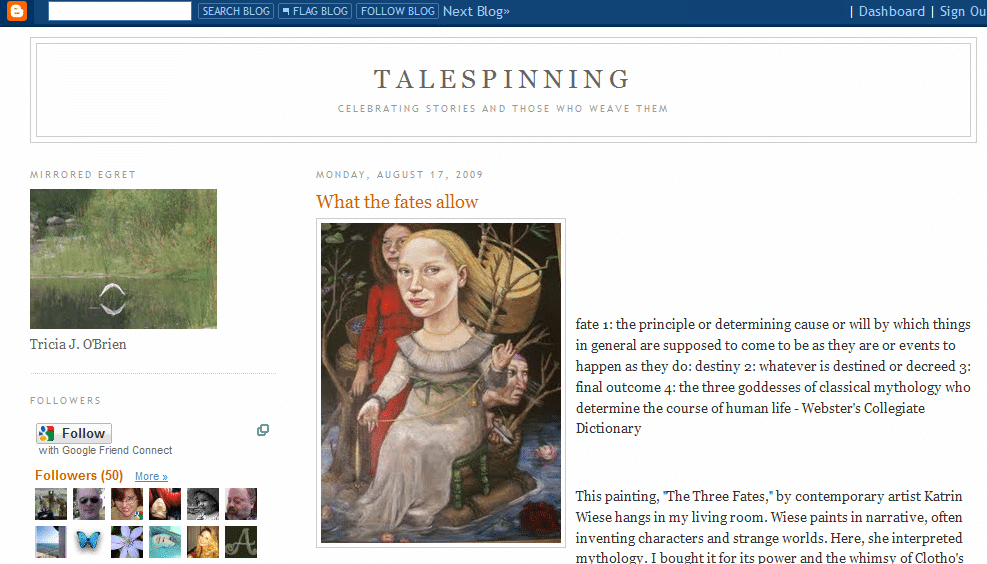
Moving right along, we have another blog review today for TriciaJOBrien.blogspot.com. I’m beginning to run out of cute things to say here, so let’s jump right in, shall we?

Kathleen’s comments

Tricia,

Your blog doesn’t have bells and whistles and graphics and so forth, so I was immediately led to start reading your posts . . . and I saw instantly that you’re a very natural writer. Your words seem to flow from your mind through your fingers. And if you struggle with grammar or syntax, you hide it VERY well! (I really, really doubt it. Your words flow too effortlessly, your voice is too clear, and people don’t spend months editing blog posts!)

I never really did find what the goal of your blog was, though. Is it primarily for you, as a method of self-expression? If so, then who cares what it looks like!

The fact that you asked for this review, however, makes me think that you ARE hoping this blog achieves something. It doesn’t appear that you’re trying to promote your own writing, since a skim down through the posts showed me nothing along those lines. Are you trying to build a small community? Just meet people online? Right now this blog is a pretty clear reflection of you, as a person, and your love of words. It’s not a reflection of your stories or books or poems, or of a particular genre. Do you want it to be?

I’m not really sure what to suggest, since I don’t know what that goal is. But think about it. This is where every website should start . . . with a careful assessment of what the goal of the website (or blog) is, what you hope it will achieve, and who you hope to reach with it. Everything else needs to follow that.

I’ll try to watch the comments over the weekend (which is sometimes difficult). Let me know what you’d like this website to accomplish, and I’ll see if I have some ideas that might help you achieve that.

Kathleen MacIver / KatieDid Design.com

Jordan’s comments

If I were guessing (oh, wait, I am!), I’d put your blog in the get ready phase—you’re networking with other writers, and discussing writing with them. Your blog is a good way to make sure that other writers can connect with you, and to start building a community.

Having the Followers widget high on the sidebar encourages your visitors to become followers—the prominent placement is visible on every page load, and it also promises 24 lucky readers their headshots on your front page. You can also directly mention the following option, explain it to your readers, or even run a contest for followers if that’s your goal. (More on Blog Followers). You could also use a subscribe widget in the sidebar to encourage your visitors to subscribe via RSS or email.

I can see from your site and its content that you like to write. But I can’t tell what you’re writing—whether you’re a hobbyist or trying to make a career of it (nothing is wrong with either of those, of course, but I just don’t know). I can’t tell what genre(s) you’re working in.

After a little digging, I found your post from Teaser Tuesday earlier this month, with the beginning of your WIP. You could feature that post more prominently—with a menu bar or a link in the sidebar—to help visitors know that you’re an active writer, working toward publication, in YA fantasy.

You mention that you were once a newspaper writer. Would you care to go into any more detail, maybe link to some columns? You could also write an “About me” post, and link to it in a menu bar or sidebar, so we can learn more about you right away. Even in the get ready phase, it’s important to have “You” in an accessible format on your site—people like to network with people. (On that note, you have your email on your Blogger profile, but a lot of people probably won’t think to check there. I know I harp on this, but seriously—contact page!)

Search engine presence

You’ve got some professional competition for [Tricia O’Brien]—a real estate agent who’s working for that top slot.

However, for [Tricia J O’Brien], your blog is in the top two spots and your Blogger profile is #3. Woot! Rounding out the top ten are two more references to you on JacketFlap.com, and some kind of random stuff.

Yahoo has your blog as #5 for [Tricia J O’Brien]. It’s outranked by posts mentioning you at Literary Lab, Corey Schwartz’s blog and JacketFlap.com.

Bing . . . sigh. Why, Bing, why? We’re right here! Look us in the eyes! Yeah, they got nothing. Not even close.

(Out of curiosity, I also searched for [Talespinning.] Only Google had your blog in the top ten, at #4.)

Okay, so you’re doing good on Google, but you could be doing better on Yahoo and Bing. My advice has been repeated so many times that I’m sure we’re all getting tired of it: get links. Guest blog. Write articles. You have lots of writerly friends out there, get them to link back to your blog. Get these posts that mention your name (as a source, as the author of a writing sample they’re critiquing) to link to your blog.

You have great content and great community on your blog—with the right direction, you can grow your blog even more.

What do you think? What goals have you set for your website? How did you choose them? How have goals helped your site to grow?

Photo credits—Book heart: Piotr Bizior

Showing and telling: the rule for blogs, too! Trish-MollyGumnut.blogspot.com

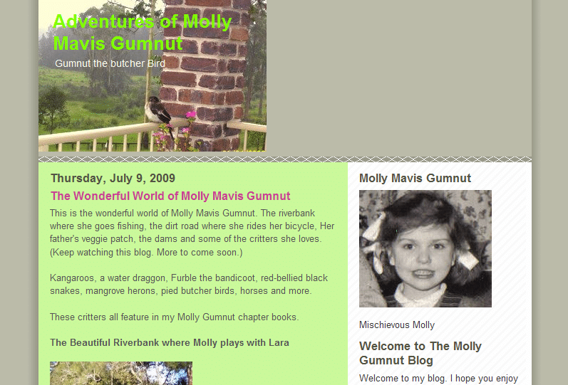
Today we’re looking at Trisha Puddle’s blog, Trish-MollyGumnut.blogspot.com. But Kathleen covered everything so well today that her comments will be the bulk of the post. (In case you’re wondering, we write our reviews separately, and if there’s overlap . . . actually, until now there’s never really been overlap!)

Jordan’s comments

Pages & content

The very last link on sidebar (last line) leads to your profile, where you have an email link. It would be easier for people to contact you with a dedicated contact page.

How can you get a contact page in Blogger? Make a post called “Contact” and put your contact information in it. Publish it, then use its URL in a menu bar. (Making a menu bar in Blogger can be a little technical, but you can find very, very simple instructions, too.)

So many writers hear the advice to start a blog and ask, “What would I blog about?” This is a great example of how you can blog about your research. You could also draw these posts out—limit posts to a few pictures at a time (probably five or fewer, so readers won’t be overwhelmed) and give a little more description. If you’re comfortable with it, maybe show a few lines from your WIPs about those animals and settings to put them into context—let us know what they mean even though we haven’t read the stories yet.

Some of the posts are a good example of an in-world character blog—but some of them aren’t. [Kathleen has more advice about both these last points, too.]

Search engine presence

On a search for your name, your Blogger profile is the #1 result on Google and #2 on Yahoo. Your blog shows up as #2 on Google. Once again, Bing is not being kind to our volunteers, and Yahoo doesn’t have your blog either.

However, on a search for [molly gumnut] (the name of her character and her series), the the one search engine that has your blog as #1 is Bing. That’s a first. #1 on Google is your Twitter profile. #1 on Yahoo is your Blogger profile again.

The other results are places around the web, mostly blogs and forums, where you’ve commented or posted work for critique. Search engines are listing a lot of other pages as more relevant than yours for your name and Molly’s name. You could definitely increase your search engine visibility. The same advice I’ve given others applies—guest blogging, linking back to your site using your name, etc. Since you have a few critique posts out there, you might consider emailing the blog owners to ask them to link your submission back to your blog.

Good luck!

Kathleen’s comments

Dear Trisha,

Your pictures of the wildlife around your house are great! Not many children (especially those in the city) can imagine seeing such variety.

I’d like to ask a question: Who visits your blog? Or rather, who do you WANT to visit your blog? Children? Their parents? Your friends? Publishing professionals?

Pretend you are that person, pretend you’ve never seen your blog before, and take a look at it with fresh eyes. What do you find?

First, it appears as though you, the author, are Molly Gumnut. (Lots of aspiring authors use childhood photos, for some odd reason.) You say, “Welcome to ‘my’ blog” . . . and since the only name we’ve been given is Molly’s, we assume that YOU are Molly. That, in turn, made me assume that these were stories from your childhood. I didn’t realize this assumption of mine was wrong until I scrolled down the bottom and happened to find your real name.

Second . . . you know the writing rule, “Don’t tell, show?” That applies to websites, too. People don’t want to be told what is somewhere on the site, they want to simply be presented with it.

bandicootThat paragraph on the right is full of telling. “I will be adding pictures.” (When you add them, you SHOW us that.) “I will update them each week.” (That’s dangerous to put, because when they see you haven’t for a month and a half, they think the blog is abandoned. Don’t tell people how often you’ll update, just update! 🙂 ) “There are a number of links.” Just put the links in, rather than telling us that they’re there somewhere.

What do you want your blog to do instead? Well . . . just like a book, you want it to hook your readers immediately! In a book, you hook your reader with action. On a writer’s website, you hook your reader with the world of your books. That’s why your photos are so wonderful.

So all you need to do is clean this up so that the visitors realize they’re looking at pictures that reflect chapter books, rather than pictures from the author’s childhood.

Here are some ideas and suggestions:

1) Take out the childhood picture and see if you can find (or have someone you know draw) an illustration of Molly. That will help us realize that Molly is fictional. It doesn’t have to be amazing quality . . . even a child’s drawing would work, since these are children’s books. They will help portray “children” and “fiction.”

2) The picture at the top needs to fill the width of the blog. I also think that it should be an illustration that matches your illustration of Molly. Pick a fun scene out of one of your stories, and have someone draw a picture of Molly in that scene. The picture should include “The Wonderful World of Molly Mavis Gumnut” AND the words “by Trisha Puddle.” That also portrays “fiction” and gives us your name. If Molly lives in Australia, then make more of it! Americans are fascinated by Australia and the wildlife there, and I’m sure much of the rest of the world is, too! Then, make sure your background colors match those in the illustration.

3) Your welcome spot on the left . . . take out the “Welcome to The Molly Gumnut Blog” (you don’t really ever need to say “Welcome,” we know it’s a blog, and you’ll have her name up at the top), and take out the first seven sentences. They’re telling and won’t interest people. Instead, do a little bio of Molly, starting with the most interesting thing about her. ie: “Eight-year-old Molly learned to ride a turtle.” or “Molly decided to be a vet the day she watched snake eggs hatch.” Choose something really out-of-the-ordinary.

4) If you can, put an illustration-looking frame around each of your snapshots. This will pull the snapshots “into” the world of Molly. You can pretend that Molly (or her mother) took them, if you want. But this will keep the new site look of the fiction world cohesive. [Note that this is particularly effective if your see your potential audience as mostly children who will/have read your books.]

5) If you want to keep the links to animal rescue in the sidebar, go ahead . . . but you need to make them clickable links. Here’s how you do it.
Instead of just pasting the link in, surround it with this code:
<a href="http://www.TheLink.com">http://www.TheLink.com</a>

So your RSPCA link would be:
<a href="http://www.rspca.org.au/">http://www.rspca.org.au/</a>

It will LOOK the same on your blog, but it’ll be clickable instead of straight text. I’d also suggest putting it in Molly’s terms. “Molly loves to rescue animals, and you can help her by . . .”

6) Your most recent blog post: take out both “Wonderful Word of . . .” because you’ll have that in the header. A better post title might be “Where Does Molly Play?” Then just show the photos with the captions. Again, don’t TELL us the photos are there . . . especially when we’re about to be SHOWN them!

7) Finally, watch your grammar. I’m a grammar nerd, so not everyone will notice what I do . . . but you have quite a few fragments (that aren’t in someone’s POV to excuse them as thoughts), and some capitalized words in the middle of sentences that shouldn’t be, and a few missing commas around clauses. There aren’t a lot, but this blog is your face on the Internet. As an aspiring author, grammar problems will tell against you more than they do any other group of people.

I hope this is helpful to you, and good luck with your books! The post you did where you mentioned Molly trying to rescue a bandicoot caught my interest, since I’m not even sure what a bandicoot is!

-Katie/Kathleen
http://www.KatieDidDesign.com
http://www.KathleenMacIver.com

What do you think? Could you do a whole blog (not just a post) in your character’s world? How can you use the world of your books to hook your website visitors?

Photo credit: bandicoot by Greenstone Girl

Optimizing a site for users and search engines: LoriTironPandit.com

Maintenance note: if you tried to download the free PDF guide to writing deep POV and the link didn’t work, it’s now fixed. Thanks to everyone who notified me about the broken link!

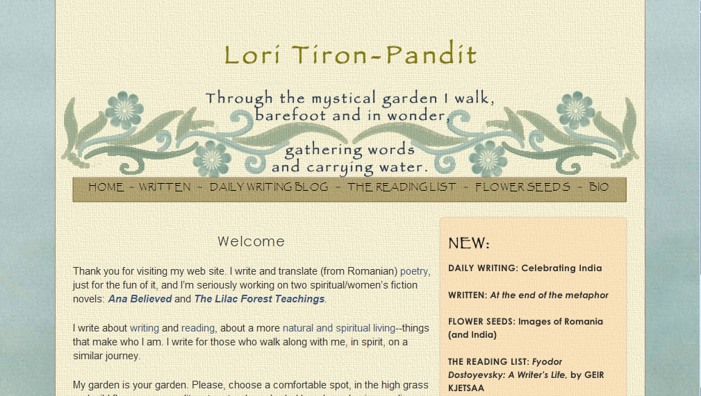
Today we have our third website review. We’re looking at Lori Tiron-Pandit‘s beautiful site. Both Katie and I thought her site was very well done—from the design to the writing of the pages, Lori has done a great job of creating her site. But Katie and I also found a number of technical issues that might be holding her site back. So there’s going to be a lot of technical advice here—be forewarned!
Jordan’s comments

Hi Lori! Like I said above, I think you’ve done a great job with your site. But something about the code is keeping your site from performing well in search engines—or even appearing at all, in some cases. So there’s a lot of information on that, though I’m afraid I might not be much help.

Pages

You have your email address listed and linked on each page of your website. That’s good—but I’m worried some visitors might not think to scroll down. (This is why I recommend having a specific contact page, so visitors always know where to find your contact info.)

On your Written page, you have original and translated poetry, as well as links to your novels in progress. If you’re using your website primarily to position yourself as a poet and translator, this may be fine. But if you’re using your website to position yourself as a fiction author, I would feature those links more prominently on the Written page—maybe in the paragraph above the poetry (with maybe a log line or other one-sentence hook), or at least “above the fold” (in the area of the screen you can see without scrolling down).

Your about page does a great job highlighting your professional qualifications and credits, with a nice sidebar on your life to make it personal.

Aside from the blogs, I don’t see any social media on your site. However, on your daily writing blog, you do feature your Twitter profile in the sidebar. I might move that up a little. I would definitely recommend moving the “Subscribe” box up to the “above the fold” area to encourage visitors to subscribe.

Your site is polished, easy to read and easy to navigate. Other than possibly your contact information, your visitors should be able to find most of what they’re looking for. The names of your various pages may be a little cryptic—I can guess what “Written” links to, and “Daily Writing Blog,” “Reading List,” and “Bio” are easy to understand, but I don’t really know what to expect when I click on “Flower Seeds.” However, on that page you do have an explanatory paragraph that explains the purpose of the page.

You have multiple blogs on your site, but you do a great job of highlighting their content on the front page and cross-promoting among your blogs.

Search engine presence

Your search engine presence is a mixed bag. Bing doesn’t list any of your sites in the top ten, though they have mentions of you on various guest posts and comments around the web.

Yahoo’s top two results for your name are from your daily writing blog (and the followers page for your blog is #4). Your bio is #3, but your main website doesn’t appear there. The rest of the top 10 results appear to be your profile on various social networks.

Google, like Yahoo, has your top two results from your daily writing blog, your Twitter page and various mentions of your name on guest posts, comments and forums to round out the top ten.

This means only one of the major search engines has any page from your website in the top ten results for your name.

Part of the problem here is that, of the pages on your website, only two pages on your domain have content that search engines can read. (Your daily writing blog has content search engines can read, but it’s on the blogspot.com domain—you could move this to blog.loritironpandit.com with Blogger Custom Domain, if you want—every little link helps!)

(You probably know this already, but for everyone else:) Search engines are kind of stupid. They’re only really good at text. (They’re getting better at Flash, and they’re working on images and video, but that’s mostly from context.) Search engines use programs called “spiders” to crawl the web, read the content, and return what they find so the search engine can index it and call it up later. Here’s what a spider sees when it reaches your Flower Seeds page:

flower seeds home written daily writing blog the reading list flower seeds bio flower seeds is about my family s journey toward a simpler more natural more aware life it s about reconnecting with our environment with traditions that have been passed to us from our romanian and indian families and with rituals that we create together blog summary widget archive archive copyright 2008 2009 lori tiron pandit all rights reserved [source]

And that’s it. Visitors can read the rest of the content—all of the blog entries—but search engines can’t find the text or the individual post pages.

What search engines see instead of a blog 🙁

After some serious digging, I think I might have found the problem. I believe it’s either one of two things:

  1. Rumor has it that with your website builder, iWeb, the font you choose—or even the version of the font you choose—can affect how your site is coded. iWeb makes some fonts appear as text in the code, while others (or maybe just certain versions) appear as images (i.e. unreadable to search engines) in the code.
  2. The more likely option: you may be using a widget to import your posts to the pages. The widget uses JavaScript to bring the summary entries to the page—yet another thing search engines aren’t great at yet (though they’re working on that one, too). And if that’s the case . . . wow. I really don’t know what to tell you. I don’t know what alternatives iWeb offers, but I recommend exploring them. If there’s no other way to do this, you might also think about moving to another platform. (I can imagine how you’d implement the same site design on a WordPress installation, for example, and I came across lots of resources for transferring, and I know there are cheap HTML to WordPress theme services.)

You can also add meta data like I’ve recommended for Livia and Eileen—here’s a page on more tips on getting a site search-engine friendly in iWeb.

To help search engines find your site, get links with your name as the text (“anchor text”). You can do this through guest posts and comments, like you’re already doing. One last suggestion: if you’re planning to use your site to attract future translation gigs, you could set up a page (maybe “under” Home or Bio) devoted to Romanian translation—with “Romanian translation” in the title. When you try to get links for that page, use “romanian translation” (or whatever term you think people would use to search for those services) in the anchor text.

Kathleen’s comments

Lori,

Your site is beautiful! The applique-looking flowers and scrollwork carry a note of something ethnic, and while I didn’t immediately think “Romanian,” I DID want to look and see what you wrote. (Of course, I knew you were a writer. I think that would still have been clear to a wandering visitor, since both your quote, with “gathering words,” and your links menu, portray that information.)

Your intro paragraphs also feel like a naturally-spoken welcome, and your in-text links are also naturally well done. ie: You didn’t say: “You can visit my blog or read what I’ve written,” etc. Those always have the effect of making me NOT want to click on either link. Done the way you did, I’m curious, but the links aren’t shoved in my face. Well done!

What would I recommend? Well, quite frankly, you’ve done extremely well! Your pages present information in a way that a visitor and reader feels encouraged to read. Your text is easy to read. The colors are relaxing. And I LOVE your author photo. It’s not your standard “author photo” but it really has character, both in the shot and the unusual shape of it, and that character really reflects what I see on the whole site.

Once you sell a book, you’ll want to redo your pages to subtly guide your visitors toward a page where they can buy your book [and she wrote this review even before I said that yesterday!] . . . but that’s not the case now, and I wouldn’t change it!

Page loading times

The only issue I came across was that a number of your pages loaded quite slowly. That turns away people on slower modems. (I’m on cable.) I was wondering if it was your website server having problems or my own connection having problems . . . until I saw the size of your background images . . . and realized that you have different background images for every page.

That’s what’s slowing down your page loading times so much, and it’s ALSO upping your website bandwidth (which you’ll be charged more for, once your traffic gets high enough).

Let me go through a few guidelines for anyone designing their own website . . . especially since I’ve recommended more images to many of the people I’ve done reviews for.

Text loads fast. Images are what slow down loading times for pages. Images are a large part of what gives your site character, however. The trick is to find the balancing point.

Large images can take a while to load, and lots of small images add up. So the goal is to not use images for anything that can be done without images (such as text menus, solid color borders, and spacing) and to keep the images you MUST use as small as possible.

Lori . . . your blue background image is as wide and long as an entire page. Your tan paper-looking background is also that wide and long. Your header image is ALSO almost that wide, and it’s two inches long. That means there are three layers of images at the top of your site, all of which are slowing down your bandwidth, even though only one is visible.

Are you aware that your site can look EXACTLY the same, if you find the repeating marks in both background images and crop them down? Both background images could be about 3% the size that they are right now. Your blue background could be a 1″ by 1″ square (maybe even smaller), and it would still repeat across the entire page the same way the large one currently does . . . except the browser would only have to download a TINY image, instead of a huge one.

Same with the yellow background. It could be only 1″ x 1.” Take the border edge off and change the code so that this section of the page has a 1 pixel border down both sides, in the same color it currently is. Your tiny image will then repeat and fill the same area and look exactly the same as it does now.

Your header image should be cropped to just above the text…then use “padding” in the code to scoot the image down (though I wouldn’t scoot it down quite as much).

(I’m not sure what size the orange background is on the bio, since I couldn’t quickly find it in your code. It should be small, too. Ditto with the brown background behind your menu.)

Next…

Site architecture

You have a separate folder set up for each page of your site. This means that every time someone visits a new page, the SAME IMAGES are downloaded again. Instead of organizing your site this way, you should have one image folder. Every page pulls the images it needs from that one folder. That way, when a visitor moves to a page that uses the same image, the browser KNOWS it’s the same image and doesn’t download it again. It just shows the one it downloaded for the last page.

So typically, we design a site so that all of the pages are in the root (main) folder, and we have a sub-folder called “images.” All of the images are in that, and when we want to put an image on a webpage, we code that the image is at: url(images/background-image.jpg). It’s only on really REALLY large sites that we create additional subfolders for sections of the site, because that makes the coding more complicated. And simple is usually better. 🙂 [We don’t know how feasible this would be in iWeb, but look around to see if you can change the CSS and code to refer to a single image source.]

Optimizing load times

Finally, if you MUST use an image that’s big (like your header), do a little trial and error. Save it as a .jpg and as a .gif. Run the .gif image through the “Image Optimizer” that’s free to use here: http://www.netmechanic.com/GIFBot/optimize-graphic.htm, and see if any of the faster-loading images look just as good as your original. Compare the size of them with the .jpg you saved, and used the one with the smallest kilobytes. Sometimes the .jpg will be smaller, and sometimes one of the reduced .gifs will be smaller. But this way you know you’re loading your design as quickly as you can.

And when you’re done (or maybe before you’re done), have NetMechanic check your page. It’s free, but it’ll tell you just how fast (or slow) your page loads. http://www.netmechanic.com/products/HTML_Toolbox_FreeSample.shtml

Happy writing and designing!

-Katie, KatieDid Design

We hope this helps—while the technical issue here may be unique to Lori’s site, we also hope that everybody can take away some principles of design and accessibility to help with your sites!

What do you think? Do you notice page load times? What do you think Lori can do to take her site to the next level?

Photo credit: File folders by Aya Otake
Get set phase website and blog review: EileenAstels.com

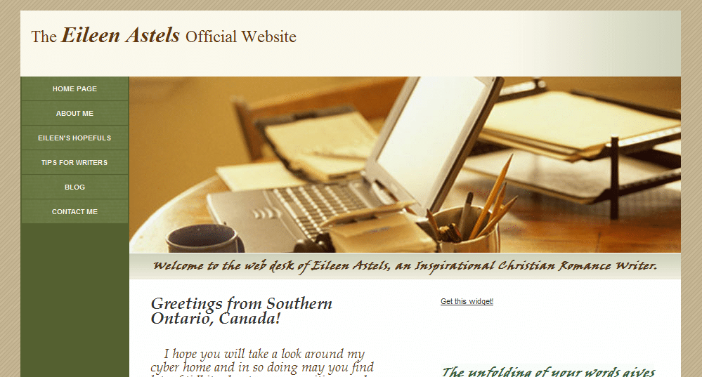
Another website review today! I feel like I’ve known Eileen for a while, since I’ve seen her around the comments of other blogs (like Kaye Dacus‘s and Nathan Bransford‘s) for over a year, but we haven’t really “talked” until she came to this blog (woot!). Now she thinks I’m a Superior Scribbler (why, thank you!), and she volunteered for the next website review with her site, EileenAstels.com. Katie and I both also looked over her blog, EileenAstels.blogspot.com, too.


Eileen’s website

Jordan’s comments

I see from your blog that you’re just entering the “get set” phase— you’re submitting to editors and agents now. Congratulations (and good luck)! It’s important that visitors can figure out what your site is about and what they’re supposed to do once there there. Your site looks pretty ready—it’s professional, easy to navigate, and the left navigation makes it easy for your visitors to find the important stuff on your site.

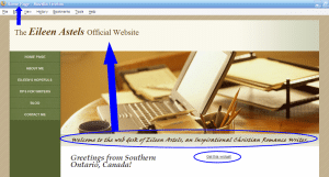
However, your genre and even the fact that you’re a writer almost seemed “buried” below the header. (It was several minutes before I saw it there.) You should use that line of text or something similar right under your name at the top as a tagline to make your purpose, niche and genre apparent when someone stumbles across your site.

Individual pages

In this phase, your contact page is more important than ever. So woot on already having a contact page! If you want, you might also use the form that GoDaddy can install on a contact page. (If you’ll recall, this page is the #1 thing an aspiring author’s website must have.)

You might consider relabeling “Eileen’s Hopefuls.” I guessed what you meant, but it almost sounds a little sad 😉 . Plus, it could be clearer—I knew what I was looking for when I came to your site. Not everyone will. On the plus side, I like your organization here—presenting your books as a planned collection or series. It looks like some of your books’ statuses need to be updated (books 3, 4 and 5).

I’d also recommend that you expand the book descriptions here into full “pitches” like you’d present in a query letter, especially for the later books (because the agents/editors will have already seen the pitch for the first book). It’s totally up to you, but you could think about putting a short excerpt—maybe five pages—on your site, too.

I might reword or delete the first sentence of the last paragraph on the Hopefuls page—it almost sounds like you’re planning on just using the series as a warmup exercise.

Your about page is personable and professional.

Search engine presence

Your search engine presence is good. Your site is #1 in Google and Bing and #2 on Yahoo for [Eileen Astels]. Your blog is #1 on Yahoo, #2 on Google and #6 on Bing for [Eileen Astels]. Other sites in the top ten for your name are the widget for your blog, Facebook, Afictionado, and Amazon.ca. While those are fine, it couldn’t hurt to seek out opportunities to get your name out there more—like you’re doing through coblogging, comments and guest blogging. (Be sure to get the most out of guest blogging if you do it.)

A few other tricks you could do to help:

  • Change the <title> element on your home page to “Eileen Astels Official Website” or “Eileen Astels – Inspirational Romance Author” or something like that. Right now, if I were to bookmark your home page or minimize my browser while viewing it, it would be described as “Home Page.” I’d lose that in my bookmarks. Plus, it’s helpful to have a descriptive title for search engines to understand what your homepage is about. (I don’t use GoDaddy for building sites, but I believe this is under “Page title.”)
    • However, if changing this changes the title of the page on the left-hand side, see if “Eileen Astels Home” or just “Eileen Astels” will fit.
  • Use headers to organize and emphasize your text, rather than just using size/styles. If you look at the source code here, you’ll see that “Jordan McCollum” is in a <h1> tag—a header (top level) tag. That indicates to search engines what the page is about. Use header tags (h1, h2, h3) to organize your text hierarchically. Test this to see what they look like, but in most designs the header tags are large and bold. (Technically, this technique seems to be losing a little power, but it can still help.)
  • Use meta descriptions to control the “snippet” in search engines. Right now, search engines are showing “The Eileen Astels Official Website. Your Subtitle text … Welcome to the web desk of Eileen Astels, an Inspirational Christian Romance Writer. …” But if you have a meta description that matches a query, they’ll show that instead (i.e. without “Your Subtitle text”). You might have to insert them in HTML, like I told Livia).

Social media & your blog

For whatever reason (I’d guess browser incompatibility, but I’m not sure), I don’t see the widget showing up on your homepage. I see you’re on Facebook (on your blog) and Twitter; you could consider having widgets for those on your website, too, in the sidebar, on the main page or on the contact page.

Your blog looks to be a good mix of appealing to and networking with fellow writers, sharing your love of literature and sharing your life in an appropriate way. It looks like your content is fun, interesting and useful, and with 50+ followers and twenty-something comments on most posts you’ve clearly built a community around your blog.

My only advice here would be to set up your blog to be hosted at http://blog.eileenastels.com. You can do this through Blogger and GoDaddy, your domain registrar, without changing anything else, really. Setting up Blogger Custom Domain is a little bit technical, but not very hard.

Why do you want to do this? Because every link to your blog is a “vote” for your site in search engines’ eyes. The more votes you have, the more authority search engines think your site has. But if these links point to http://YOURBLOG.blogspot.com, it’s BlogSpot getting all that authority. If you move your blog to blog.eileenastels.com, the votes now all go toward your domain (which many professionals believe will give your site an overall lift—and since Blogger will redirect your links, it can’t hurt!).

This might seem like a lot, but really, you have a good site set up so far and a few tweaks could take it to the next level.

Katie’s comments

Dear Eileen,

Nice to meet another Christian romance writer! 🙂

Your site uses a common layout, but it’s still tasteful, in relaxing colors, and is easy to navigate. Those may seem like simple compliments, but they’re extremely important. (And many people get them wrong.) So congratulations! It is also a perfectly-functioning site, as it is. So these thoughts are just things to consider the next time you feel like doing a re-design.

What would I recommend on your site? Well, to me, there are three main issues.

Web-safe fonts

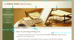
The font that you’ve chosen for the green bar (that says, “Welcome to the web desk of . . .”) and the scripture verse is very hard to read. At least, it is on my computer. (This is the only thing that might NOT be perfectly-functioning on other computers. Read on to understand why.)

Here’s the thing about using fonts other than Arial, Courier, Georgia, Times, and Verdana . . . you have absolutely no guarantee that your visitors have the same font installed on their computer that you do. What does the browser do if you’ve told it to render “Viner ITC” and the visitor (like me) doesn’t have it? The browser picks one at random and renders the text in it. So the visitor is totally stuck if the browser picks “Webdings” or some illustrative font that renders a picture for each letter. (I have no idea what Viner ITC looks like, so I don’t know what font YOU see on your computer. I also don’t know which, of my 100+ fonts, the browser picked . . . I just know it’s not easy to read.)

The only way to avoid this is to stick to the very, very short list of fonts that are pre-installed on all versions of all operating systems. (Google them, if you’d like.) If you want to do something in a font other than that, you have to use a graphics program to make an image of your text in that font [That’s what I did for my header when I fell in love with that font—Jordan]. (And then make sure you use an alt tag for that image, so that blind Internet users’ text-reading programs can still tell them what the text says [And also search engines!—Jordan].)

While I’m on fonts . . . I’d recommend un-italicizing the rest of your text as well. It’s harder on the eyes, and therefore makes it more likely that your readers will click away without reading it. (You’d be surprised how little a website visitor needs to click away! And most of it is subconscious, too, so you can’t argue with it.)

Conveying your genre in the design

Your header image portrays writing . . . but not inspirational romance. I’d see if you can find something a little more romance-y. Adjust your background colors, if needed, to match . . . but keep them tasteful and relaxing! Also, your header image stretches farther down the page than your navigation menu. That looks a little . . . “off” to me. Maybe see if you can add a few other little items of interest in that bar on the left. Do you have a twitter feed? How about a favorite scripture? Or an image that coordinates what your header? Maybe you can install a widget that will automatically post the titles to your last five blog posts?

Blog/site transition

Finally, your blog’s overall feel doesn’t reflect your site’s at all. It makes the reader do a double-take and think, “Wait! Did I click on that right? Is this really the same person? It can’t be! No . . . wait, (checking back and forth) that’s the same name, so it must be. Okay. . . .”

You don’t want that interruption. If someone visits one, and then later visits the other, you want them to think, “Hey, this looks familiar! I must have been on this woman’s site before or something.” And actually, your blog reflects Inspirational Romance much more than your site does. Where did you get the background image? Do you have permission to use it on your site as well? I can think of several ways to use it, if you’re interested.

Finally, two other tiny things:
4) Your header bar, with your name in it, looks too long . . . almost like you’ve got a blank line under the text. I’d scoot it up against the top of the browser window (so the brown background doesn’t show) and shorten that up so it’s about half the height it currently is.

5) On your tips, hopefuls, and contact pages, you’ve got a light green background behind the text, that’s covering your gradient image. (It’s not . . . and it looks better . . . on your home and about pages.)

I hope this is helpful to you!

-Katie, KatieDid Design

What do you think? What other feedback would you give Eileen on her site?