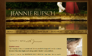
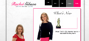
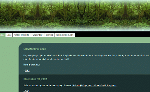
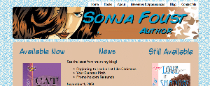
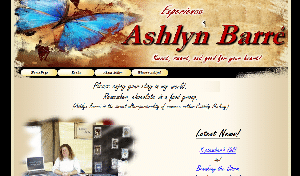
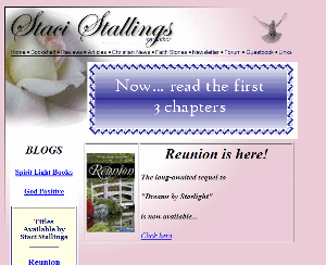
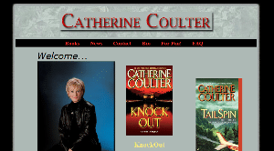
We are moving on to marketing tactics! We’ll start off by talking about author websites. This post originally appeared as a guest post on Nathan Bransford‘s blog as part of his first-ever guest post contest in July 2009. I’ve refined it a little bit.
Once upon a time, my day job involved learning how to get the most out of your website—and how to make your website work for your visitors. So from the perspective of Internet marketing, here are the top seven things every aspiring author’s website should have.
7. A blog. All right, all right. I’m a little partial to blogs, but not everyone likes blogs or is good at blogging. And that’s okay. If you want to call it  an “announcements” section, or call it your “articles,” that’s fine. But do have at least one section of your site where you can post your news—anything from finishing your latest work in progress to selling a short story. This is also a great place to start gathering a following, especially if you like to connect with other people, share your research and discuss the process of writing.
Free advice: If you already have a blog, you can integrate it with your website. Check out Blogger’s Custom Domain feature and host it at http://blog.YOURWEBSITE.com to make sure everyone linking to you is pointing those links to your domain.
6. Social media. This doesn’t mean you need to run out and join every social networking site you’ve never heard of. But it’s always a good idea to give your website visitors potential ways to connect with you. So if you’re already on MySpace, Facebook or Twitter, or any other large social network, list those somewhere on your site—somewhere easy to find.
5. Search engine presence. Unless your name is John Doe or Mary Smith, it should be fairly easy to  find your website by searching for your name in the major search engines (Google, Yahoo and Bing). One good way to start with this is to buy YourName.com. If YourName.com (and YourName.net and YourName.org) is taken, experiment with middle initials, maiden names, hyphens, etc. Still nothing? Maybe you should consider a pen name that would be easier for your readers to remember, too.
Free advice: If you have some competition for your name in search results, put in a little extra legwork to find places to get links back to your site, especially from related sites—guest blogging, article writing, etc. I mean, we are writers here, aren’t we?
4. Professional design. For real. This doesn’t mean you need to run out and hire a $10,000 website designer, or that your website has to look as awesome as J.K. Rowling’s. You don’t have to dress like a fashion model to pitch to an agent at a conference.
At the same time, you’re not going to wear your ratty jeans and torn up tank top to a business meeting. Just like your nice pleated khakis, your website needs to look professional: clean, polished, easy to read (spell checked!), easy to navigate. Make it easy for your visitors to find the important stuff on your website (see #1, 2, 3, and 7, at least).
3. An about page. Most of us have an urge to list our friends, spouses, pets, children, favorite television shows, other hobbies, and small collectibles in our query letter. Hopefully, if you’re reading Nathan’s blog, you’ll forbear and omit this paragraph from your query. But your website about page is exactly where you should put all that information. After all, if someone visiting your website wants to know more about you, why not tell them?
2. Your work. No, you probably shouldn’t slap your whole manuscript on your website. But you should at least have a short summary of your work on your site. You might also consider a short excerpt—a chapter or less—in addition to your extremely engaging summary. After all, if your work is ready to query, it’s ready to show, isn’t it? This is also a good place to put your writing credentials (if not under #3 already).
 1. A contact page. You’d be amazed how often both aspiring and published authors forget (or don’t want) to give their website visitors a way to contact them. Now, odds are low that a literary agent, editor or publisher is going to use your contact page to send you a desperate “Please, please, work with me! Your brilliance makes me cower in inferiority, but I cannot bear the thought of anyone else tainting your work!” note—but there’s always the possibility.
Free advice: Use a simple web form instead of listing your email address to avoid spam email harvesters.
What do you think? What else should an aspiring author have on his/her website?
Photo credits: Microphone—RAWKUS; binoculars—Joël Dietlé; telephone—Maria Li

 .
. Taylor Lindstrom. She acknowledges that blogging can be a major draw on a writers’ creativity and often very limited time—but it can still be beneficial for any fiction writer.

