Another website review today! I feel like I’ve known Eileen for a while, since I’ve seen her around the comments of other blogs (like Kaye Dacus‘s and Nathan Bransford‘s) for over a year, but we haven’t really “talked” until she came to this blog (woot!). Now she thinks I’m a Superior Scribbler (why, thank you!), and she volunteered for the next website review with her site, EileenAstels.com. Katie and I both also looked over her blog, EileenAstels.blogspot.com, too.

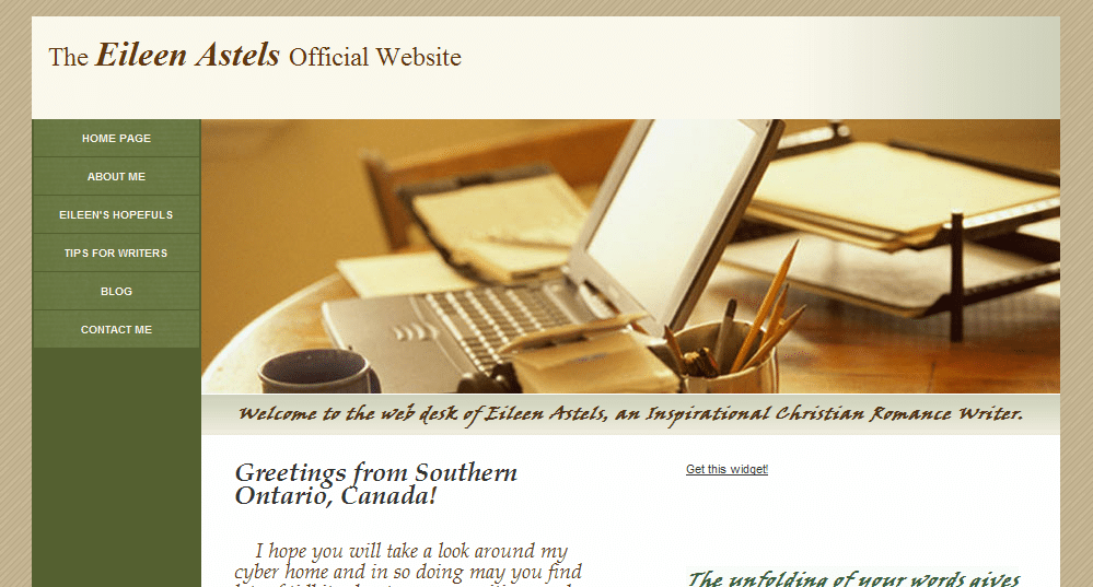
Eileen’s website
Jordan’s comments
I see from your blog that you’re just entering the “get set” phase— you’re submitting to editors and agents now. Congratulations (and good luck)! It’s important that visitors can figure out what your site is about and what they’re supposed to do once there there. Your site looks pretty ready—it’s professional, easy to navigate, and the left navigation makes it easy for your visitors to find the important stuff on your site.
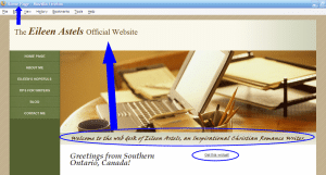
However, your genre and even the fact that you’re a writer almost seemed “buried” below the header. (It was several minutes before I saw it there.) You should use that line of text or something similar right under your name at the top as a tagline to make your purpose, niche and genre apparent when someone stumbles across your site.
Individual pages
In this phase, your contact page is more important than ever. So woot on already having a contact page! If you want, you might also use the form that GoDaddy can install on a contact page. (If you’ll recall, this page is the #1 thing an aspiring author’s website must have.)
You might consider relabeling “Eileen’s Hopefuls.” I guessed what you meant, but it almost sounds a little sad 
I’d also recommend that you expand the book descriptions here into full “pitches” like you’d present in a query letter, especially for the later books (because the agents/editors will have already seen the pitch for the first book). It’s totally up to you, but you could think about putting a short excerpt—maybe five pages—on your site, too.
I might reword or delete the first sentence of the last paragraph on the Hopefuls page—it almost sounds like you’re planning on just using the series as a warmup exercise.
Your about page is personable and professional.
Search engine presence
Your search engine presence is good. Your site is #1 in Google and Bing and #2 on Yahoo for [Eileen Astels]. Your blog is #1 on Yahoo, #2 on Google and #6 on Bing for [Eileen Astels]. Other sites in the top ten for your name are the widget for your blog, Facebook, Afictionado, and Amazon.ca. While those are fine, it couldn’t hurt to seek out opportunities to get your name out there more—like you’re doing through coblogging, comments and guest blogging. (Be sure to get the most out of guest blogging if you do it.)
A few other tricks you could do to help:
- Change the <title> element on your home page to “Eileen Astels Official Website” or “Eileen Astels – Inspirational Romance Author” or something like that. Right now, if I were to bookmark your home page or minimize my browser while viewing it, it would be described as “Home Page.” I’d lose that in my bookmarks. Plus, it’s helpful to have a descriptive title for search engines to understand what your homepage is about. (I don’t use GoDaddy for building sites, but I believe this is under “Page title.”)
- However, if changing this changes the title of the page on the left-hand side, see if “Eileen Astels Home” or just “Eileen Astels” will fit.
- Use headers to organize and emphasize your text, rather than just using size/styles. If you look at the source code here, you’ll see that “Jordan McCollum” is in a <h1> tag—a header (top level) tag. That indicates to search engines what the page is about. Use header tags (h1, h2, h3) to organize your text hierarchically. Test this to see what they look like, but in most designs the header tags are large and bold. (Technically, this technique seems to be losing a little power, but it can still help.)
- Use meta descriptions to control the “snippet” in search engines. Right now, search engines are showing “The Eileen Astels Official Website. Your Subtitle text … Welcome to the web desk of Eileen Astels, an Inspirational Christian Romance Writer. …” But if you have a meta description that matches a query, they’ll show that instead (i.e. without “Your Subtitle text”). You might have to insert them in HTML, like I told Livia).
Social media & your blog
For whatever reason (I’d guess browser incompatibility, but I’m not sure), I don’t see the widget showing up on your homepage. I see you’re on Facebook (on your blog) and Twitter; you could consider having widgets for those on your website, too, in the sidebar, on the main page or on the contact page.
Your blog looks to be a good mix of appealing to and networking with fellow writers, sharing your love of literature and sharing your life in an appropriate way. It looks like your content is fun, interesting and useful, and with 50+ followers and twenty-something comments on most posts you’ve clearly built a community around your blog.
My only advice here would be to set up your blog to be hosted at http://blog.eileenastels.com. You can do this through Blogger and GoDaddy, your domain registrar, without changing anything else, really. Setting up Blogger Custom Domain is a little bit technical, but not very hard.
Why do you want to do this? Because every link to your blog is a “vote” for your site in search engines’ eyes. The more votes you have, the more authority search engines think your site has. But if these links point to http://YOURBLOG.blogspot.com, it’s BlogSpot getting all that authority. If you move your blog to blog.eileenastels.com, the votes now all go toward your domain (which many professionals believe will give your site an overall lift—and since Blogger will redirect your links, it can’t hurt!).
This might seem like a lot, but really, you have a good site set up so far and a few tweaks could take it to the next level.
Katie’s comments
Dear Eileen,
Nice to meet another Christian romance writer!
Your site uses a common layout, but it’s still tasteful, in relaxing colors, and is easy to navigate. Those may seem like simple compliments, but they’re extremely important. (And many people get them wrong.) So congratulations! It is also a perfectly-functioning site, as it is. So these thoughts are just things to consider the next time you feel like doing a re-design.
What would I recommend on your site? Well, to me, there are three main issues.
Web-safe fonts
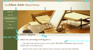
The font that you’ve chosen for the green bar (that says, “Welcome to the web desk of . . .”) and the scripture verse is very hard to read. At least, it is on my computer. (This is the only thing that might NOT be perfectly-functioning on other computers. Read on to understand why.)
Here’s the thing about using fonts other than Arial, Courier, Georgia, Times, and Verdana . . . you have absolutely no guarantee that your visitors have the same font installed on their computer that you do. What does the browser do if you’ve told it to render “Viner ITC” and the visitor (like me) doesn’t have it? The browser picks one at random and renders the text in it. So the visitor is totally stuck if the browser picks “Webdings” or some illustrative font that renders a picture for each letter. (I have no idea what Viner ITC looks like, so I don’t know what font YOU see on your computer. I also don’t know which, of my 100+ fonts, the browser picked . . . I just know it’s not easy to read.)
The only way to avoid this is to stick to the very, very short list of fonts that are pre-installed on all versions of all operating systems. (Google them, if you’d like.) If you want to do something in a font other than that, you have to use a graphics program to make an image of your text in that font [That’s what I did for my header when I fell in love with that font—Jordan]. (And then make sure you use an alt tag for that image, so that blind Internet users’ text-reading programs can still tell them what the text says [And also search engines!—Jordan].)
While I’m on fonts . . . I’d recommend un-italicizing the rest of your text as well. It’s harder on the eyes, and therefore makes it more likely that your readers will click away without reading it. (You’d be surprised how little a website visitor needs to click away! And most of it is subconscious, too, so you can’t argue with it.)
Conveying your genre in the design
Your header image portrays writing . . . but not inspirational romance. I’d see if you can find something a little more romance-y. Adjust your background colors, if needed, to match . . . but keep them tasteful and relaxing! Also, your header image stretches farther down the page than your navigation menu. That looks a little . . . “off” to me. Maybe see if you can add a few other little items of interest in that bar on the left. Do you have a twitter feed? How about a favorite scripture? Or an image that coordinates what your header? Maybe you can install a widget that will automatically post the titles to your last five blog posts?
Blog/site transition
Finally, your blog’s overall feel doesn’t reflect your site’s at all. It makes the reader do a double-take and think, “Wait! Did I click on that right? Is this really the same person? It can’t be! No . . . wait, (checking back and forth) that’s the same name, so it must be. Okay. . . .”
You don’t want that interruption. If someone visits one, and then later visits the other, you want them to think, “Hey, this looks familiar! I must have been on this woman’s site before or something.” And actually, your blog reflects Inspirational Romance much more than your site does. Where did you get the background image? Do you have permission to use it on your site as well? I can think of several ways to use it, if you’re interested.
Finally, two other tiny things:
4) Your header bar, with your name in it, looks too long . . . almost like you’ve got a blank line under the text. I’d scoot it up against the top of the browser window (so the brown background doesn’t show) and shorten that up so it’s about half the height it currently is.
5) On your tips, hopefuls, and contact pages, you’ve got a light green background behind the text, that’s covering your gradient image. (It’s not . . . and it looks better . . . on your home and about pages.)
I hope this is helpful to you!
-Katie, KatieDid Design
What do you think? What other feedback would you give Eileen on her site?


