Tag Archives: goals of website design

Marketing 101: Author Branding

This entry is part 7 of 8 in the series Marketing 101

What is branding?
When we think about branding, it’s easy to think of all the work that companies like Coca-Cola or Pepsi put into their logos, commercials and jingles. And the American Marketing Association does use “Name, term, design, symbol, or any other feature that identifies one seller’s good or service as distinct from those of other sellers” in the definition. While that’s definitely a part of it, the true definition of a brand is:

the sum total of all the interactions, impressions, information and expectations within the minds of people associated with a person, product, company or name.

It’s important to remember that branding isn’t just something we do on our blogs and Twitter accounts: it resides in the minds of other people. That’s not to say we don’t have any influence on our brands—of course we do. But if we don’t take charge of our brands, we won’t be able to make the impressions that we’re looking for on our blog readers, book readers and the rest of the public.

So let’s look at a few aspects of branding that authors can influence!

Tone
I hope most authors are familiar with tone from their writing: for highly dramatic scenes, we make sure our language matches the scene—we don’t use “poopyface” as an insult in an intense scene in a novel for adults (unless we really want to mess with the tension for comedic effect).

In the marketing presentation by Rob Wells that we referenced a few weeks ago, he talks about branding. (Page through—you’ll see Brandingi n big red letters, then a list of things branding isn’t, then a definition of branding. The next slide is what we’ll talk about.) We know there are dozens of marketing tactics we can use. But if we want to help people understand who we are and what we write, it’s important to think about our tone across media. There are tons of different tones we can strike—Rob lists hysterically funny, literary and erudite, mysterious and intense, folksy and warm, and hip and clever, just to name a few.

That doesn’t mean that every single Facebook page update, Tweet and blog post have to be completely folksy and warm or mysterious and intense. Just like in our books we can mix in a little of a different tone—even if we don’t write romance or humor, there’s often an aspect or subplot of romance or humor in almost every novel.

Which leads to another important question: do you have to match the tone of your books in your marketing? Simple answer: yes and no. The tone of a novel will almost always be different because we don’t generally address the audience, like we must do (or at least consider) in a personal marketing medium.

Appearance
Just like with a book cover, the visual appearance of your blog, Twitter, etc., plays a big role in setting the tone. Generally, the advice that I like is to match your design to your target genre. A dark paranormal author will have a very different design than a historical inspirational romance author.

Web designer Kathleen MacIver also covered this well in our guide to aspiring author websites (PDF).

Name
Yep, you can influence your name—ever heard of a pen name?

We see this most often in cases like J. K. Rowling: she used her initials (okay, her first initial and an invented second initial) because her publisher believed that boys would be less willing to read MG fantasy written by a woman, even with a male protagonist.

But you can also choose your pen name based on other factors: if there’s already an author or other celebrity with your name or something very similar, who you want to be next to on the shelves, hiding your identity (but honestly, this is harder and harder these days).

Make sure you’re consistent across platforms. It’s easiest to make your website/blog YOURNAME.com, but you also want to think about your Facebook page (your name, perhaps with “author” at the beginning or end), your Twitter handle, etc.

Tag line
I don’t think an a tagline is an absolute must, but it can be a nice thing to have to help signal to your visitors what kind of books you write. The tagline should be more about the type of books you write, or maybe the thing that sets you apart—your USP—in the genre rather than a single book you’re working on or that’s coming out most recently.

Vince Mooney offers some good advice on author branding & author tags, including these basic principles:

1. a tag line should reflect and support the author’s chosen brand.

2. a tag line should be original and not too much like another author’s.

3. a tag line should be memorable and intuitively attachable to that author. (By this I mean a reader might reasonably be expected pick the author’s tag line from a list of tags without ever having read one of the author’s books.)

4. a tag line should promise a benefit just as an advertising headline should promise benefits.

I have a few more general ideas on branding you can read here.

The bottom line
In his marketing presentation, Rob Wells covers the most important reason for branding very well. Studies have shown that Coke branding messages light up the brains of Pepsi drinkers just as effectively, and that the exact same drink served with expensive trappings is considered worth more money. By working to build a quality brand, by considering the perceptions of your audience, you can create that kind of emotional response, loyalty and perceived value in the minds of your potential customers.

What do you think? How do you see authors branding well?

Image credits: brand logos via Adam Crowe; Brand by Rupert Ganzer

The collected wisdom of website design

I used to do website critiques fairly regularly, and fantastic web designer Kathleen MacIver gave wonderful in-depth critiques to our participants. We’ve fallen out of touch (but Kathleen, if you’re reading this, I’d love to change that!), but a lot of her wisdom from previous critiques is just as applicable to our victims volunteers from this round!

On defining your site through blog goals:

Is [your blog] primarily for you, as a method of self-expression? If so, then who cares what it looks like!

The fact that you asked for this review, however, makes me think that you ARE hoping this blog achieves something. It doesn’t appear that you’re trying to promote your own writing, since a skim down through the posts showed me nothing along those lines. Are you trying to build a small community? Just meet people online? Right now this blog is a pretty clear reflection of you, as a person, and your love of words. It’s not a reflection of your stories or books or poems, or of a particular genre. Do you want it to be?

I’m not really sure what to suggest, since I don’t know what that goal is. But think about it. This is where every website should start . . . with a careful assessment of what the goal of the website (or blog) is, what you hope it will achieve, and who you hope to reach with it. Everything else needs to follow that.

On matching your design to your theme, and the purpose of design:

A website made from a basic, generic template (99% of the time) is like finding a hardcover book that’s missing its dust jacket (the old kind that had nothing more than a solid color and gold lettering on the edge). There’s nothing to turn you off to the book/site, but you really had to have a compelling reason from somewhere else in the universe to open up that book and start reading, because the book cover itself is offering you nothing.

You do have that little paragraph that explains a little. Now you need to find a design that is the visual interpretation of your concept. . . .

Basic layouts for blogs are often best, since people are there to read content (once they know they’re interested, of course).

So all-in-all . . . you don’t have anything wrong here, but you haven’t really taken any steps toward the two main goals of a website’s design, which are:

  1. Instantly portray what your website is about, and what the visitor will receive if they hang around. (In your case, interesting information that they’re not likely to find anywhere else on the Internet, since the number of brain scientists blogging about writing has got to be extremely small)
  2. Make the site stick in their mind, thereby upping their chances of wanting to come back, coming back, and remembering why they bookmarked it when they do come back.

And this one is actually from me, on the purpose of a website:

Also, make your website somewhere that people will want to come back to—do something for them, reach out to them (see building a community), be accessible. Even if they’ve already bought your book, they’re still your customers, your readers, your fans, and striving to build a relationship with them (individually and collectively) can help sustain you, both emotionally and financially. . . .

Always remember: your website will be the major way you’ll interact with most of your readers and potential business associates. Use it wisely!

free website guideI’d forgotten how much good advice has already passed through here, and I know many readers weren’t here two years ago when we were doing these. Luckily, I’ve already collected the generally-applicable advice from several of the critiques and put them together into a handy, free PDF: a Guide to Aspiring Author Websites!

What do you think? What did you take away from these critiques that will help with your site?

Photo credits: heart in a book—Piotr Bizior; book without cover—Marcos Ojeda

Quick website quiz

In yesterday’s website review, Kathleen mentioned how important it is to convey your genre with your website. It can be hard, depending on the genre. Even some published authors’ sites don’t do it well.

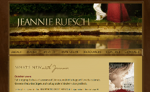
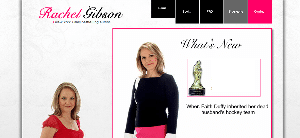
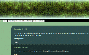
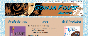
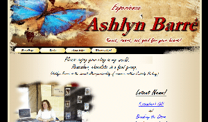
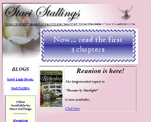
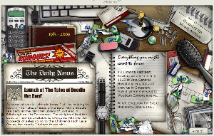
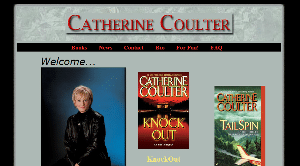
Quick: Can you tell me what genre these published authors write in? (I took the name off a couple and removed outright genre identifiers because that would be too easy, and that’s not what this is about—it’s about looking at the graphics on their site to see if they convey their genres. If you’ve read any of them or recognize their sites, try to judge only by what you see here.

Links and answers to be posted in the comments!

1.)quiz1

2.)quiz6

3.)quiz2

4.)quiz7

5.)quiz 3

6.)quiz4

7.)quiz8

8.)quiz5

Post your guesses in the comments! The person with the most answers right (without cheating) will win . . . something!

Get-ready phase blog review: LiviaBlackburne.blogspot.com

After we looked at four goals of an author’s website (before publication), now we’re ready to start our website reviews. Just as a reminder, my day job is in Internet and search engine marketing. Kathleen MacIver, my co-reviewer, runs KatieDid website design. Our first victim review is of LiviaBlackburne.blogspot.com. Thanks for being the first to step up to the plate for the website reviews, Livia!


Livia’s site

Jordan’s comments

Hi, Livia! If I had to guess, I’d say you’re in the get ready phase—you’re in the process of writing, but you’re not submitting to agents or editors yet.

In the get ready phase, your goal is to build a community around your blog. You can network with other writers (and maybe agents and editors), you can appeal to readers of your chosen genre, you can tout your platform or skills.

So right now, I’d focus on using your blog in one or more of those ways. As far as usability goes, right now, you’re probably okay, but you’ll want to make some changes before you use your blog as a marketing tool or mention it in a query letter.

Your blog can actually perform the functions of a full website if you add a menu bar. On the menu bar, you’d want to link to your about page, contact page and works page, at a minimum. (Your blog would probably benefit from at least the first two right now.) Additionally, you can buy the domain LiviaBlackburne.com and put your blog on it. (If you want to develop a separate website later, no problem—put your blog on blog.liviablackburne.com and you can add your main website at liviablackburne.com later.)

If you do anything now, I would add a way for someone to contact you directly. Yes, we can tweet you, but if we’re not on Twitter, the only other way we have to contact you is through a blog comment—not very private.

Posts and their content

A huge strength of your blog already is your focus on a topic and a niche—a [neuro]scientific approach to writing. In terms of quality, your posts look great! You have really good, helpful content. Generally, however, when you post more frequently, your blog will grow more. Posts are what blogs are for, after all 😉 . Once a week is probably the minimum, and it’s important to be consistent.
If you have trouble coming up with things to write about, you could break some of your future posts into series of shorter posts (you could get four posts out of a post like yours on the power of prologues, for example). Series also helps to build a sense of anticipation among your blog readers—they’re looking forward to your next post.

You can also add more bulleted lists to help make your reading more scanable, if suited to your posts. Pictures, even stock photos, also help to break up big blocks of text and draw in readers (I use sxc.hu and Flickr Creative Commons search to find mine). See the screencap at right to see how photos break up what otherwise looks like a long block of text. (Also, there’s a bulleted list in there; they stand out more when you do them “for real” instead of just throwing a graphic together like that.) The screencap also includes the recommendations I have made/will make about your sidebar.

For a blog that’s pretty young, you’re already getting multiple comments on your posts—woot! You can always try to appeal more directly to encourage blog comments, such as asking discussion questions at the end of the post.

Similarly, you can appeal directly to your readers to become Followers and subscribers.

Search engine presence

Your search engine presence is decent. I think you’re very smart to start using your married name now (and congrats and good luck on the big day!)—changing later would’ve caused a few problems. You have little competition for your name. This blog is #1 on Yahoo and #6 on Google for your name. (#1 on Google is your Twitter page; #1 on Bing is your other blog.)

Unfortunately, I can’t seem to find this blog on Bing. To help improve your rank on Google and get indexed by Bing, look for opportunities for links with your name as the anchor text, like guest blogging, your friends’ blog rolls, etc.

Also, you can sometimes have more control over the “snippet” that appears in search engine results (the description below the blue link) by using the meta description element. The format is:

<meta name="description" content="[description of your site, such as what you have below your blog name]" />

The description you put there will show up as the snippet in search results (if there isn’t a better match for the search terms elsewhere on the page).

Here are some more specific instructions on how to insert header codes in Blogger.

Social media

You’ve done a great job of integrating Twitter with your blog with the Twitter widget in the sidebar and TweetMeme on each post. This goes both ways, since you actively use Twitter and promote your blog posts there (good!). You also promote your subscription options well, though I might recommend moving them above the topics menu (that way we can see the subscribe buttons “above the fold”—in the area of the page you can see without having to scroll down).

I might also move the Twitter widget above the Google ads, but that’s fairly subjective.

In all, you’re off to a good start. A little work on the static pages and posting consistency will get your blog to the next level.

Katie’s comments

Hello Livia!

First, I’d like to say that I find your little catch phrase quite intriguing! What IS a brain scientist’s take on creative writing?

However, this is a website review, so I’ll have to focus my comments on your blog design . . . and frankly, I’m not sure what to say. There’s not really anything to critique, since it appears to be a basic template. A website made from a basic, generic template (99% of the time) is like finding a hardcover book that’s missing its dust jacket (the old kind that had nothing more than a solid color and gold lettering on the edge). There’s nothing to turn you off to the book/site, but you really had to have a compelling reason from somewhere else in the universe to open up that book and start reading, because the book cover itself is offering you nothing.

You do have that little paragraph that explains a little. Now you need to find a design that is the visual interpretation of your concept. A header image/text would help . . . my initial thoughts would be your name long, spaced out (and not too large) and centered, then immediately under it, in a strong technical-looking font, your words, “A brain Scientist’s take on” on the left, leading to “Creative Writing” on the right, but done in a fun “creative” font. This would give a partial “translation” of the text and help show the contrast between “brain scientist” and “creative writing.” (Note: this text would have to be turned into an image . . . check back for the next review for the reason why.)

Then, a background and/or other image here or there that carried that contrasting theme would be fantastic. You’d want something that melds technical/scientific/detailed, with art. (I’d sure have fun designing that one!)

Your layout is fine . . . basic layouts for blogs are often best, since people are there to read content (once they know they’re interested, of course).

So all-in-all . . . you don’t have anything wrong here, but you haven’t really taken any steps toward the two main goals of a website’s design, which are:

  1. Instantly portray what your website is about, and what the visitor will receive if they hang around. (In your case, interesting information that they’re not likely to find anywhere else on the Internet, since the number of brain scientists blogging about writing has got to be extremely small)
  2. Make the site stick in their mind, thereby upping their chances of wanting to come back, coming back, and remembering why they bookmarked it when they do come back.

Feel free to drop me a line if you’ve got any more questions!

-Katie, KatieDid Design

What do you think? Can Livia’s site do more? What advice would you give her?

Photo of book by Marcos Ojeda