Tag Archives: website review

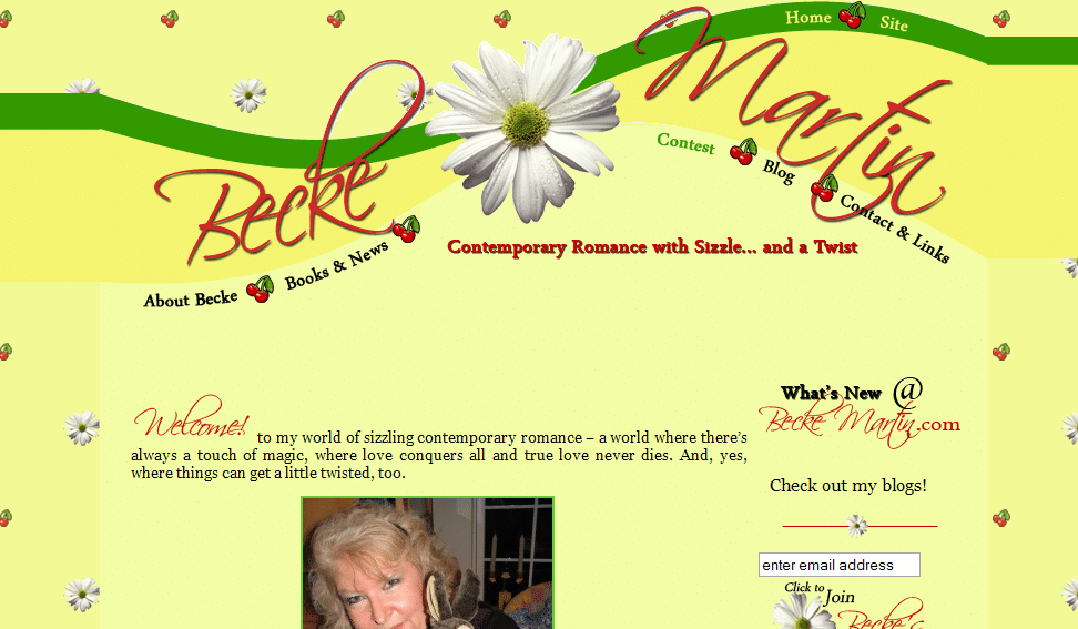
Website review: Becke Martin

Um, so I wasn’t thinking so hard when I only posted two critiques last week—so this week we’ll have four reviews, and then take a look at our favorite author websites.

First up this week, Becke Martin‘s beautiful site!

becke

Kathleen’s comments

Dear Becke,

This is a fantastic, beautiful website! Your colors are pleasing and cheerful—but I’m not sure you’ve effectively portrayed and advertised what you write at first glance.

Both your catch phrase and your site’s graphics led me to believe that you wrote either humorous, passionate, romance, or light-hearted chic lit romance. Therefore, it caught me by surprise to read that your books have magic and mystery, and that you write romantic suspense. This means that your best potential readers, those looking for romantic suspense, might click away as soon as they see that big cheerful sunflower and get the impression that you DON’T write romantic suspense. Do you see the problem?

I think you’ll have an easier time reaching readers if you redesign the colors and graphics on the site to look less like a country kitchen and more like the world of your books.

I also think that you should adjust your catch phrase. Even adding the word “magical” twist would help, though it still makes it sound more like Sabrina the Teenage Witch than romantic suspense.

Finally, the image that (I think) replaces your “Welcome” word on the home page isn’t showing in Firefox. [Note: it’s showing on my Firefox . . . not sure why that would be different—Jordan]

Your content layout and blog integration are fantastic. So I think that once you match the look of the site to your genre, you’ll have a top notch website. God bless!

Kathleen MacIver, KatieDid Design

Jordan’s comments

What a beautiful website! While I do agree with Kathleen, I also want to point out that you’re doing so much right here. You’ve made your website fun—including with an ongoing contest.

You’re using your books and news page to highlight not only your works but the awards you’ve won (and you even link here—I’m flattered). That’s a great way to show off your works and your awards to prospective agents, publishers and buyers. (As always, of course, I think 5-7 polished pages of a story can highlight your work really well, too.) As Kathleen mentioned, your blog is integrated perfectly with your site.

Your search engine presence is good—your site is #1 for your name on all three search engines. Your MySpace, Twitter, guest blog posts and other blog mentions also rank in the top ten. One thing you could do here is add a meta description to your site—often search engines use that description as the text underneath the link in their results.

A couple technical comments: when I view a blog post, the page looks really strange (the text is all off to the side very far). Also, on the homepage sidebar, where it says “Check out my blogs,” I expected it to be a link. On a few pages, I’d like to see the text (or lists of links) categorized or accompanied by explanatory graphics—long lists of links or blocks of text can make web readers’ eyes glaze over.

I see that your website was done professionally, and I assume you had input in the process—so you tell me, Becke. What were you going for with your site design?

Hope this helps!
Jordan

What do you think?

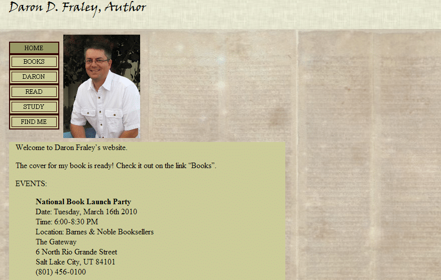
Promoting your books with your site—Daron Fraley’s review

Today, we’re looking at the site of an author whose first book is due out in a few months: Daron Fraley. It’s time to get ready for promoting that book! (Also note: I posted the answers to yesterday’s quiz.)

daron

Kathleen’s comments

Dear Daron,

I like the paper-looking background on your website. You’ve got a great author photo, too, which is a nice, personal touch. Your site is very simple, which isn’t necessarily a bad thing.

What would I suggest when you’re ready to make improvements? Well, the first issue is that your site doesn’t sell or advertise your book. It says it’s coming out soon, but the home page doesn’t say what it’s called, nor what genre it is, nor the publication date (and where it will be available), etc. You want to get all of this on your front page in an easily read and understood way. If the book will be available through Amazon, then as soon as a page is up for it, make sure you link to it!

Hopefully, the cover art is such that an image of it will show the genre…but even so, it would be great to have a catch phrase or mention of the genre up under your name on every page of your site.

Second, there are many different layouts and templates, etc. that could improve the site, but it’s hard to know what you would like. Therefore, I’ll mention improvements for THIS layout and look.

  • How about a graphic that matches your genre? Back in the first series of website reviews that we did, (and which Jordan has created a PDF of) I talked about how you want your website to give the visitor the impression that they’ve stepped into the world of your books. I’m not sure what limitations your website account has, but anything that will move toward this goal will increase interest in your books.
  • Right now all of your site content is shifted to the far left of your site, which makes it look a little lop-sided. If you can center the content section so the blank space to the right is split between the left and right, that will really help the pages look more balanced.
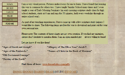
  • The Study page should, I think, show the connection between the Bible studies and your story. As it is, I think I understand, but I have to look on two pages (the books page and the study page) to figure that out. That might confuse those who happen upon your Study page first (through Google). Instead, you want those who are googling these things and finding your page to instantly KNOW that you’ve written a book that they might find interesting!
  • Your Find me page could be snazzed up a little by adding one of Twitter’s widgets there, so it shows your last number of Tweets. Take a look at my twitter page for an example. Twitter will walk you through getting the code.
  • The blog template that you chose is gorgeous. If you can adjust the colors of your website images (and the solid color behind your text) to match the blog images better, that would help them fit together. Then see if whatever graphics you add to your site can also be added to your blog. At the very least, add a book cover image to the top of one of your sidebars.

I hope this helps, and God bless!

Kathleen MacIver, KatieDid Design

Jordan’s comments

Hey Daron! As usual, Kathleen is spot-on. In the last series, I also had an article on how you can use your site to help promote your book, and there are a number of suggestions there, including the ones Kathleen made, excerpts, and trailers.

But since she covered that so well, I’m going to move on to more technical issues. Your search engine presence is good for your name—with a unique name, you should definitely rank well. However, your site itself is #4 on Google and Bing (#1 on Yahoo, though)—it could be better, and it’s competing against your blog (which is winning on Google).

I ran your site through a simulator to show what a search engine spider would see when looking at your site:

Spidered Text : Daron D. Fraley, Speculative Fiction Author

Spidered Links : No spiderable links found.

Meta Keywords : Daron D. Fraley, The Chronicles of Gan, The Thorn, speculative fiction, author, writer, adult books, Gan, Valor Publishing Group, Christian fiction, fiction, YA books, Daron D. Fraley, Daron Fraley, Daron, author Daron Fraley

Meta Description : No meta description found.

Thankfully, search engines are slightly smarter than this, and they have been able to index your site’s content. But the underlying problem here is that your site uses frames.

For those that don’t know, frames split out the content of a website into different “windows” or panes on a browser page. (Once upon a time, there were actual bars between the frames.) The actual code for the page only refers to the other files that have the actual content on them, adding an extra step for search engines.

Frames are also hard on users. For example, if I wanted to link directly to your Study page . . . well, I just couldn’t. When I go to the Study page, the URL in my browser is still “http://daronfraley.com.”

Rather advanced users of a web browser can still find the URL of your Study page by right-clicking on the navigation, but if we follow that URL, the page we come to has the top header of the site (the other “frame”) cut off.

daron2

The solution: it’d be really easy just to leave frames behind altogether and put the code for the header into the individual pages or the template for your site.

Also note, the meta description will serve you better than the meta keywords (which aren’t used by most search engines anymore—but the descriptions may be used as the snippet below the blue link on a search engine result page). Finally, links will help pull your rankings up. I also recommend hosting your blog on your domain (at blog.daronfraley.com), which can also help your link authority in search engine’s eyes.

As always, I also recommend having a way for site visitors to contact you directly, preferably a contact page with an email form. It’s great that you have the social media contacts, though, making sure that people can find you around the Internet (and your Twitter profile, Facebook profile and blog are prominent in the search engines, too).

Finally, I do want to tell you that you have great content on your site. It’s rare that an author has stuff on their site that could be truly useful (and at least somewhat related to their works) like your study helps. Sharing short stories also helps prospective readers to get a taste for your writing. It’ll just take a few tweaks to help your website better represent your book and work for you!

Hope that helps!

What do you think? How can authors promote their books on their sites? What authors have you seen doing this well?

Photo credit: excited reader—Chris Johnson

Highlighting your works—Michelle Jefferies review

Thanks to everyone who offered encouragement yesterday! And now, oh frabjous day! We’re starting our latest series of website reviews by me, Jordan McCollum, of here and Marketing Pilgrim, and Kathleen MacIver of KatieDid Designtoday with C. Michelle Jefferies’s website.

michelle

Kathleen’s comments

Dear Ms. Jefferies,

I like this site! It clearly portrays the idea of stories and words, and the use of quotes establishes the genre, to a small extent. Your navigation is also clear and easy to follow.

Here are some suggestions that might help bring your site to life just a bit more:

  • If you want to improve your site, I would try to add just a bit more color, perhaps, just to make the site not feel so cold.
  • The Japanese/Chinese (I’m not sure which) characters effective hint at the genre, but it might be nice to know a little more. Are these YA? Adult? Romance? Adventure? Children’s? If you can find a way to portray that so your visitors can know if the first 3-5 seconds on your site (without looking for it), that might help.
  • However, the “hit man” quote on the top of the Why Butterflies page didn’t fit the whole idea of Asian fantasy that I got from the front. That leads me to think that my Asian fantasy perception is not accurate…which means that you DO need to clarify your genre better.
  • How about a great author photo? 🙂
  • Your My Books page is hard to follow. Some paragraph breaks dividing each book and series would help. Some book covers would be great as well.
  • Your Why Butterflies page confused me. Also, at the bottom you have the word, “Meramorphosis.” Is this a word I don’t know, or a typo?

I hope this helps, and God bless!

Kathleen MacIver, KatieDid Design

Jordan’s comments

Hi Michelle! I do like your site design (though I’d like the gradient background on the right to repeat down the length of the page).

As always, I recommend getting a domain of your own, and putting your Blogger blog and website on that domain. Both michellejefferies.com and cmichellejefferies.com are both currently available—I’d tend toward the one without an initial since it’s that much easier to remember and get it right. But either are better than your current URL—all people would have to do is remember your name, not your name and a domain.

Search engine presence

Now, I do assume that many people won’t remember your first initial when searching for your name. Without the C, there is some bingsadcompetition for your name, and Bing can’t find you at all (not terribly surprising). Google ranks your site as #5 and your blog as 8 (your Twitter profile is between those). Yahoo ranks your blog as #1 and your site at the 8th and 9th positions.

Now, with the C, your presence is better. Google and Yahoo have your blog and your site in the top 3. Even Bing finds your blog—putting it in the #3 and 4 slots. Other relevant results include your Twitter, Facebook and Listorious profiles.

This shows that you could probably work some more to build links to your blog and especially your site, but you have a decent start.

Pages

I agree with Kathleen on your My Books page—your site could be working harder to show off your works and your writing. The list of titles and statuses doesn’t tell us a whole lot about the stories you’re writing. I agree that book covers will liven the page up (although I think designing one’s own covers for an unpublished site is hokey, I did it because a page of text is boring).

I also agree that a paragraph format would be helpful—but with that many WIPs, it could easily be overwhelming. In fact, it already is—fifteen novels in various stages of planning, writing and revising is simply too many for most people to wrap their heads around.

I think the best strategy would be to select the best works—the ones you’re actively pursuing publication on now, plus a few to show depth—to give a quick summary of and put together mock covers for. Also, while you have a very short excerpt on the front page, I think adding one or two short (up to 5-7 MS page) excerpts from your edited and polished works (on separate sub-pages) would let visitors get an even better taste of your works.

On your Biography page, I would add your awards. You use “Award winning author” as your tagline, but you only have an award mention buried in the My Books page. I would recommend highlighting that award prominently in your Biography page. That award will set you apart for readers and more importantly publishers. Finally, as always, I recommend adding some more social networking info—promoting at least your Twitter profile (probably on the Blog & Email page, which you might then rename Blog & Contact).

We hope that helps!

What do you think? How does your site highlight your works and your writing?

Photo credit: highlight&dmash;Daniël Cohen

Call for websites!

It’s that time again! Kathleen MacIver of KatieDid Design and I, Jordan McCollum of Marketing Pilgrim (and, of course, this website), are looking for volunteers to have your aspiring author website reviewed by two professionals!

If you’ll recall, we did a series of aspiring author website reviews in August and September. The series was so well received that Katie and I decided to do it again!

This time, because of the holidays and the like, we’ll be limiting the number of sites we can review. The reviews will run in December.

To sign up for one of the very limited slots, leave a comment on this post! Be sure to include the URL of your website in the URL box provided. If comments are closed, all the slots are full (but we’ll do this again in the future!).

Can’t wait until December? The free Guide to Aspiring Author Websites PDF from our last series is still available!

Photo by Sean Dreilinger

Free guide for aspiring author websites

This entry is part 5 of 5 in the series Aspiring author websites

Is it just me, or did Saturday totally sneak up on you?

Sorry about the delay, folks. As promised, I’ve compiled the articles and advice from our aspiring author website series and website reviews into a free PDF guide.

free website guideThe free Guide to Aspiring Author Websites was a bit of a challenge. Rather than including the full reviews, which are most useful to the person who received them, I’ve assembled all the advice that Kathleen and I gave into a little more general format, to apply to anyone who reads it.

The series was more popular than we’d anticipated, so we’ll be doing it again sometime soon. That’s right, we’ll be reviewing more websites. Don’t forget to subscribe to the blog to so you don’t miss the call for volunteers! Thanks to all of our brave and gracious volunteers, and thanks to everyone who commented and enjoyed our series.

Next week, we’re going to start looking at plotting methods.

Cover photo by Ben Lancaster

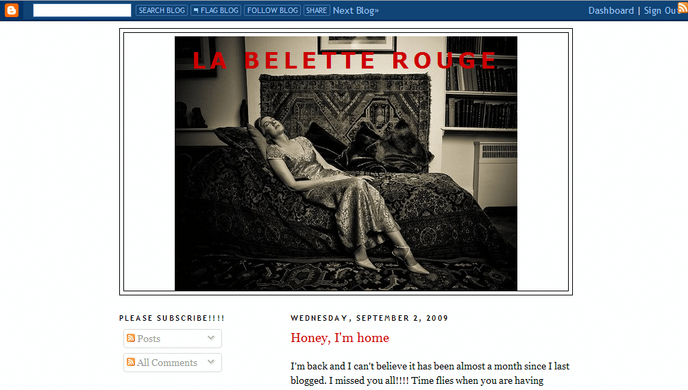
The challenge of a pseudonym, LaBeletteRouge.blogspot.com

Today we have our final website review for La Belette Rouge: oh, the luxuries of going last. Have you been reading and making adjustments all along? Cheater 😉 .

(Remember, we’ll be doing more website reviews in a few months, so subscribe so you don’t miss the call for volunteers!)

belette1

Kathleen’s comments

Dear ‘Belette Rouge,’

I visited your site and I was . . . intrigued. It seems that you have a pretty wide circle of friends online, and that’s a good thing! The number of comments your posts bring shows that you’re doing something right. 🙂

But to be quite honest, I’m not sure what to review! I see from the series down on the left that you have blogged on writing . . . but that doesn’t seem to be the focus at present. Without reading the whole blog, I don’t know what you write, to know if it’s something I’m interested in. I’m not sure what the focus of the blog is, to know if it’s something I might like to subscribe to. I don’t know what “Belette” means, so that doesn’t give me any hints.

question_3I’ll ask you the same thing I asked a few other blog owners . . . what is the purpose of your site? What is your goal? If yours is community (which you seem to be doing excellent at fostering), then I think your community would attract new participants more easily if your site clearly states what your community revolves around.

Give the site a clear blog description, and put something at the top of your sidebar, or above the posts that explains it a little more. [Also, a tag line displayed as part of the header can be a great help for quickly letting visitors know what your blog’s all aboutJordan.] You might find new readership builds much faster!

I’ll be offline for most of next week, but if you’ve got a specific question, go ahead and ask it in the comments and I’ll reply when I’m back online.

Happy blogging!

Kathleen MacIver / KatieDid Design

Jordan’s comments

Pages

Your blog is another example of a “lifestyle” blog, where you blog about your daily experiences from the mundane to the therapeutic. You have a great voice and wonderful humor that comes through in every post.

However, while you have a series on life as a writer, you don’t highlight any WIPs or works prominently on your blog.

volunteerThere may be a good reason for this. If you’re purposefully blogging under a pseudonym, and you want it keep it that way, you may want to keep potential publication info away from your site so you don’t get your real name associated with your site. (Then again, maybe you should be writing under a pseudonym, too.)

But if you don’t have that aversion, you might consider featuring your works more prominently.

I might also suggest a menu bar—a single line of text underneath the header that links to the permanent features of your site. This is where you can put links to your About page, a page about your WIPs and writing credits, and possibly pages on the various areas of your site—writing, infertility, Francophilia, etc.

Sidebars

The top two elements in your sidebar are encouraging visitors to subscribe—nicely done. I might add a little explanation (or a link to an explanatory post) in the first Subscribe widget (if possible), so people know what it means to subscribe—something you do well for the email subscription link.

Your contact information is fairly prominent on each page, as the third element in the sidebar. However, because your header image is so long, that contact information is below the fold. I’m torn over whether that’s enough. But it’s good that you offer several different ways to connect with you.

glassy eyedAlso, your sidebar is quite long. I really like that you’ve been highly selective about what badges and honors to display. However, there are still a lot of links there. When visitors come across a long list of links, their eyes are likely to gloss over—they can’t focus on any single link, so they don’t bother looking at any of them. (A lot of links on a single page may also dilute the value you’re passing along to the sites you link to, in search engines’ eyes.)

If you want to make the links in your sidebar stand out more, you might consider having fewer of them. Don’t worry, I’m not saying you should just ditch links to your favorite blogs—but over 200 links on the main page is kind of a lot to handle. Instead, you could consider a single post, linked in your side bar or menu bar, for all your favorite links/blog roll. You can still use the same headings and divisions on the page, too.

Your own search engine presence, however, is fantastic. Your blog is #1 for [belette rouge] on Yahoo, Google and Bing (and also #2 on Yahoo and Google and #3 on Bing). The rest of the top ten results are all about you—your Facebook profile, your blog on various blog sites, friends’ mentions of your blog.

And obviously, with that many followers and that kind of discussion on each post, you have a fantastic community on your blog.

What do you think? Would you rather have a popular community on a lifestyle blog under a pseudonym where you wouldn’t want to promote your writing, or an author website with your real (or publishing) name?

Photo credits: question—Svilen Mushkatov; no pictures, please—StillSearc; glassy eye—Michelle Mangum

Minisites: a shared author site, ScorchedSheets.com

Our review today is for Scorched Sheets. Elise Logan volunteered, but her site is actually a shared author site, with Emily Ryan-Davis. They also offer serial reads—very cool.

How does a shared author site work? Well, Elise and Emily have made it so they basically have two “minisites” (like we mentioned yesterday) on the same domain (except they’re using directories instead of subdomains), as well as a shared minisite.
elise1

Jordan’s comments

Pages

Woohoo! You know how I love dedicated contact pages. Yours looks like it’s designed really well for two authors sharing a website—you can contact one or both of you (I think—I assume the SS Admin link goes to both of you—if not, you might want to change that to webmaster, and see about adding an option to contact both of you). The only thing I would say here is that it doesn’t look like you have a link to the contact page on your own part of the site—that might be useful, if someone comes directly to your part of the site instead of the main page. (Kathleen has a great suggestion for this, too.)

On the blog, the subscribe links could be a little more prominent (right now they’re below the fold, and below the Twitter widget)—and a lot of people require an explanation of what it means to subscribe.

On your part of the site (/elise-logan/), I might recommend placing your book covers where they’re visibile “above the fold”—in the part of the page you can see when it first loads, without scrolling down any, like you have them on the blog. For you, that would probably be in the top right (where you have your publisher link—switching the two, really).

You could also do a little more to promote your books on your site—the reviews are a good start here. Let us know what the story is about and why we’ll want to read it—I’m sure you’ve mentioned it on your blog before, but put that info into one place (or at least link to it from the Books page) so we can find it easily.

Search engine presence

spider confusedBecause your main page is so heavily based on graphics, it might be a little hard for search engines to understand. One spider simulator showed this when I pointed it to your page:

scorched sheets import url http scorchedsheets com wp content themes erdelise style css png background image expression this runtimestyle filter progid dximagetransform microsoft alphaimageloader src this tagname ‘img’ this ‘src’ this currentstyle ‘backgroundimage’ split ‘ ‘ 1 this runtimestyle backgroundimage none this src http scorchedsheets com wp content plugins wp pngfix pixel gif this width this style width this clientwidth this height this style height this clientheight pngbg behavior url http scorchedsheets com wp content plugins wp pngfix iepngfix htc concealed display none block display block copyright 2009 all rights reserved scorched sheets and all contributing authors designed by get cesigned top sitemap chat log in chat plugin by bowob chat for wordpress this site uses a hackadelic plugin hackadelic sliding notes 1 6 2

Also, the simulator found only seven links to other pages on your site: two to the front page, two to your page, one to the sitemap, one to /bowob/ (which is broken) and one to the WordPress login page.

This can be a problem for both search engines and users who have their browsers read aloud the page’s text to them (i.e. blind users). To help with this, you can add the alt tag to the image map on your main page. For example, where your code now has:

<area shape=”rect” coords=”218,1,459,60″ href=”elise-logan”></area>

you could add the alt tag to make it more descriptive:

<area shape=”rect” coords=”218,1,459,60″ alt="Elise Logan, [tagline here]" href=”elise-logan”></area>

You could do the same thing with a title element, which changes what visitors see when they hover their mouse over a link. This might not make your homepage rank #1 for your names, but it will make it a little more understandable.

missing puzzle pieceOne thing going for you is you have a sitemap. Generally, that’s a good way (albeit a last resort) to help users and especially search engines find the content on your site. However, when I clicked on the sitemap link, it was broken.

In both Google and Yahoo, your site is #1 and #2 for [scorched sheets]—with the blog as the #2 on Google and Emily’s page as the #2 for Yahoo.

For [Elise Logan], the main page is #1 and a blog post from Scorched Sheets is #2 on Google. Yahoo has your part of the site (/elise-logan/) as #1. The same blog post that ranks on Google is #4 for your name on Yahoo. Your Twitter profile is #3 on Google and on Bing.

For [Emily Ryan Davis], her part of the site is #1 on Google and Bing (now there‘s a surprise!). The same blog post as above is #2 on google (Excerpt Monday from last month, in case you’re wondering). Yahoo has EmilyRyanDavis.com (which she redirects to her part of the site) as #1 and #2.

It’s very interesting that Emily seems to have a better search engine presence than you do. What are you doing differently in terms of links? Is it because she’s been in the business longer?

Kathleen’s comments

Dear Emily and Elise,

Wow! Fantastic custom-designed site! And it’s great that you two teamed up. That means you split the costs of the site and the blog duties, but you SHARE readers! So anyone who finds one of you will most likely try the other as well. Great marketing!

Your intro/splash page does well at instantly portraying romance writing. I think the only struggle I had was knowing where to click. I instantly knew the site represented a romance author, but there were none of the normal “Books” links, which is where I usually click. Of course, those are on your individual portions of the site . . . but I didn’t know that at first. I did see your two names after a few moments, but you know what my first thought was? That one name was the author, and the other was a character.

I knew Emily Ryan-Davis was an author, since we’ve crossed paths over on the Romance Divas site, but if I hadn’t known that, I wonder if I’d have thought that both names were character names? Because of this, I think it might help to add some sort of a romantically-scrawled phrase across the right side of the home page that says something along the lines of “Two authors, five series/worlds, countless stories…” That would instantly make everything clear.

The main issue with the site is that, if someone googles your name(s), they’ll probably end up on one of the inside pages of the site. So when people find you that way (which is what most will do), they may not notice the little sidebar links to your blog, your serial, and your news feeds. There isn’t even a link to your root home page that you share. And that means that most of your promotion efforts are only about 25% as effective as they could be.

You want EVERYONE who googles your names and finds your site to know about the other (don’t count on them noticing or clicking on the other name at the bottom of the pages), know you have a blog (and hopefully sign up for updates), check out your serial, etc. You don’t want them to click around and leave without knowing they exist!

Sooo . . . you need to add a second link menu with the same links that are on your home page. I’d add it above your current menu in such a way that the “Emily” link is highlighted when you’re on Emily’s half of the site, and the “Elise” link is highlighted when you’re on Elise’s half. Maybe that “Two authors…” line should be small and run across the page just above it. This shouldn’t be too difficult to add to the site, and it shouldn’t affect your layout at all. It’ll just help you both get the most out of your promotional efforts.

I’ll take a moment here to point out that this is why, when you design a website, we cannot simply think of making the site beautiful. Beauty is important . . . but beauty is wasted if function is forgotten. Any time we are thinking about a website redesign, we have to put ourselves in the mind of our prospective visitors . . . try to imagine what they’ll see and think. And we must do this with EVERY page of our site.

opening-doorIt’s not enough to make sure that the site makes sense from the home page, because very, very few people enter a site by the front door. We can’t even count on people who find us through a business card or bookmark entering through the front door because an unbelievably large percentage of Internet users think that URLs are supposed to be entered into the search engine bar of their browser. They don’t even know that URL bar exists up there! [Aggravating, but true: Google searches for “amazon.com” and “google.com” are amazingly high, and 24% of Internet users can’t even navigate to Google.com!Jordan] And Google will usually rank inner pages of a site higher than the front page. Why? Because that’s where the content is!

Other than that, your site is beautiful. It offers everything readers expect to see on a site, and the free reads and serials offer people free samples of your writing, which will hopefully draw them in and make them buy. Congratulations!

Kathleen MacIver / KatieDid Design

What do you think? Would you want to share websites with another author? How do you find your friends’ and favorite authors’ sites?

Photo credits: puzzle piece—Andronicus Riyono; door—Vinicio Capossela
Go! phase site review: HughHowey.com

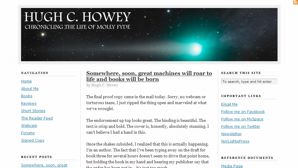
First off, we need to start with a huge congratulations! Hugh Howey, our next volunteer, is from North Carolina! That’s so freakin’ awesome! (I’m North Carolina born and raised 😀 ). Oh, and he also has his first book coming out in just a few weeks. I guess that’s important too. Hopefully Kathleen and I will be able to help you get your website ready for the influx of fans and media!
hugh1

Jordan’s comments

It’s time to promote the heck out of your book. Why not add a prominent purchase link to your sidebar? (Note: if you want to free up a little space in the sidebar, you could probably put the links to your pages across the top of your blog, just above or below the header image.) You could also sign up for Amazon Affiliates (yay $0.41—hey, sometimes that’s double the royalties you’d see from that book!). I’d also recommend adding a little summary or the back cover copy to your Books page to help entice us to buy.

Connecting with site visitors and readers

mazeThink about why your readers will be coming to your website. Will it be because they’re interested in your book and want to learn a little more before they buy? Will it be to learn more about the author? (You could probably help them out a little more there 😉 ). Will it be to learn more about your next book? Will it be because they’re reviewing your book for their blog or newspaper? What are they looking for? Help them to find it—and make their paths to their goals clear.
To make your blog posts a little more user friendly, you could make your posts more scannable. Few people sit and read online like they would read a book—but if we break up our text and highlight the main points, people can still “read” it and understand our points instead of glancing over the whole thing and reading nothing.

To do this, you can use bold, white space, headings, lists, block quotes, pictures (even stock images, such as from sxc.hu and Creative Commons–licensed ones from Flickr) and more. I see that you’ve done this in a few places, and that’s a great start. ProBlogger has a great post on making your content scannable that goes into more depth on the topic.

While you don’t have a dedicated contact page that I saw, having the contact info in the sidebar of each page might actually be enough. It’s high enough to be prominent—it displays on every page above the fold. I might suggest adding a link to subscribe to the blog there, too.

You have a newsletter! That’s excellent! I would recommend expanding the newsletter page so your potential subscribers know what they’re getting into—maybe archived issues?

Obviously you already have an active community around your site—you have forums, and they’re not just languishing in nothingness. Excellent. Now, how can you further involve these friends and neighbors? Can you make a badge for your book for them to carry on their blogs? Can you ask them to review your book? Get creative!

Search engine presence

hugh search resultsFor [Hugh Howey], your site ranks #1 and #2 on Google, and #1 and #3 on Yahoo. Awesome! Bing, as always, is evil. They have your Facebook profile first, followed by LinkedIn, Facebook again, Twitter, your publisher, two articles about another Hugh Howey, and your profile on Asimovs. So apparently they don’t just hate Blogger blogs.

For [Molly Fyde] (your character’s name, I take it?), however, only Google has your site in the top ten (and that’s at #10). MollyFyde.blogspot.com also appears in the top ten in Google (at #3)—I assume this is also your site. Is there a reason why you’re keeping both this blog and your blog at HughHowey.com? (I’m assuming you haven’t moved this content over to HughHowey.com, right?)

The rest of the top ten results are YouTube videos, posts on forums and social sites (which appear mostly to be yours; don’t worry, no one’s stealing your character), and pages from Amazon and your publisher. If you’re okay with those results, then it’s not a big deal. But if you want your site to place for those results, you might want to recruit more links to your site using the text [Molly Fyde]. See if those old forum and social network posts can link back to your website.

Since you’re on self-hosted WordPress, I have a few more specific guidelines to give, too. One thing to make your site a bit more attractive to search engines: use “pretty” permalinks. That way, instead of your About Me page being at http://www.hughhowey.com/?page_id=5/ , it would be at http://www.hughhowey.com/about-me/ (this can also be helpful to users if they’re looking at the URL).

BUT before you go changing anything, first you’ll need a plugin so you don’t break every link you’ve ever made. (That doesn’t always happen, but it can—and it would be less than fun.) I use Redirection by Urban Giraffe. Just install it and activate it, and then you can change the permalink structure in WordPress (it’s under Settings>Permalinks). You can set the exact structure that you like, but I suggest something with the post name ( %postname% ) in it.

Kathleen’s comments

Dear Hugh,

Nice nebula picture at the top! That, combined with the fact that I knew you were an author, instantly made me think sci-fi, so good! I’d also like to say that your writing voice is loud and strong on your blog posts. That’s fantastic.

I’m wondering, however, if a visitor who didn’t already know that you were an author would be able to figure that out. Your header text . . . “Chronicling the life of Molly Fyde” hints at that, but I’m wondering if you can make it a little stronger? Maybe add “in the science fiction world of ______” or something like that.

As it is right now, your website is dominated by a humorous story/sales pitch for a backpack. It’s well written, but it doesn’t tell us anything about your upcoming release. And when we click your “About Me” link, the text is slightly confusing. I mean, it says you want to be a science fiction writer, but it gives the impression that Molly Fyde is a real person. Is she? (I hope I’m not making an awful blunder by even asking. I’m not a sci-fi aficionada.) Your Books link doesn’t even portray that you’re an author, because many review sites and/d subject-matter sites have links called “Books.” Maybe change it to “My Books”?

globeFinally, what else can you do to bring your visitors into your world? Make your website a window into the world of your books. Draw them in, so they just can’t help wanting to know about the characters in your world. This might mean re-designing a new home page that focuses on your characters and your world, instead of your blog…that way, when you post reviews on other products and books, your visitor’s first impression is still on YOUR book, instead of someone else’s. Feature your book covers on your home page…maybe overlap that nebula image with a small photo of each of your books tilted on edge, so there’s an instant sales pitch in one glance. If not there, get those covers somewhere on the home page!
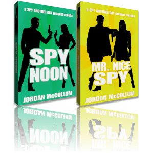
And what about your characters? Your blog description says it’s about “the life of Molly Fyde.” What is special about Molly Fyde’s life? How can you quickly and simply portray that, so your visitors are itching to get their hands on your book so they can read Molly’s story? Give us a chance to meet the most fascinating side of Molly, so she comes to life on our screens, and follow it up with a link to buy your books.

Have fun!

Kathleen MacIver / KatieDid Design

What do you think? How would you promote your published books? How would you invite your website visitors into your characters’ world?

Photo credit: globe—Sanja Gjenero