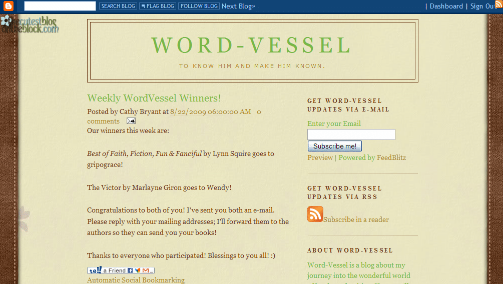
Today we have a great example of integrating social media from Cathy Bryant’s blog, WordVessel.blogspot.com. We’re also going to take a look at the ordering of her sidebar.

Jordan’s comments
Pages
I see you’ve contributed to a published book—congratulations! You could feature the purchase link a little higher in your sidebar, however—anywhere from the top to after the “About Me” section, depending on how prominent you want it to be.
You could also feature your current works a bit more, to let us see what genre you’re working in. You don’t have to put an excerpt up if you’re not comfortable with that, but some indication of what you’re working on, possibly in your about page or profile, can be helpful to help other authors connect with you, as well as other publishing professionals.
Your Blogger profile is good, and the about paragraph in your side bar is good. They’re personable, explain the purpose of your blog and who you are, and inject your personality into your blog. You could also create a post on your blog to give that information on your blog itself. (And then link to that page in the side bar or in a menu bar.)
You have your email on your Blogger profile, but you could have that on your website, too, either on an about page or a contact page. Again, these could be linked in a side bar or menu bar.
 Speaking of the side bar, you’ll note at right that I have the first thirteen screens of your blog here (with orange arrows highlighting the advice from me and Kathleen), and neither the content nor the sidebar is anywhere near the end. But it’s not until the eleventh page down that I found the purchase link for your book, and the ninth through twelfth that gave me the social media links. Even below that (not shown) is your search widget. With it that low, your visitors are going to need a search widget to find your search widget!
Think about what you have in your sidebar—and what, of that, is most useful to your visitors. It’s fine to have awards and accomplishments there—it’s a great place to display your “trophies.” But when you order the stuff in your sidebar, consider what will help your visitors find what they’re here for? What will keep them coming back (ie subscription links)? What do you want them to notice most (ie published works)?
Search engine presence
You are all over the search engines—woot! You have social profiles from Facebook, Amazon, ShoutLife, Shelfari, Gather, GoodReads, NaNo and more. It’s good that you’re networking and using all these social sites. Your blog is ranked #5 on Google for [Cathy Bryant], but not in the top 10 on Bing or Yahoo.
Also good news: your blog ranks #1 on Google, Yahoo and Bing (yes, Bing!) for [word vessel]. Yahoo and Google also have additional posts from your blog on the first page of results. This is great—but it’s important to remember that if people are looking for you professionally, they’re more likely to search for your name than your blog name.
You can try to get links back to your blog with your name, and you can try to add links (that search engines recognize—Facebook, for one, doesn’t use that kind of link) to your blog with the anchor text “Cathy Bryant’s blog, Word-Vessel.” If your social network profiles have blogs of their own, you can sometimes have them import your blog or excerpts from your blog posts. If you have links in your posts back to other posts on your blog, that can help to increase your blog’s overall authority. Higher authority = higher rankings.
There are two caveats with that practice however. One: search engines penalize content that’s just copied off another web page, pushing it down in the rankings—so if your social network profiles are already outranking your blog, you might end up with your blog posts on your social networks outranking your blog posts on your real blog (which is why you might want to do excerpts only). Two: be careful about the social networks’ terms of service. I stopped importing my blogs to Facebook because I didn’t like the ToS, which implied at the time that they could keep or even claim your content.
Social media
 |
 |
|
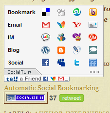
Mouse over—pops up lots of options for sharing |
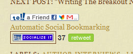
No mouse: small and unobtrusive |
You’ve done an excellent job of integrating social media into your blog! At the bottom of each post, you have various options for sharing your posts through social media from  Twitter (though it looks like the TweetMeme counts are off—all your posts link to the counter for a single specific post) to Facebook to email to blogging about it ourselves, with the above widget that appears easy to use. See how it doesn’t take up much room, but expands when you move your mouse over it to offer lots of options?
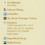
Also, you have links to your profiles on a host of social media sites in the sidebar, which allows users to share your content and connect with you. I might recommend moving this up a little bit, so it’s above the long archive list—a little more prominent, and more likely to be noticed.
It’s also good that you display your subscription options prominently above the fold, but you might be able to add a little bit here to explain more about what these are.
Kathleen’s comments
Cathy,
Hello! I love the look of your site. It’s cute and has character, which is always a good thing! Your “About Word-Vessel” paragraph is good, as well. It’s a short summary that explains the blog and welcomes people in a natural way, rather than in a here’s-a-list-of-things-I-want-you-to-check-out way.
However . . . those reasons for your blog really shouldn’t be necessary. They don’t hurt, because lots of people look for them. But you want them to look for that paragraph because they want to, not because they can’t figure out what your blog is about without it.
When I arrived at your blog, I noticed the background, and I noticed the nice clean look. I noticed that your sign-up widgets are in an excellent spot . . . but I didn’t know what content I would be signing up for!
I read your blog description, which told me that you are a fellow Christian, but it made me think that this is a ministry blog. But then I read the first paragraph of your current post, and it was about your writing. That’s why I went looking for the “About Word-Vessel” paragraph.
I’m thinking that your blog name and description is more a description of you, rather than of your blog. I’m wondering if you could find a variation of it that reflects the focus on writing that the blog actually has. I suppose “Word” could  reflect writing, but to me (and probably other Christians who would be interested in your blog), Word meant the Bible, which doesn’t have anything to do with your writing. You want both . . . both the Christianity that your blog definitely reflects, and the fact that YOU write fiction (or non-fiction, whichever). Another option would be to find/make/have made a header image that uses images to portray some of this. ie: a cross would tell people this is a Christian blog, a pen and paper would portray writing, a stack of books would portray books. You’d just want to make sure the image is as well-done and tasteful as your background image is. Otherwise you’re better off sticking with text.
Finally, for your blog (I’m not going to suggest this for everyone), I think it might help to move that “About Word-Vessel” paragraph up above the posts. It’s small, so it won’t shove your posts much farther down the page, but that would be a good place for that introduction. This way, when visitors arrive, they’ll see a nice clear blog title and description that instantly tells them that this is a Christian blog about books and writing. Those of us that are interested in those things will then be given a very brief paragraph with just a tad more detail. After that . . . the content! Your posts flow smoothly and are written well, so I think you’ll then be set to capture subscriptions from anyone who is interested!
God bless!
–Kathleen MacIver / KatieDid Design
What do you think? What kind of things are you looking for in a sidebar, as a visitor and as a blogger?
Photo credits: typofi
