Tag Archives: author website

Should authors blog?

I’ve asked this question for a long time, and over time, my answer has evolved.

Simon and Schuster is supposed to have told their authors that they must blog . . . in 2010. It’s been five years. Internet marketing isn’t on a different plane five years later—basically on a different planet now. I’ve been blogging since 2006. Two. Thousand. Six. Blogging’s simply not as effective as it used to be—not for getting traffic, not for bringing in search engine users, and especially not for sales.

However, you might still want to blog as an author. Why?

The advantages of a blog

A blog still gives you a chance to “own” or “host” the conversation with your fans—if you can get them there. They are already on Facebook, Twitter, Instagram, etc., but remember that the content you post and the fanbase you build there could go away in an instant.

A blog gives you a quick and easy website. You might not even use the blog functionality if you’re just using the pages, but it’s good to have the place to stick your latest news as well as the usual, static information you’d want on a website.

Along with that, a blog gives you a place to promote. It’s your homebase where people are less likely to be annoyed or feel like you’re getting in their face to sell to them (versus social media).

HUGE caveat

There is one HUGE caveat: if you are a nonfiction writer, you probably need to blog. It’s the cheapest and perhaps the fastest to way to start your platform, which is super important for publishing whether you’re going indie or traditional. This helps to build your authority and your writing.

Also, it’s way more likely that people will be searching for a nonfiction topic than for “clean spy romance,” so it can be more effective with search engines as well as social media—because which would you rather share: a post with an interview with a character/list of fun facts about an author/pretty pictures of a book’s setting OR an informative post on a topic you’re interested in and that helps you with your life?

The effectiveness of a blog

Have you EVER bought a novel because you read the author’s blog? I don’t mean, “I went to an author’s blog because I liked her other books and there discovered that she has another book out so I bought this book because I was already a fan.” I mean, “I discovered this author through her blog and have purchased novels (or fiction of any length) by her.”

[click through for poll]

I’m a nonfiction author, too, so I’ll keep blogging, mostly focused on that side. I’ll still have announcements about new releases and promotions on the fiction side, and I’ll be using the pages of my site just like any other author would—to highlight good reviews, to share deleted scenes and bonus features, to be the “center” of my promotions—but when it comes to blogging about your fiction? I just don’t see it making a difference to your search engine traffic or your sales. Your mileage may vary—and if it does, great! Come share your story!

Author websites vs. author blogs: the smackdown

This entry is part 1 of 8 in the series Marketing: blogging

Website, or blog? They’re not (exactly) the same thing—and which one is right for you?

A website vs. a blog

A blog is a chronological, topical Internet location with lots of regularly updated, fresh content. A website, on the other hand, is typically a static, topical location on the Internet with lots of “permanent,” evergreen content that might occasionally need updating.

An author’s website will have information about their books—where to buy, marketing materials, media kits—as well as the authors themselves. An author’s blog will have updates about something that interests them, and might interest you too (blogs that just focus on how awesome the author is or when the next book is coming out basically don’t count).

An author website is where you go to learn more about an author and his/her books. An author blog is where you go to get to know an author.

A website can integrate a blog as part of the site, or it can be a separate corollary, if you want to devote the time to running both. Some people will tell you a blog can’t also function as a website—but I completely disagree.

When is a blog not a website?

Obviously a blog is a type of website. (Duh.) Blogs do sometimes have a stigma of being less professional or cheaper than a website, and thus actually being harmful to an author’s (or any other professional’s) career.

But this really depends on the design of the site itself. I can point you to some really unprofessional websites that are not blogs, aren’t laid out like blogs, but that still do not give a favorable impression of the author of the site. Similarly, I can show you some very professional websites that are built on blog software.

When it comes down to it, it’s not the back end of the website that matters, or whether you spent $1000 or $10,000 on a fancy Flash design (which search engines can’t read anyway). What matters is presenting yourself professionally.

A website or a blog: which is right for you?

While it’s definitely not an either/or proposition, I think it’s important to make a conscious choice about whether you want to have an author website, or an author blog (or both. Or neither, but good luck with that one).

The pros and cons:

  Pros Cons
Website
  • Easy to maintain—almost “set it and forget it”
  • About the author and their books
  • May be a little more distant
Blog
  • Very easy to connect with readers on a personal level
  • About the author’s life/chosen topic
  • Requires regular updating (weekly)
  • Not all readers want a personal connection

Now: choose your own adventure. Are you ready for a blog or a website?

I’m ready for a blog

Great! The two best blog backbones out there are Blogger and WordPress. Blogger is probably more user-friendly out of the box than WordPress, and the free version of Blogger is more customize-able than the free version of WordPress. (Both pale in comparison to to the self-hosted version of WordPress, which is free, but you’ll have to pay for web hosting. My web host, BlueHost (aff) is about $7 a month, and they’ve been really good to me for the last five years.)

Both Blogger and WordPress feature posts and pages. The posts are the everyday updates, the timely news and the fresh content. The pages are for timeless content: About Me, Books, etc. (Note that there is a limit of 20 pages on Blogger, and in Blogger you can’t create subpages, or a hierarchy of the pages.)

I’m ready for a website

Great. Get a blog.

I’m not joking or being facetious: I think blog software is probably one of the easiest and most user-friendly ways to to establish a blog or a website. But instead of using the post feature for the majority of your content, you’ll rely heavily on the pages. At the risk of repeating myself, in most blog software, the posts are the everyday updates, the timely news and the fresh content. The pages are for timeless content: About Me, Books, etc.

Another advantage to using blog software is that, if you choose, you can add a blog later that’s already seamlessly integrated with your site.

I’m still overwhelmed!

Start small. Get a blog.

Okay, yes, I’ve been blogging for going on six years, so that doesn’t sound overwhelming to me: but you can cut your Internet presence teeth pretty easily with a blog.

The NUMBER ONE RULE

Be professional! Be professional! Be professional!

That doesn’t mean you have to write your site content or website posts like the entire Association of Authors’ Representatives is looking over your shoulder. It means making sure that your site’s overall appearance (and its content, too) show you’re serious about your writing (even if your writing isn’t exactly serious).

What do you think? Website or blog?

Photo credits: blog checklist—Owen W. Brown; blog microphone—Michael Sauers
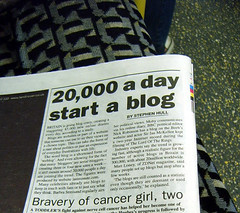
blog newspaper article—Annie Mole
The photos aren’t meant to be a subliminal message;
I just couldn’t find anything for the query “website.”

Seven Things An Author’s Website Must BE

This entry is part 4 of 4 in the series Marketing: Websites

This post originally ran on Romance University last year.

We all know we’re “supposed” to have a website if we’re pursuing a career in publishing—but we’re not all sure exactly what we’re supposed to do with it! Today, we’re adding seven more secrets of successful sites—what your website must be:

Findable
Bottom line: a website’s no good to you if no one can find it. Make sure your website doesn’t block search engines, or put up any barriers to them finding your site. Links to your site with your name as the anchor text (the text of the link) can help search engines to find and rank your site for your name.

If possible, YourName.com or YourPenName.com is the best address for your site. Lots of free hosting services (including Blogger) will let you redirect your site to YourName.com (some for a modest fee). If YourName.com is taken, try to get something as close to that as possible by using initials (especially if you’re using them in your credits) or an extra word such as “author,” “writer” or “books.” Note that hyphens, i.e. Your-Name.com, are used less often and can be harder to remember.

Useable
Visitors to your website should be able to navigate easily and find what they’re looking for. Use an easy-to-understand set up: generally, websites have navigation links horizontally below the header and/or on the right or left sidebar. Also, think carefully about what you call the various areas of your site. “About me” or “Biography” is a lot easier to find and understand than “Everything you ever needed to know” or “100 things.”

Shopable
Imagine you’ve just finished a book by a great new author and you head to her website to see if she has any others. Great, she has some listed—but how can you find them? She doesn’t say! Are they out of print? Do you have to order them through her? (How?) Should we resort to Amazon? Ooh . . . pretty books . . . what was that author’s name again? Ooh, sale!

Give your website visitors an easy way to get more of your books—give direct links to your books where they can buy them.

Shareable
If you want your visitors to tell their friends about your site, make it easy on them. Include links to email articles from your blog, or share them on Facebook and Twitter. But even more important than making it easy to share your site is making your site worth sharing. Give your visitors an experience they’ll want others to have, whether that’s laughing, loving or learning, and then give them a way to share that experience.

Professional (yeah, I ran out of ables)
This site is your business card, your TV commercial, your sales flyer and your public persona all rolled into one. Being professional doesn’t mean being stodgy, but it does mean putting your best foot forward in attitude and appearance. Match your design and your writing style on your site to your chosen genre. You can be funny (even irreverent!)—and you should be if you’re writing humorous books—and still be professional.

(The same rule goes for your interactions all over the Internet!)

Informative
One of my pet peeves is visiting “thin” sites: sites with almost no content or information. You don’t have to be the next Wikipedia, but you should have enough information to draw visitors into your site, let them know who you are, maybe even let them see what you’re working on. One of my friends had an editor approach her about her book from what the editor read on her website. If you have your first pages or chapter polished for a contest or querying, I think it’s a good idea to make them available on your site as well. And don’t forget your About page—let us get to know you!

Fun!
A fun site doesn’t necessarily mean you need to hire somebody to create a bunch of animated games tangentially related to your works. A “fun” author’s site should include bonuses. It could be games or contests, or it could be something as simple as deleted scenes from a published book. If you’re lucky enough to have a group of dedicated fans, help them to interact and build a community (and don’t forget to participate!).

Conclusion
Whether you’re preparing to query or publishing your pentology, your author website can work for you and for your visitors. By making sure your site is findable, useable, shopable, shareable, professional, informative and fun, you’ll create an experience your website visitors will want to repeat, whether they’re agents, editors or readers.

What do you think? What else do you look for in an author’s website, and what are you striving to do with yours?

Photo credits: frustrated—Sybren A. Stüvel; asleep at computer—Aaron Jacobs; loving your site—Chris Champion

Five more things an author’s website must do

This entry is part 3 of 4 in the series Marketing: Websites

Continuing with some good advice from years past, part two of the post from last week!

Last week, we started to look at four things an aspiring author’s website must do. We looked at the “get ready” and “get set” phases—gearing up for submitting your work for publication. This week, we have a few things that all authors—aspiring or not—should be doing with their websites, as well as just a little advice for soon-to-be published authors. There are volumes more to say on what an author’s website should do and have and be, but we’ll stick to these few today.

The 1-2-3 phase: attract interest for your book

After your book has been accepted for publication, your website is an even more powerful tool. If you’re still solely on a blog on a free domain (i.e., ilurvewritin.blogspot.com), it’s time to buy your own domain, preferably YOURNAME.com. And along with a new domain, this is a good time to upgrade to a “real” website—keeping your blog, of course, but also hosting a stable website—or at least a blog with a full complement of pages. Ideally, the blog and the website design will be integrated seamless.

In this phase, it’s time to focus on that book to attract as much prelaunch interest as you can.

How can you do this? There are a few things you’ll want on your site before the book launches to help drum up interest:

  • An awesome, engaging description of the book
  • The cover (so people will recognize it in a bookstore)
  • An excerpt, preferably from that incredibly intriguing beginning (with permission from your publisher)
  • A link to your book on Amazon—hello, pre-order! (Also, you can use an affiliate link [how to sign up as an Amazon affiliate] to make a few extra pennies off any sales).
  • Your book trailer, if you’re doing one.
  • Anything else that will make people want to run to the bookstore on launch day!
  • Send author friends (especially ones with newsletters) a short paragraph about your book, with links.

You can also look at the terms people are advertising and searching on in search engines, to see if any of those people might be interested in your site—then use those terms (“keywords”) on your site, in page titles and content, in natural language. (You’re a writer, right? So write!)

The Go! phase: sell your book

As with the 1-2-3 phase, your website can be a major vehicle for selling your book (and your backlist, if you have one). Candace E. Salima gave a great presentation on this subject at a conference I attended in April.

How can I do this? Well, along with the above ideas, it’s also a good idea to spread the word on other websites through advertisements, reviews, releases, contests, and other publicity.

But that’s not on your website. On your website, always, always, ALWAYS have a purchase link. Have “bonus features” to your books on the website—recipes, play lists, deleted scenes—anything you think will interest your readers.

Also, make your website somewhere that people will want to come back to—do something for them, reach out to them (see building a community), be accessible. Even if they’ve already bought your book, they’re still your customers, your readers, your fans, and striving to build a relationship with them (individually and collectively) can help sustain you, both emotionally and financially.

Always: sell YOU

Your website is also a great way to sell you—and I don’t mean prostitution. I mean building a brand that will lead to agents, editors, fans, loyal readers, subscribers, fame* and glory* (*results not typical). If you have something to say, some kind of message, that’s part of your brand. If you write in a specific genre, that’s part of your brand.

How can I do this? Make your site professional and consistent—use the same layout, color scheme, graphics, etc. on each page. If you have a theme running in your published books (especially their covers or color schemes), go with it on your website.

On your site (perhaps the about page), talk about what draws you to your genre or your message. Encourage your visitors to share their stories of why they’re interested in the same topics.

Also, talk about or at least hint at future projects to keep your readers—your potential customers—interested. If it’s feasible, think about running a regular newsletter (monthly, bimonthly, quarterly). You can keep your most loyal, interested fans updated on your progress, offer special contests, and interact with them.

Have photographs of yourself (for visitors and high quality ones for media contacts). Feature other peoples’ interviews with you (or interview yourself). Allow people to get to know you (somewhat—we all need our privacy, and we don’t all need to know if you’re wearing clean underwear right now!). This goes hand in hand with the next point, something you should always strive for with your author website:

Always: build a community

A community based around a blog, forum or website means that people feel welcome. People can participate and interact with you. People come back.

How can I do this? Building a community around your blog or website can be as simple as encouraging discussion, responding to comments and writing on requested topics. Whatever you do with your website, interact with your visitors. Even if you don’t have a blog, you can interact with your website visitors—host a forum or weekly chats to connect personally with them. Use your email newsletter to appeal to them.

Always: build your platform

If you’re lucky enough to have a unique selling proposition just by virtue of who you are and/or what you do, bank on that. If you’re a computer engineer writing about high-tech computer hacking, tout those qualifications on your site. Once you’re published, you can also use that platform to launch yourself into public speaking opportunities on related topics—building your brand and your platform in the real world.

How can I do that? Feature your qualifications on your about page—maybe even write a “sub” page to your about page, just devoted to that. Include it in your FAQ (if you have one). Create an FAQ around that industry. List your speaking engagements on related topics, and make it clear you’re available for such gigs. (What would you speak on? Something related to your platform and your writing or research—if you’re writing fiction on high-tech computer hacking, you could speak about how to protect yourself from hackers, for example.)

Always remember: your website will be the major way you’ll interact with most of your readers and potential business associates. Use it wisely!

Next week, we’ll take a look at an easy way to set up a website!

What do you think? How else could you do these things on your website? What else should an author’s website do?

Photo credits: excited reader—Chris Johnson; bookseller—Herman Brinkman; bricklayer—Jovike

Four things an aspiring author’s website must do

This entry is part 2 of 4 in the series Marketing: Websites

Continuing with our series, a repeat of another post from three years ago, part 1 of 2!

We’ve covered the seven things an aspiring author’s website must have. But in addition to having convenient features and good appearance, an aspiring author’s website must do certain things to fulfill its purpose, depending on what phase your career is in.

(Side note: I have a blog where I talk a lot about blogging, I reference some posts on my other blog here.)

The get ready phase: networking with other writers

When you’re in the “get ready” phase, you’re actively writing and seeking out other writers, but at present you’re not ready to submit to agents or editors. Since your career is just starting out, your website may just be starting out, too, though it won’t hurt if you already have a fairly well-developed site.

Before you’re ready for publication, your website can help you find critique partners, talk with other writers about writing, explore your genre with other writers, and make the connections that help smooth the path for your career—or at least make a solitary profession a lot less lonely. This is your time to start building a community of writers.

How can I do this? The easiest way to make your website into a networking tool is to make sure there are plenty of ways other writers can connect with you—and often the easiest way to do that is through engaging blog content and comments.

The get ready phase: find your niche

While you’re preparing for publication, it’s also a good time to get your web presence ready—especially to find the niche where you’ll fit in the blogging and publishing (and publogging?) worlds.

How do I do this? To find your blog/site niche, ask yourself why you’re blogging and what you’ll be blogging about. It needs to be more than just blogging about your book and your career—and at some point, it will probably need to transition to be more than just appealing to other writers, too.

This is almost like a market analysis—using a search engine, look for other sites of authors with similar books/niches. See what they’re blogging about (if anything). See what angle you can add to the discussion, especially if it relates to your books. If you can use your website to show how you and your books will fit on a bookshelf, your site is ready for the next phase.

The get set phase: show you’re professional and marketable

In the “get set” phase, you’re in the process of searching for an agent or editor. (You may also fall in the “get set” phase if you have an agent who’s currently shopping your manuscript.) In this phase, one of your big goals will be to show your target audience (agents and editors) that you’re serious about your writing and your career.

How can I do this? Professional appearance—check out advice from professional website designer Kathleen MacIver of KatieDid Design in the free PDF guide to aspiring author websites.

Also important in professional appearance is the “demeanor” on your website. It’s fine to use casual, laid back text and images—but a website for your career might not be the best place to air out your dirty socks (or any of the rest of your dirty laundry!). Also, be sure to read over (and have others read over) your site for typos, misused words, broken links and images, or anything else that would detract from your appearance.

In this phase, you can still rely heavily on a blog, but it’s a good idea to at least set up a few pages (about, contact, works) with links in the sidebar or create a menu bar to help visitors learn more about you and your writing, and navigate your site.

The get set phase: show off your storytelling

Also in the “get set” phase, and more important in the long run, your website is a place to show off your storytelling abilities. In the end, that’s what’s going to get you an agent, get you sold to a publishing company, and get you sold on the bookshelves.

How can I do this? Showing off your storytelling doesn’t mean that every page and every blog post has to be written as if it were flash fiction. (Unless you want to . . . but that’d probably be weird.) It does mean making sure that you have at least an excerpt of your writing on your site—especially if you’re submitting to agents that don’t ask for or allow sample pages with their queries.

However, do not use your website as the only medium an agent can see your query or sample pages, especially not if they ask for any writing from you. An agent or editor will expect you to email them words (either in the body of the email or as an attachment)—not a link to their website. Never make an agent do more work for your writing when they’re interested. Odds are good that they won’t follow links.

(Side note: if you’re sitting there thinking, “But it’s just one click. Why can’t they do that?”, stop. It’s not just one click. It’s one click per person per item submitted. It’s dozens of clicks per day, minimum, if agents/editors are even interested enough to click on the link anyway. Also some email programs also strip out links.)

What do you think? What must an aspiring author’s website do? What does your website do—and what do you want it to do?

Photo credits: bookshelf by Josh; handshake by ThinkPanama; Click by Jordan McCollum

The Top 7 Things Every Aspiring Author’s Website Must Have

This entry is part 1 of 4 in the series Marketing: Websites

We are moving on to marketing tactics! We’ll start off by talking about author websites. This post originally appeared as a guest post on Nathan Bransford‘s blog as part of his first-ever guest post contest in July 2009. I’ve refined it a little bit.

Once upon a time, my day job involved learning how to get the most out of your website—and how to make your website work for your visitors. So from the perspective of Internet marketing, here are the top seven things every aspiring author’s website should have.

7. A blog. All right, all right. I’m a little partial to blogs, but not everyone likes blogs or is good at blogging. And that’s okay. If you want to call it an “announcements” section, or call it your “articles,” that’s fine. But do have at least one section of your site where you can post your news—anything from finishing your latest work in progress to selling a short story. This is also a great place to start gathering a following, especially if you like to connect with other people, share your research and discuss the process of writing.

Free advice: If you already have a blog, you can integrate it with your website. Check out Blogger’s Custom Domain feature and host it at http://blog.YOURWEBSITE.com to make sure everyone linking to you is pointing those links to your domain.

6. Social media. This doesn’t mean you need to run out and join every social networking site you’ve never heard of. But it’s always a good idea to give your website visitors potential ways to connect with you. So if you’re already on MySpace, Facebook or Twitter, or any other large social network, list those somewhere on your site—somewhere easy to find.

5. Search engine presence. Unless your name is John Doe or Mary Smith, it should be fairly easy to find your website by searching for your name in the major search engines (Google, Yahoo and Bing). One good way to start with this is to buy YourName.com. If YourName.com (and YourName.net and YourName.org) is taken, experiment with middle initials, maiden names, hyphens, etc. Still nothing? Maybe you should consider a pen name that would be easier for your readers to remember, too.
Free advice: If you have some competition for your name in search results, put in a little extra legwork to find places to get links back to your site, especially from related sites—guest blogging, article writing, etc. I mean, we are writers here, aren’t we?

4. Professional design. For real. This doesn’t mean you need to run out and hire a $10,000 website designer, or that your website has to look as awesome as J.K. Rowling’s. You don’t have to dress like a fashion model to pitch to an agent at a conference.

At the same time, you’re not going to wear your ratty jeans and torn up tank top to a business meeting. Just like your nice pleated khakis, your website needs to look professional: clean, polished, easy to read (spell checked!), easy to navigate. Make it easy for your visitors to find the important stuff on your website (see #1, 2, 3, and 7, at least).

3. An about page. Most of us have an urge to list our friends, spouses, pets, children, favorite television shows, other hobbies, and small collectibles in our query letter. Hopefully, if you’re reading Nathan’s blog, you’ll forbear and omit this paragraph from your query. But your website about page is exactly where you should put all that information. After all, if someone visiting your website wants to know more about you, why not tell them?

2. Your work. No, you probably shouldn’t slap your whole manuscript on your website. But you should at least have a short summary of your work on your site. You might also consider a short excerpt—a chapter or less—in addition to your extremely engaging summary. After all, if your work is ready to query, it’s ready to show, isn’t it? This is also a good place to put your writing credentials (if not under #3 already).

telephone1. A contact page. You’d be amazed how often both aspiring and published authors forget (or don’t want) to give their website visitors a way to contact them. Now, odds are low that a literary agent, editor or publisher is going to use your contact page to send you a desperate “Please, please, work with me! Your brilliance makes me cower in inferiority, but I cannot bear the thought of anyone else tainting your work!” note—but there’s always the possibility.

Free advice: Use a simple web form instead of listing your email address to avoid spam email harvesters.

What do you think? What else should an aspiring author have on his/her website?

Photo credits: Microphone—RAWKUS; binoculars—Joël Dietlé; telephone—Maria Li

The collected wisdom of website design

I used to do website critiques fairly regularly, and fantastic web designer Kathleen MacIver gave wonderful in-depth critiques to our participants. We’ve fallen out of touch (but Kathleen, if you’re reading this, I’d love to change that!), but a lot of her wisdom from previous critiques is just as applicable to our victims volunteers from this round!

On defining your site through blog goals:

Is [your blog] primarily for you, as a method of self-expression? If so, then who cares what it looks like!

The fact that you asked for this review, however, makes me think that you ARE hoping this blog achieves something. It doesn’t appear that you’re trying to promote your own writing, since a skim down through the posts showed me nothing along those lines. Are you trying to build a small community? Just meet people online? Right now this blog is a pretty clear reflection of you, as a person, and your love of words. It’s not a reflection of your stories or books or poems, or of a particular genre. Do you want it to be?

I’m not really sure what to suggest, since I don’t know what that goal is. But think about it. This is where every website should start . . . with a careful assessment of what the goal of the website (or blog) is, what you hope it will achieve, and who you hope to reach with it. Everything else needs to follow that.

On matching your design to your theme, and the purpose of design:

A website made from a basic, generic template (99% of the time) is like finding a hardcover book that’s missing its dust jacket (the old kind that had nothing more than a solid color and gold lettering on the edge). There’s nothing to turn you off to the book/site, but you really had to have a compelling reason from somewhere else in the universe to open up that book and start reading, because the book cover itself is offering you nothing.

You do have that little paragraph that explains a little. Now you need to find a design that is the visual interpretation of your concept. . . .

Basic layouts for blogs are often best, since people are there to read content (once they know they’re interested, of course).

So all-in-all . . . you don’t have anything wrong here, but you haven’t really taken any steps toward the two main goals of a website’s design, which are:

  1. Instantly portray what your website is about, and what the visitor will receive if they hang around. (In your case, interesting information that they’re not likely to find anywhere else on the Internet, since the number of brain scientists blogging about writing has got to be extremely small)
  2. Make the site stick in their mind, thereby upping their chances of wanting to come back, coming back, and remembering why they bookmarked it when they do come back.

And this one is actually from me, on the purpose of a website:

Also, make your website somewhere that people will want to come back to—do something for them, reach out to them (see building a community), be accessible. Even if they’ve already bought your book, they’re still your customers, your readers, your fans, and striving to build a relationship with them (individually and collectively) can help sustain you, both emotionally and financially. . . .

Always remember: your website will be the major way you’ll interact with most of your readers and potential business associates. Use it wisely!

free website guideI’d forgotten how much good advice has already passed through here, and I know many readers weren’t here two years ago when we were doing these. Luckily, I’ve already collected the generally-applicable advice from several of the critiques and put them together into a handy, free PDF: a Guide to Aspiring Author Websites!

What do you think? What did you take away from these critiques that will help with your site?

Photo credits: heart in a book—Piotr Bizior; book without cover—Marcos Ojeda

Avoiding burnout (and website critiques!)

So I set a goal to finish my revisions by May 25th.

Ha. Hahaaha. HA!

I set the goal because I was having a hard time getting motivated. But in this case, a deadline just made my problem worse. I wasn’t having a hard time focusing and working because I was lazy or distracted. I was shirking because I was on the verge of burning out.

Burn out, for me, happens when I push myself too hard just for the sake of being done. I find myself completely blocked. If I do may any progress at all, it’s just throwing something on the page so I can move on and be done with it, often not really improving the problems (or simply noting them and moving on).

I can work quickly, especially when I’m really excited about a story. But if I’m not excited about the story at the moment (or just overwhelmed by it), I need to allow myself to slow down. So I am. I might flirt with a story I shouldn’t be writing if something strikes me. I might just work on my crafts or play the piano, or explore another creative outlet.

But I still have good news for you: I’m going to do some website/blog critiques! Sign up in the comments before noon EST on Friday, and I’ll randomly draw three sites to critique. Website designer Ted Finch will also be on hand to critique the visual aspects of the lucky websites!

Don’t have a blog or website yet? Don’t worry! I’m also looking for one volunteer who doesn’t have a website or blog. We’ll be working together to get you set up, with the results posted as a tutorial! Again, this will be chosen at random from the comments left here before noon EST Friday.

The lucky winners will be announced on Friday. The critiques and tutorial will be posted starting June 6.

How do you avoid burnout? (Or just volunteer in the comments 😉 )

Photo by Patricia Espedal