Tag Archives: website review

The collected wisdom of website design

I used to do website critiques fairly regularly, and fantastic web designer Kathleen MacIver gave wonderful in-depth critiques to our participants. We’ve fallen out of touch (but Kathleen, if you’re reading this, I’d love to change that!), but a lot of her wisdom from previous critiques is just as applicable to our victims volunteers from this round!

On defining your site through blog goals:

Is [your blog] primarily for you, as a method of self-expression? If so, then who cares what it looks like!

The fact that you asked for this review, however, makes me think that you ARE hoping this blog achieves something. It doesn’t appear that you’re trying to promote your own writing, since a skim down through the posts showed me nothing along those lines. Are you trying to build a small community? Just meet people online? Right now this blog is a pretty clear reflection of you, as a person, and your love of words. It’s not a reflection of your stories or books or poems, or of a particular genre. Do you want it to be?

I’m not really sure what to suggest, since I don’t know what that goal is. But think about it. This is where every website should start . . . with a careful assessment of what the goal of the website (or blog) is, what you hope it will achieve, and who you hope to reach with it. Everything else needs to follow that.

On matching your design to your theme, and the purpose of design:

A website made from a basic, generic template (99% of the time) is like finding a hardcover book that’s missing its dust jacket (the old kind that had nothing more than a solid color and gold lettering on the edge). There’s nothing to turn you off to the book/site, but you really had to have a compelling reason from somewhere else in the universe to open up that book and start reading, because the book cover itself is offering you nothing.

You do have that little paragraph that explains a little. Now you need to find a design that is the visual interpretation of your concept. . . .

Basic layouts for blogs are often best, since people are there to read content (once they know they’re interested, of course).

So all-in-all . . . you don’t have anything wrong here, but you haven’t really taken any steps toward the two main goals of a website’s design, which are:

  1. Instantly portray what your website is about, and what the visitor will receive if they hang around. (In your case, interesting information that they’re not likely to find anywhere else on the Internet, since the number of brain scientists blogging about writing has got to be extremely small)
  2. Make the site stick in their mind, thereby upping their chances of wanting to come back, coming back, and remembering why they bookmarked it when they do come back.

And this one is actually from me, on the purpose of a website:

Also, make your website somewhere that people will want to come back to—do something for them, reach out to them (see building a community), be accessible. Even if they’ve already bought your book, they’re still your customers, your readers, your fans, and striving to build a relationship with them (individually and collectively) can help sustain you, both emotionally and financially. . . .

Always remember: your website will be the major way you’ll interact with most of your readers and potential business associates. Use it wisely!

free website guideI’d forgotten how much good advice has already passed through here, and I know many readers weren’t here two years ago when we were doing these. Luckily, I’ve already collected the generally-applicable advice from several of the critiques and put them together into a handy, free PDF: a Guide to Aspiring Author Websites!

What do you think? What did you take away from these critiques that will help with your site?

Photo credits: heart in a book—Piotr Bizior; book without cover—Marcos Ojeda

Website critique: Ronda Hinrichsen (RondaHinrichsen.com): help from search engines

The last of our site critiques is for Ronda Gibb Hinrichsen, author of Missing and Trapped. Hi, Ronda!

Content and navigation
The site layout is simple and easy-to-use. There’s a hint of mystery in the mist around the trees, which relates back to your theme.

Your bio is informative, but it could also be fun! If people are coming to your site, they want to know more about you, so you can write a heck of a lot more than you might on a bio in a book. The trivia in the sidebar is a good start, as is the FAQ (though questions about the individual books could be on the book pages). You could also mention your family.

I think I’ve made it clear how I feel about contact info buried at the bottom of the about page! On the other hand, I don’t mind putting your awards on the About page, and I think it’s fantastic that you’re using a link and anchor to jump down to them.

You have separate pages for each of your books. This is okay right now, but as you write more books, will your website be able to grow with that? I’d suggest keeping pages for your individual books to 1-2: One page for all your books, with possible the second page for your most recent release. I’m assuming GoDaddy gives you five pages for your site, so this would free up a separate page for your Events, which might be more useful than the FAQ, for example.

I like that you have the covers of your books prominently displayed on the home page and each of their pages—along with purchase links! Always a good idea!

However, each tab on your navigation opens in a separate page. After reading the home page, I clicked on the about page, etc. After reading through each page of your site, I realized it had opened each page in a separate tab:

I’m hoping there’s a check box or something you can check somewhere to change this setting. Otherwise, you’ll want to take target=”_blank” out of each link on each page.

I love the background color on your site, but light text on a dark background is harder for people to read. Maybe you could find a way to add a lighter background behind the content area of your pages and switch to darker text (maybe even matching your background!).

Search engine presence:
I have some great news for you: I misspelled your name when I Googled you, and Google corrected me:


Google knows you!

And you totally dominate Google for your name. The first three results are your site, and it also lists your Facebook, blog, Twitter, your book on Amazon as well as some reviews.

I was very confused to see your site listed twice in the results, until I realized one was RondaHinrichsen.com and the other is RondaGibbHinrichsen.com. I worry that this might be confusing for readers, too, when they visit the Gibb version, which happens to be a blog. They wouldn’t realize this isn’t your site, only your blog—I definitely think you should include a prominent link to your full site on the Gibb version.

Bing, which serves results for Yahoo as well, knows you well enough to make your name a suggestion:

Bing’s results aren’t quite as impressive as Google’s. They include the “plain” and “Gibb” sites, and one page inside your site. The results also include Facebook, LinkedIn, Goodreads and a couple more personal sites: MyLife and Manta, which lists your address, phone number and income. (You might want to see about having that removed from Manta!) The last results include reviews.

Probably the best thing about Google and Bing knowing you is that it helps to eliminate (or at least minimize) the need to optimize for misspellings of your name.

Thanks for volunteering, Ronda!

What do you think? How else can Ronda get the most out of her website?

Website review: Sierra Gardner (sgardn.blogspot.com)–highlighting blog content

All right! A little behind schedule, we’re digging into the website reviews. Ted will get to the visual side of the reviews ASAP, but I want to get these reviews up even sooner than possible (ESTP?). And we’re starting with one of my fellow crusaders, Sierra Gardner!

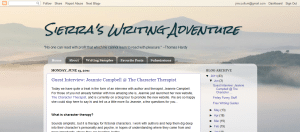
Hi, Sierra! Since I’ve subscribed to your blog for almost four months now, I’m familiar with some of your great content already. Highlighting that content can be a challenge for all bloggers, but I can see you’re working very hard to do just that. We’ll also look at your future marketing efforts, since you’re not pursuing an agent or a book deal yet.

Content and navigation
I’m always happy to find an About page quickly and easily on a new blog. Your bio is cute and personable. You might consider using the sidebar widget version of “About Me” in addition to the page, so we get some idea of the face behind the blog without having to dig deeper.

Also, you might consider breaking contact me into a separate page. If I came to your blog to contact you, I might not think to look on the about page for that info—and if I did, I’d still have to scroll down to find it.

You’re working hard to highlight several types of content on your blog, and that’s great. You’ve got a page that lists writing samples you’ve shared as well as one for your favorite posts. Both of these are great ideas. You might be able to make these pages work even harder for you by sharing a short summary or synopsis of the post or sample to encourage clickthroughs. On your writing samples page, at the very least an indicator of the genre could help entice readers to click. The favorite posts page might also benefit from a sentence or two of description to hook your readers.

The Submissions page is a little bit confusing, especially on a writing blog since we’re used to seeing submissions on only agent and publisher sites. While the name is appropriate, a title like maybe Guest Posts & Questions might help, too. If you have any examples of either type of submissions, maybe list & link to them underneath.

You might also consider moving the followers widget higher to highlight that feature of your site and encourage people to follow your blog. Generally, the archive isn’t the best thing to have first in your sidebar—it doesn’t ask your readers to engage or take further action as effectively as subscribe buttons, a Followers widget, social media buttons or even your bio. Show your readers how to

Search engine visibility
On Google, your blog comes up third for your name. Your LinkedIn profile is fourth. There are a couple Facebook profiles, but they’re not yours. In Bing/Yahoo, your LinkedIn is first, but your blog doesn’t show up in the top 10 results—although your Blogger User Profile does. When you’re ready to begin the agent search, be sure to include your name prominently on your site, and get links using your name as the link back at your site (such as from guest posts). If possible, it might be good to move your blog to sierragardner.blogspot.com (or better yet use Blogger’s Custom Domain feature to put it at sierragardner.com, sierragardnerauthor.com or blog.sierragardnerauthor.com).

Optimizing for your name does post some challenges. There are a lot of people out there named Sierra Gardner or Sierra Gardener, and there’s even some competition from the Riverside, CA, community of Sierra Gardens. However, it doesn’t look like anyone is actively trying to rank in search engines for your name, so a little bit of effort could pay off quickly and well.

I’m sure you come across this pretty often, but it might be difficult for readers to remember how to spell your name. (NO, I’ve never had that problem. Sigh.) You might think about also optimizing for Sierra Gardener so your site ranks high when people search for your name spelled incorrectly.

Sierra, thanks for sharing your site with us and good luck in all your writing and blogging efforts!

What do you think? How can you highlight the content in your blog better?

Avoiding burnout (and website critiques!)

So I set a goal to finish my revisions by May 25th.

Ha. Hahaaha. HA!

I set the goal because I was having a hard time getting motivated. But in this case, a deadline just made my problem worse. I wasn’t having a hard time focusing and working because I was lazy or distracted. I was shirking because I was on the verge of burning out.

Burn out, for me, happens when I push myself too hard just for the sake of being done. I find myself completely blocked. If I do may any progress at all, it’s just throwing something on the page so I can move on and be done with it, often not really improving the problems (or simply noting them and moving on).

I can work quickly, especially when I’m really excited about a story. But if I’m not excited about the story at the moment (or just overwhelmed by it), I need to allow myself to slow down. So I am. I might flirt with a story I shouldn’t be writing if something strikes me. I might just work on my crafts or play the piano, or explore another creative outlet.

But I still have good news for you: I’m going to do some website/blog critiques! Sign up in the comments before noon EST on Friday, and I’ll randomly draw three sites to critique. Website designer Ted Finch will also be on hand to critique the visual aspects of the lucky websites!

Don’t have a blog or website yet? Don’t worry! I’m also looking for one volunteer who doesn’t have a website or blog. We’ll be working together to get you set up, with the results posted as a tutorial! Again, this will be chosen at random from the comments left here before noon EST Friday.

The lucky winners will be announced on Friday. The critiques and tutorial will be posted starting June 6.

How do you avoid burnout? (Or just volunteer in the comments 😉 )

Photo by Patricia Espedal

Authors Websites Critiqued

In case you missed it, Monday I did a guest post at Romance University about seven things an author’s website must be. I drew three lucky websites from the comments that day and today RU has posted my critiques on their content, navigation, networking, promotion, design, and search engine presence.

There is a lot of information over there, including quick tips on what to put on your site, how to increase our search engine rankings, and how to promote (or prepare to promote) your books on your site. Check it out!
free website guide
I used to do author website critiques here from time to time, and it’s been almost a year and a half since our last round. And because I seem to need a little extra motivation these days, I’ll do it as a challenge to myself: if I finish my rewrites by May 25, we’ll do a quick series of (aspiring) author website critiques here!

In the meantime, check out my series on aspiring author websites (also available in PDF)!

A little about me
I do actually know what I’m talking about. I worked in Internet marketing for five years, specializing in organic search engine marketing and industry news. Until I left to have baby #3, I was the editor of the prominent Internet marketing news blog Marketing Pilgrim, one of Advertising Age’s Top 10 Internet Marketing Blogs. I’ve spoken at (and otherwise attended) several industry conferences and might even be called an “expert.” But I’m way too modest for that 😉 .

What do you think? What kind of feedback would you want on your website?

Website review: Cindy R. Williams

We’re on our last review today, from published author Cindy R. Williams.

cindy

Kathleen’s comments

Dear Cindy,

I like your “author, harpist, and dreamer” catchphrase. Even though harpist and dreamer don’t necessarily have to do with writing, together they evoke an image of who you are . . . and that is a good thing.

Your overall site design, menu links, and graphics don’t necessarily portray your books, but they’re still nice. And since you’re probably not courting the attentions of children on the Internet, what you have is probably sufficient.

What I’d recommend working on, however, is your text colors and font choices. Right now you have many color changes and a number of font changes, and each one is harder and harder on the eyes. With very few exceptions, black, dark gray, or a color so dark it may as well be black are the color choices for text. Why? Because you want people to notice the pictures your words portray, not the actual letters themselves. To be perfectly honest, multi-colored text is generally considered a hallmark of an amateur website.

The good news is that it’s easy to fix! Change your text on the home page to a black or very, very dark gray (like #333333). Take out the color change code first, before you change all the rest. That way you’re not just adding one color change on top of another. If you have headings, you may choose a bright color for them . . . just use the same color for ALL headings throughout the site, and make sure it’s a color that is easy to read. Use your home page text to focus on your book.

On your books page, use a nice font and color for the titles of your books, if you wish, but use the same dark color and simple font for the rest of the text. Try to keep your text all left-justified as well.

On your news page, it would be okay to use different colors for different sections of news. I would limit it to only two alternating colors, though.

Do similar color simplification throughout the site, and you’ll have a much easier to read and more professional-looking site to enjoy!

God bless!

Kathleen MacIver, KatieDid Design

Jordan’s comments

Hi Cindy!

Let’s start off with some of the things you’re doing really well: you have your book prominently placed on your site with several options for purchasing. You’re obviously working hard to promote your book and further your career with many appearances. And your site is pretty 😉 .

But of course, there are also a few things you could do to help your site work harder for you. On several pages of your site, I have a hard time understanding what I should be focusing on. I see so many different types of news that I can’t focus on any one thing.

Now, I realize some pages can be kind of a catch-all, but organization can help to guide your website visitors and show them what’s most important. Pretend you’re a first time visitor to your site (I know it’s hard) and look at your site. What do you want to see on the News/Books/Contact page? What is most helpful to you in learning about the book and the author? What might help move you toward buying Chase McKay (or your next book)?

Here’s an example. As a first time visitor, I come to your main page. On my desktop (as shown above), the full title of your book isn’t visible. (On my laptop, it cuts off in the middle of the next line.) If I’m interested enough to scroll down, I wonder what the Arizona Glyph Award is. I see a lot of information about appearances, conferences, a bunch of different options to buy. I see your Thundertail book mentioned as a novel, but without reading the full history of its development, I don’t know what level it’s geared to. Then some more awards, a mention of interviews with you, and a lot of blank space at the end of the page.

Now what do I do? Unless I came to your site with a specific mission, I don’t know. Help us know how to use your site, and what your site can do for us as visitors. (As another example, it would be good on the Contact page to start with the contact form rather than your mailing address—it’s highly likely that people will see just a mailing address and give up without scrolling to the end of the page to find an online way to contact you.)

Your search engine presence (searching for [Cindy R. Williams]) isn’t bad, especially considering you’re facing some pretty serious competition from this Cindy Williams. (She’s Cindy Williams, but Shirley of Laverne & Shirley has at least a little bit of info about her on the web.)

Actually, for [Cindy Williams], Yahoo has your site ranked at #7. (Bing and Google don’t have you in their top ten.) For [Cindy R. Williams], your site is #1 on all three major search engines. However, for some odd reason, Bing lists your Privacy Policy and Copyright pages only. Google lists your site and several mentions of you and your book from around the web. Most of Yahoo’s results are about you, but the actress does still get quite a bit of attention.

So what can you do there? Keep doing what you’re doing—get mentions of your book and your blog around the web, and get more links back to your website.

You’re clearly working hard to promote your books online and off. A few simple changes can help your website work even harder for you.

We hope that helps!

What do you think? What do you expect to see on an author’s home page? Books page? News page? What layouts on those pages help you process that information well?

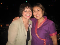
Photo credit: Cindy Williams—Roberta Romero

Website review for Deb Salisbury

Today’s website review is for long-time reader Deb Salisbury. She followed the first series of website reviews with interest, and it shows!

deb

Kathleen’s comments

Dear Deb,

Your site is a nice, clean basic writer’s website. You’ve organized your information clearly and offered your visitors a little glimpse into three stories. Nicely done!

Really, the main recommendation I can find for your site is the same thing I’ve recommended for many websites: Match your graphics to your genre. Since you’re not published yet, it doesn’t matter quite as much. (It’s a tad frustrating to design a website for one genre, change genres later on and get published in the new one, then have to re-design it all over again. Therefore, it’s not necessarily a bad thing to keep a writer’s website generic until you get that first contract.)

However, adding graphics to make your genre more apparent can help you with networking as well . . . finding critique partners and potential beta readers, etc.

The other issue is that your home page reads kind of like a newspaper—a mish-mash of advertisements, editorials, links, news, etc. I would suggest adding a “news” and/or “links” page for those things, and allow your home page to focus on your writing. Instead of saying “welcome, I am . . .” (we assume the welcome, and we see your name, above) , how about a blurb for one of your stories? Or, if your short story is in the same world as your other stories, offer a blurb for that, and mention that it’s in the same world as ______ and _____ (making both of those words links to those pages).

Kathleen MacIver, KatieDid Design

Jordan’s comments

Hi Deb!

Like Kathleen said, you have an attractive site that definitely conveys “writer.” You’ve got all of the basics in place, but I think your site could do a little more to help you promote yourself and your books.

Unless you’re trying not to overly emphasize a nonfiction or an e-credit, I think you should highlight your publishing credits a little more—for example, on your home page, you could put that above the progress on your latest work. (It’s always good to know that you’re working on something, but a credit is going to be more impressive to potential editors and agents.) You could also promote your book better to help push more sales—a purchase link would be helpful there.
Your Contact me solution is interesting—having a contact form at the bottom of each page (with links to the form at the top of the home page and the About Me page). If that seems to be working for you and your users, awesome!

Now, you know I’m all about the excerpts—but like Kathleen, I think we should look at your site structure. I know this may be limited by the software you use to create your site, but could you create one page for your books and have that on your navigation, and then link to the individual pages with the excerpts, as well as the information about your stories’ world (so that’s not all the navigation)?

You search engine presence is good—in fact, in the top 10 results for the big three search engines, only 2 of those 30 results aren’t about you or your book. Clearly, you’ve been hard at work getting your name out there!

I think it’s awesome that you’re using Google Friend Connect—another great way to get people involved in your site. I usually tell people to offer social media connections—you could add a badge linking to your GoodReads author profile or your Facebook profile, unless you’re trying to hide them.

What do you think? How have you organized your site?

Photo credit: highlight&dmash;Daniël Cohen

Website review for Gabriella Edwards

In case you’ve missed it, there’s a great discussion going on in the comments from yesterday’s post about what to do with your website design when you change genres.

And today we have another treat! Gabriella Edwards‘s site is up for review.
gabriella

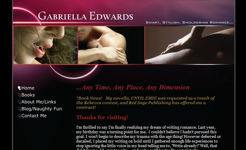
Like Becke, she has a great site—visually appealing, hitting all the right notes and featuring all the right information already. (So our suggestions are very focused.)

Kathleen’s comments

Dear Gabriella,

Fantastic website! As I read your Books page, it seems that your website reflects what you write quite well. The only part that had me confused was when you discussed your love of Scottish males. It led me to think that your stories were set in Scotland, although neither the website graphics nor the book blurbs reflect this. I would either cut that paragraph, or (if one or some of your books DO take place in Scotland) add some other Scottish accents here or there, and let your blurbs show the setting of those books.

I say this because Scottish/Irish romance is almost a sub genre of its own. Readers who love it read it voraciously, and readers who don’t won’t touch it. So if you’ve got it, advertise it! If you don’t, don’t scare off those who don’t like it. Does that make sense? (And if only a few of your books have that setting, then try to accurately reflect that as well.)

Otherwise, your site is simple, but great-looking . . . just waiting for some cover art and links when Red Sage makes those available to you! Congratulations on your contract!

Kathleen MacIver, KatieDid Design

Jordan’s comments

Hi Gabriella!

Let me echo Katie’s well wishes: congratulations on your contract! I’m so jealous—I read a blog by two of Red Sage’s amazing editors (Edittorrent by Alicia Rasley and Theresa Stevens), and I know they’re fantastic. (Sadly, I don’t write in that genre.)

You’re doing good at promoting your success—be sure to look at suggestions on promoting your book once you get your cover.

Pages

You have some impressive honors in your awards section—don’t bury them “below the fold”! It’s great to advertise your recent successes on your homepage, but when they fall that far down, they risk not being read. Do you have an option to add another page for your awards (I know some hosts only include five pages for a site)? If not, you might also consider putting them on your books page (you could put them lower on that page, with a link at the top of the page to let us know they’re there).

On your Books page, be sure to tell us which book is under contract. I know you have it on the homepage, but not everyone will read that whole line or remember the title from page to page. Plus, don’t you want to say it again? 😉

On the homepage, you do a good job breaking up text with images—don’t forget to do that on your Books page (this will be easier once you get your cover, too).

With your link to Facebook (About page) and your link to guest post on Anya Davis’s blog (Blog page), be sure to link directly to your profile/the post rather than the main page—it makes the relevant pages easier to find.

Don’t forget, especially if you’re planning on doing publicity once your book is out, to include a nice, quality picture of you on your About page. (Hi res ones are a must for any appearance in print, too.)

Check plus for using a form on your Contact page. You might consider adding a note to your contact page that you have social media links on your About page, or just copying them there, too.

Search engine presence

Your search engine presence is pretty good—your site is #1 and #2 on Google and Yahoo (Bing only gives you the #1 spot). It doesn’t look like anyone else is actively targeting your name, so you have a great opportunity here to “own” the search results—the more mentions of your name around the web, the more results linking back to you! Guest posting and social media profiles (your Facebook shows up in the top ten, but not your Twitter or MySpace) are two good ways to do that.

Another note that might help your search engine presence—on a search for your name, all three search engines use your meta description as their “snippet” below the link to your site:

Gabriella Edwards – Cincinnati, OH. Smart, Stylish, Smoldering Romance Any Time, Any Place, Any Dime. Industry Not Listed

That’s kind of funny to me 😉 . If you can edit this, I’d recommend getting the Cincinnati, OH and Industry Not Listed out, so your full tagline can show. Otherwise, it might give off a slightly different impression….

Note for the future: if you ever start a blog of your own, I recommend hosting it at blog.gabriellaedwards.com (or gabriellaedwards.com/blog)—another opportunity to “own” the search results, and to garner links for your site, adding authority to your domain in search engines’ eyes.

Your site is doing a good job, Gabriella, and with just a few tweaks it could work even harder for you.

Hope this helps!
Jordan

What do you think? Other than an author’s web page, what kind of search results are you most likely to click on?

Photo credits: fireworks—Harold Neal; thumbs up—Joel Telling