Minisites: a shared author site, ScorchedSheets.com

Our review today is for Scorched Sheets. Elise Logan volunteered, but her site is actually a shared author site, with Emily Ryan-Davis. They also offer serial reads—very cool.

How does a shared author site work? Well, Elise and Emily have made it so they basically have two “minisites” (like we mentioned yesterday) on the same domain (except they’re using directories instead of subdomains), as well as a shared minisite.
elise1

Jordan’s comments

Pages

Woohoo! You know how I love dedicated contact pages. Yours looks like it’s designed really well for two authors sharing a website—you can contact one or both of you (I think—I assume the SS Admin link goes to both of you—if not, you might want to change that to webmaster, and see about adding an option to contact both of you). The only thing I would say here is that it doesn’t look like you have a link to the contact page on your own part of the site—that might be useful, if someone comes directly to your part of the site instead of the main page. (Kathleen has a great suggestion for this, too.)

On the blog, the subscribe links could be a little more prominent (right now they’re below the fold, and below the Twitter widget)—and a lot of people require an explanation of what it means to subscribe.

On your part of the site (/elise-logan/), I might recommend placing your book covers where they’re visibile “above the fold”—in the part of the page you can see when it first loads, without scrolling down any, like you have them on the blog. For you, that would probably be in the top right (where you have your publisher link—switching the two, really).

You could also do a little more to promote your books on your site—the reviews are a good start here. Let us know what the story is about and why we’ll want to read it—I’m sure you’ve mentioned it on your blog before, but put that info into one place (or at least link to it from the Books page) so we can find it easily.

Search engine presence

spider confusedBecause your main page is so heavily based on graphics, it might be a little hard for search engines to understand. One spider simulator showed this when I pointed it to your page:

scorched sheets import url http scorchedsheets com wp content themes erdelise style css png background image expression this runtimestyle filter progid dximagetransform microsoft alphaimageloader src this tagname ‘img’ this ‘src’ this currentstyle ‘backgroundimage’ split ‘ ‘ 1 this runtimestyle backgroundimage none this src http scorchedsheets com wp content plugins wp pngfix pixel gif this width this style width this clientwidth this height this style height this clientheight pngbg behavior url http scorchedsheets com wp content plugins wp pngfix iepngfix htc concealed display none block display block copyright 2009 all rights reserved scorched sheets and all contributing authors designed by get cesigned top sitemap chat log in chat plugin by bowob chat for wordpress this site uses a hackadelic plugin hackadelic sliding notes 1 6 2

Also, the simulator found only seven links to other pages on your site: two to the front page, two to your page, one to the sitemap, one to /bowob/ (which is broken) and one to the WordPress login page.

This can be a problem for both search engines and users who have their browsers read aloud the page’s text to them (i.e. blind users). To help with this, you can add the alt tag to the image map on your main page. For example, where your code now has:

<area shape=”rect” coords=”218,1,459,60″ href=”elise-logan”></area>

you could add the alt tag to make it more descriptive:

<area shape=”rect” coords=”218,1,459,60″ alt="Elise Logan, [tagline here]" href=”elise-logan”></area>

You could do the same thing with a title element, which changes what visitors see when they hover their mouse over a link. This might not make your homepage rank #1 for your names, but it will make it a little more understandable.

missing puzzle pieceOne thing going for you is you have a sitemap. Generally, that’s a good way (albeit a last resort) to help users and especially search engines find the content on your site. However, when I clicked on the sitemap link, it was broken.

In both Google and Yahoo, your site is #1 and #2 for [scorched sheets]—with the blog as the #2 on Google and Emily’s page as the #2 for Yahoo.

For [Elise Logan], the main page is #1 and a blog post from Scorched Sheets is #2 on Google. Yahoo has your part of the site (/elise-logan/) as #1. The same blog post that ranks on Google is #4 for your name on Yahoo. Your Twitter profile is #3 on Google and on Bing.

For [Emily Ryan Davis], her part of the site is #1 on Google and Bing (now there‘s a surprise!). The same blog post as above is #2 on google (Excerpt Monday from last month, in case you’re wondering). Yahoo has EmilyRyanDavis.com (which she redirects to her part of the site) as #1 and #2.

It’s very interesting that Emily seems to have a better search engine presence than you do. What are you doing differently in terms of links? Is it because she’s been in the business longer?

Kathleen’s comments

Dear Emily and Elise,

Wow! Fantastic custom-designed site! And it’s great that you two teamed up. That means you split the costs of the site and the blog duties, but you SHARE readers! So anyone who finds one of you will most likely try the other as well. Great marketing!

Your intro/splash page does well at instantly portraying romance writing. I think the only struggle I had was knowing where to click. I instantly knew the site represented a romance author, but there were none of the normal “Books” links, which is where I usually click. Of course, those are on your individual portions of the site . . . but I didn’t know that at first. I did see your two names after a few moments, but you know what my first thought was? That one name was the author, and the other was a character.

I knew Emily Ryan-Davis was an author, since we’ve crossed paths over on the Romance Divas site, but if I hadn’t known that, I wonder if I’d have thought that both names were character names? Because of this, I think it might help to add some sort of a romantically-scrawled phrase across the right side of the home page that says something along the lines of “Two authors, five series/worlds, countless stories…” That would instantly make everything clear.

The main issue with the site is that, if someone googles your name(s), they’ll probably end up on one of the inside pages of the site. So when people find you that way (which is what most will do), they may not notice the little sidebar links to your blog, your serial, and your news feeds. There isn’t even a link to your root home page that you share. And that means that most of your promotion efforts are only about 25% as effective as they could be.

You want EVERYONE who googles your names and finds your site to know about the other (don’t count on them noticing or clicking on the other name at the bottom of the pages), know you have a blog (and hopefully sign up for updates), check out your serial, etc. You don’t want them to click around and leave without knowing they exist!

Sooo . . . you need to add a second link menu with the same links that are on your home page. I’d add it above your current menu in such a way that the “Emily” link is highlighted when you’re on Emily’s half of the site, and the “Elise” link is highlighted when you’re on Elise’s half. Maybe that “Two authors…” line should be small and run across the page just above it. This shouldn’t be too difficult to add to the site, and it shouldn’t affect your layout at all. It’ll just help you both get the most out of your promotional efforts.

I’ll take a moment here to point out that this is why, when you design a website, we cannot simply think of making the site beautiful. Beauty is important . . . but beauty is wasted if function is forgotten. Any time we are thinking about a website redesign, we have to put ourselves in the mind of our prospective visitors . . . try to imagine what they’ll see and think. And we must do this with EVERY page of our site.

opening-doorIt’s not enough to make sure that the site makes sense from the home page, because very, very few people enter a site by the front door. We can’t even count on people who find us through a business card or bookmark entering through the front door because an unbelievably large percentage of Internet users think that URLs are supposed to be entered into the search engine bar of their browser. They don’t even know that URL bar exists up there! [Aggravating, but true: Google searches for “amazon.com” and “google.com” are amazingly high, and 24% of Internet users can’t even navigate to Google.com!—Jordan] And Google will usually rank inner pages of a site higher than the front page. Why? Because that’s where the content is!

Other than that, your site is beautiful. It offers everything readers expect to see on a site, and the free reads and serials offer people free samples of your writing, which will hopefully draw them in and make them buy. Congratulations!

–Kathleen MacIver / KatieDid Design

What do you think? Would you want to share websites with another author? How do you find your friends’ and favorite authors’ sites?

Photo credits: puzzle piece—Andronicus Riyono; door—Vinicio Capossela

How many websites do you need?

This entry is part 4 of 5 in the series Aspiring author websites

A few reminders today: we’re almost done with our website review series—just two reviews left. Several people have asked about getting on the list. We took volunteers back in July—but Kathleen and I are both surprised at how well-received this series has been. We’re planning to do this again, but it probably won’t be for a couple months. (So subscribe to make sure you don’t miss this call for volunteers!)

Another reminder: don’t forget to vote for the writing craft book club book. Don’t make me just choose one!

How many websites should you have?

frustrateA writing blog. An in-world children’s picture book website. A website for your steamy romance ebooks. A site for your nonfiction aspirations. A personal blog. How many websites can one person have?

The answer, of course, is as personal as your websites should be—you can have as many websites as you can handle (and please, no more! A neglected website is sometimes worse than no site at all.). But how many do you really need?

I’m of the opinion that you should try for as few sites as possible. At its simplest, this would be one website, with a blog as part of that website (if you truly feel you can maintain a blog).

However, in some situations, you will need separate or nearly separate sites. These situations might include:

  • Genres that are completely incompatible—where writing in one genre could permanently alienate readers in another genre (like the above example of picture books and hot romance).
  • Writing under different names—especially in conjunction with the above example.

Note that I also said “nearly separate” sites—rather than completely separate sites, you could try doing “minisites.” For example, if you’re writing in very different genres but under the same name, you could have Mystery.YourDomain.com and UrbanFantasy.YourDomain.com . The sites would have at least one or two links to one another, and to your main site, but would remain mostly separate.

a-novel-characterAnd then there’s the question of personal stuff: does it have a place on your professional site(s)? That also depends on your genre, the tone of your personal stuff, and your audience. If you have a “lifestyle” blog before you get published, then it’s fine to keep that and maintain the personal tone and the insights into your personal life.

However, if that’s not the kind of site and community you’ve already built, be cautious about sharing personal stuff. Introducing too much information, unprofessional presentation, or flat-out boring content can hurt your brand.

On the other hand, sharing some information about yourself—on a limited, interesting, professional basis—can help to make your website more personable and appealing. It’s a fine balance—and sometimes it takes some practice.

What do you think? How have you shared personal information in a way that appealed to your visitors? How many sites do you want/need?

Image credits: frustrated—John De Boer; character—Svilen Mushkatov

Go! phase site review: HughHowey.com

First off, we need to start with a huge congratulations! Hugh Howey, our next volunteer, is from North Carolina! That’s so freakin’ awesome! (I’m North Carolina born and raised 😀 ). Oh, and he also has his first book coming out in just a few weeks. I guess that’s important too. Hopefully Kathleen and I will be able to help you get your website ready for the influx of fans and media!

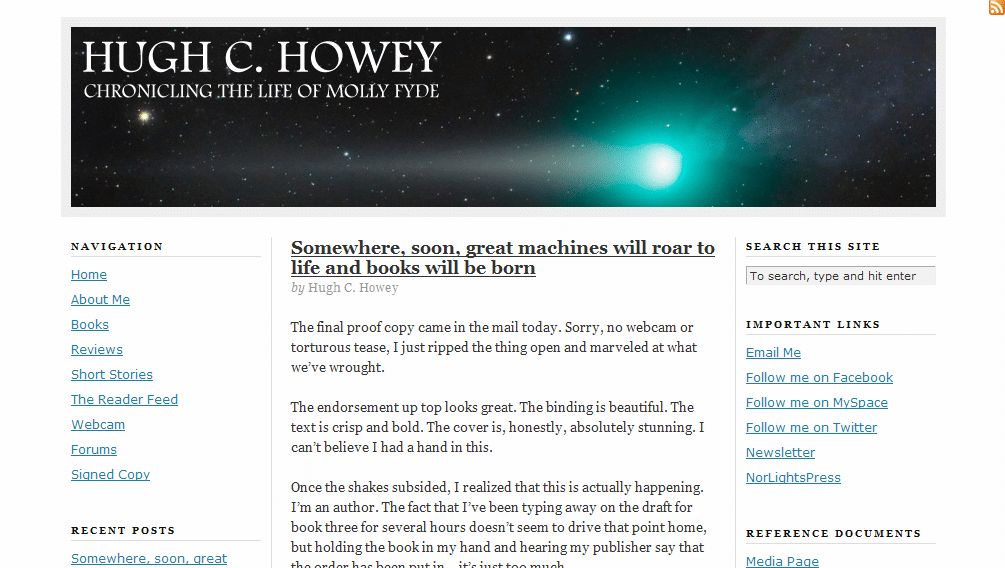
hugh1

Jordan’s comments

It’s time to promote the heck out of your book. Why not add a prominent purchase link to your sidebar? (Note: if you want to free up a little space in the sidebar, you could probably put the links to your pages across the top of your blog, just above or below the header image.) You could also sign up for Amazon Affiliates (yay $0.41—hey, sometimes that’s double the royalties you’d see from that book!). I’d also recommend adding a little summary or the back cover copy to your Books page to help entice us to buy.

Connecting with site visitors and readers

mazeThink about why your readers will be coming to your website. Will it be because they’re interested in your book and want to learn a little more before they buy? Will it be to learn more about the author? (You could probably help them out a little more there 😉 ). Will it be to learn more about your next book? Will it be because they’re reviewing your book for their blog or newspaper? What are they looking for? Help them to find it—and make their paths to their goals clear.
To make your blog posts a little more user friendly, you could make your posts more scannable. Few people sit and read online like they would read a book—but if we break up our text and highlight the main points, people can still “read” it and understand our points instead of glancing over the whole thing and reading nothing.

To do this, you can use bold, white space, headings, lists, block quotes, pictures (even stock images, such as from sxc.hu and Creative Commons–licensed ones from Flickr) and more. I see that you’ve done this in a few places, and that’s a great start. ProBlogger has a great post on making your content scannable that goes into more depth on the topic.

While you don’t have a dedicated contact page that I saw, having the contact info in the sidebar of each page might actually be enough. It’s high enough to be prominent—it displays on every page above the fold. I might suggest adding a link to subscribe to the blog there, too.

You have a newsletter! That’s excellent! I would recommend expanding the newsletter page so your potential subscribers know what they’re getting into—maybe archived issues?

Obviously you already have an active community around your site—you have forums, and they’re not just languishing in nothingness. Excellent. Now, how can you further involve these friends and neighbors? Can you make a badge for your book for them to carry on their blogs? Can you ask them to review your book? Get creative!

Search engine presence

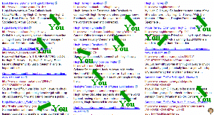
hugh search resultsFor [Hugh Howey], your site ranks #1 and #2 on Google, and #1 and #3 on Yahoo. Awesome! Bing, as always, is evil. They have your Facebook profile first, followed by LinkedIn, Facebook again, Twitter, your publisher, two articles about another Hugh Howey, and your profile on Asimovs. So apparently they don’t just hate Blogger blogs.

For [Molly Fyde] (your character’s name, I take it?), however, only Google has your site in the top ten (and that’s at #10). MollyFyde.blogspot.com also appears in the top ten in Google (at #3)—I assume this is also your site. Is there a reason why you’re keeping both this blog and your blog at HughHowey.com? (I’m assuming you haven’t moved this content over to HughHowey.com, right?)

The rest of the top ten results are YouTube videos, posts on forums and social sites (which appear mostly to be yours; don’t worry, no one’s stealing your character), and pages from Amazon and your publisher. If you’re okay with those results, then it’s not a big deal. But if you want your site to place for those results, you might want to recruit more links to your site using the text [Molly Fyde]. See if those old forum and social network posts can link back to your website.

Since you’re on self-hosted WordPress, I have a few more specific guidelines to give, too. One thing to make your site a bit more attractive to search engines: use “pretty” permalinks. That way, instead of your About Me page being at http://www.hughhowey.com/?page_id=5/ , it would be at http://www.hughhowey.com/about-me/ (this can also be helpful to users if they’re looking at the URL).

BUT before you go changing anything, first you’ll need a plugin so you don’t break every link you’ve ever made. (That doesn’t always happen, but it can—and it would be less than fun.) I use Redirection by Urban Giraffe. Just install it and activate it, and then you can change the permalink structure in WordPress (it’s under Settings>Permalinks). You can set the exact structure that you like, but I suggest something with the post name ( %postname% ) in it.

Kathleen’s comments

Dear Hugh,

Nice nebula picture at the top! That, combined with the fact that I knew you were an author, instantly made me think sci-fi, so good! I’d also like to say that your writing voice is loud and strong on your blog posts. That’s fantastic.

I’m wondering, however, if a visitor who didn’t already know that you were an author would be able to figure that out. Your header text . . . “Chronicling the life of Molly Fyde” hints at that, but I’m wondering if you can make it a little stronger? Maybe add “in the science fiction world of ______” or something like that.

As it is right now, your website is dominated by a humorous story/sales pitch for a backpack. It’s well written, but it doesn’t tell us anything about your upcoming release. And when we click your “About Me” link, the text is slightly confusing. I mean, it says you want to be a science fiction writer, but it gives the impression that Molly Fyde is a real person. Is she? (I hope I’m not making an awful blunder by even asking. I’m not a sci-fi aficionada.) Your Books link doesn’t even portray that you’re an author, because many review sites and/d subject-matter sites have links called “Books.” Maybe change it to “My Books”?

globeFinally, what else can you do to bring your visitors into your world? Make your website a window into the world of your books. Draw them in, so they just can’t help wanting to know about the characters in your world. This might mean re-designing a new home page that focuses on your characters and your world, instead of your blog…that way, when you post reviews on other products and books, your visitor’s first impression is still on YOUR book, instead of someone else’s. Feature your book covers on your home page…maybe overlap that nebula image with a small photo of each of your books tilted on edge, so there’s an instant sales pitch in one glance. If not there, get those covers somewhere on the home page!
And what about your characters? Your blog description says it’s about “the life of Molly Fyde.” What is special about Molly Fyde’s life? How can you quickly and simply portray that, so your visitors are itching to get their hands on your book so they can read Molly’s story? Give us a chance to meet the most fascinating side of Molly, so she comes to life on our screens, and follow it up with a link to buy your books.

Have fun!

–Kathleen MacIver / KatieDid Design

What do you think? How would you promote your published books? How would you invite your website visitors into your characters’ world?

Photo credit: globe—Sanja Gjenero

Writing craft book club poll

I’m thinking for our September series, we’ll do something collaborative: a book club. But since we’re all writers, I though we could read a writing craft book together and discuss it—possibly chapter by chapter.

Why? Because although we can get a lot out of reading these kinds of books and pondering them ourselves, I think we can get even more out of discussing the concepts and applying them to our work, and to one another’s. And even if you can’t get ahold of the book, you can still participate in the discussion.

So what book should we choose? (Feel free to check your local library for availability—no need to pay to participate!)

[polldaddy poll=”1920163″]

Click through to the post to take the poll and choose our writing craft book club choice!

What do you think? What book should we read—or is this not the sort of thing you’re interested in?

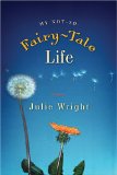
My Not-So-Fairy-Tale Life by Julie Wright – Review

Once again, I’m catching up with the last of the reviews for my Summer Reading Thing list. Website review tomorrow, and be sure to participate in the craft book club poll!

Suzanna Quincy has had a hard life—and, as the back cover of My Not-So-Fairy-Tale Life says, she hasn’t made it any easier on herself by turning to drugs and alcohol to numb the pain of her abusive childhood. But when she finds out she’s pregnant, Suzanna knows something has to change.

mynotsocoverShe ends up moving across the country to live with her brother—a convert to the LDS church. Although Suzanna slowly acclimates to her new life, she’s still left with a lot of turmoil (and the pregnancy hormones don’t help). Kicking and screaming (sometimes literally), she slowly lets the people around her into her life. But believing in God? That might be asking a bit too much.

Suzanna also has to make a choice about her baby’s future. Can she raise a child when she thinks she’s a nobody? Or can Suzanna choose to give her child the stable family life she always wanted, even if it means adoption?

Julie wrote a guest post for us here on making readers love unlovable characters, so I was especially interested to look at the character of Suzanna in this book. Yes, she was unlovable—even she thought so. But she was still a sympathetic character—she was still someone I was rooting for, someone I wanted to see overcome the obstacles in her life (and stop putting them in her own way, too!). (Take a look at Julie’s great guest post for more on how she did this!)

The changes Suzanna made in her life were also pretty convincing, as was the emotional aftermath of Suzanna’s baby’s birth. Some of the changes, however, didn’t seem to get a full treatment, since the book spans over two years (and most of that is in the last three chapters).

What do you think? What does it take to make a 180 convincing in a character?

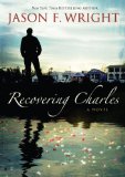
Recovering Charles by Jason F. Wright – Review

Once again, I’m catching up with the last of the reviews for my Summer Reading Thing list. Website review tomorrow, and be sure to participate in the craft book club poll!

I received this book as a freebie with my registration packet at a conference I attended in April. As you might expect, for a free book I didn’t pick myself, my expectations were pretty low.

(Okay, so maybe some evil part of me secretly resented having this foisted upon me and I was hoping I wouldn’t like it. But that’s the evil part. I don’t really listen to that. That often.)

In Recovering Charles, Luke Millward has a difficult relationship with his parents. His mother descended into depression and prescription painkillers after her own mother’s death, and eventually committed suicide. His father, Charles, was also incapable of dealing with his grief and devolved into alcoholism. Luke grew up to become an award-winning freelance photographer—and have little contact with his father.

It was kind of ironic that I ended up reading this book this weekend—four years after Hurricane Katrina. In Recovering Charles, Luke receives a call in the wake of Katrina. His estranged father had settled there—and now he was missing. Luke finally resolves to go to New Orleans to recover his father’s body. But he never expected to find his father’s legacy.

The beginning was a little odd, since not a whole lot was happening in the present, and we were regularly thrown back into fragmented flashbacks. However, once Luke actually got to New Orleans, I really understood where he was coming from, and how he felt about his father (and the flashbacks stopped).

One big coincidence in the book seemed just a little too big. I’ve read before that coincidence in fiction is okay—but you really have to set it up, and usually it’s better if the coincidence doesn’t resolve a problem. But in all, I enjoyed the book. I liked learning about who Luke’s father had become and seeing Luke come to understand how people can change.

What do you think? How big of a coincidence is too big? Is coincidence better as an inciting incident or a resolution?

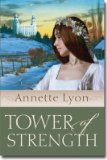
Tower of Strength by Annette Lyon – Review

Once again, I’m catching up with the last of the reviews for my Summer Reading Thing list. Website review tomorrow, and be sure to participate in the craft book club poll!

I bought Tower of Strength back in March, when I first met Annette Lyon (the author). It’s the latest of her series on books centered around the old LDS temples built in Utah.

In Tower of Strength, Tabitha married young, became pregnant almost immediately—and is widowed just two months after her wedding. She spends the next six years hundreds of miles away, building a life for herself and her son. When her hometown’s newspaper owner offers Tabitha the Sanpitch Sentinel, she decides to return home.

But things aren’t easy for her there. She has to see her bitter former mother-in-law regularly, she faces opposition to a woman owning the paper as well as the stories she’s printing, and she undertakes breaking a wild horse. Meanwhile, she develops feelings for the newly-widowed Samuel Barnett—but she struggles to let herself rely on anyone else after her first husband’s death left her abandoned. Samuel, too, has to work through his own problems as he learns a whole new trade with unpredictable animals—and finds himself falling in love only months after losing his beloved wife.

The characters in Tower of Strength are complex and well-rounded. I think the only thing that detracted for me in the book was the fact that I didn’t really “feel” like Samuel was English. He “sounded” just as Western as the other characters—though maybe if I’d read his passages in an English accent, he might have sounded more accurate 😉 . It could also be a time period thing.

What do you think? How many little speech patterns does it take to convey a character is from another culture? How much is too much?

A blog with a niche!

Today we have a great example of a blog with a niche—The Chocolate Chip Cookie.

Kathleen’s comments

Thank you for sharing your blog with us!!! Why am I so excited? Well . . . twice in the past week, I’ve suggested that blog authors find something quirky to center their blog around when a single genre didn’t fit . . . and here you are, with a blog called the Chocolate Chip Cookie!

This is the kind of thing I mean. Doesn’t hearing about a writing blog with that name make you sit up and take notice? When you find links listed under such headings as “Some delicious books,” “Quotes to snack on,” “Some tasty side dishes,” and “Some cookie bites,” don’t you want to click on them, just because they follow her memorable idea? My favorite heading is what she put over her blogger profile picture. She calls herself “The word & cookie chef.” And that says it all.

There are two things I’d recommend for you. (At least right now, while you’re not working to promote a book.)

The first is to have a little more fun with the graphics. Your lovely photo of chocolate chip cookies shouldn’t be hiding on your welcome letter, or shrunk to your sidebar. Crop a wide and short version of it with your title, and put it up at the top in your header! Even doing that much will show how your link colors pull that lovely toasty color from the picture and give the site a bit more style. You can also find (or make) a very simple background image that will add some black and toast colors down the sides of the page. Maybe the template settings in Blogger will allow you do that easily. But spice it up a bit. Have some more fun with your marvelous idea and make it a bit more visual!

Second . . . add the idea of writing into your blog description and/or the graphic that will replace it. “Sanity food for the soul” is good, but neither shows those who don’t already know that you’re a writer that this blog has a lot to do with writing. How about replacing it with “writing with the Word and Cookie Chef” or something else that includes the idea of writing?

One other thing: You obviously have an affinity for art . . . that theme also came across on your blog. I see the novel you’re working on follows that theme, as well. That’s two different themes which, at the moment, almost conflict with each other. I’d say to see if you can join them together a little more, but that would leave you joining art and writing and chocolate chip cookies, and that’s a bit much. Once you finish your YA book and you’re ready to start promoting it, you’ll want to add a YA slant to this, and that would include the art, based on your story idea. So maybe, at that point, the entire site would be YA/art based, and the chocolate chip cookie would be the morning breakfast room in your art gallery, where you chat with your readers. That would work, though it’s a bit much for now.

Just think about it. You’ve got a great idea . . . don’t let it get watered down. ::smiles::

Have fun!

–Kathleen MacIver / KatieDid Design

Jordan’s comments

I’ve visited your blog before, of course, and I’m really impressed.

Like some of the other sites we’ve looked at, your blog looks like more of a “lifestyle” blog than a website for a writer—the content deals more with your life than your writing. And that’s okay—it’s clear from your amazing writing that you are a writer, and an awesome one at that.

But that also means that when you’re looking for publication, you’ll want to add something about your fiction to your blog (or create a separate website).

blankbookIn some ways, however, a lifestyle blog can be even better than a writing blog. You don’t have to make the switch from writing about writing for writers—you already have a niche. You obviously already have a community around your blog, and your future readers can join in this community.

This is one case where I would say keep your blog at its current address rather than moving it to blog.yourname.com (the only exception: if you have/can get (the)chocolatechipcookie.com). Even if you establish YourName.com, I would keep your blog at the same address.

Your welcome letter is fantastic. As an about page, it does a great job of conveying your blog’s niche and purpose, and most of all you and your writing style.

Search engine presence

Your search engine presence is pretty good. For your name, your blog is #1 and #2 on Google, and #1 on Yahoo. Bing, as usual, doesn’t have your blog. However, your Facebook profile is #1. As with lots of our reviews, most of the rest of the top ten results come from your comments around the Internet (hey—Yahoo has your comment on my mom blog in the top ten. Cool!)

(By the way, Bing is Microsoft’s newest name for its search engine, which is supposedly totally revamped. Microsoft and Yahoo have announced a deal where Microsoft will eventually power Yahoo’s search.)

For [chocolate chip cookie], naturally you have some competition. However, your blog is #3 on Google. Bing obviously needs some more time to understand the whole “blog” thing. But the good news: your blog is #1 on Yahoo. You’re competing with every chocolate chip cookie recipe out there and you win! Woot!

Sidebar

I love the way you highlight your favorite posts in the sidebar, especially with the graphics. However, sometimes I wasn’t sure whether a picture a badge, a link to an essay or just something cool to look at until I hovered my mouse over it. Also, there are so many of them I feel a little overwhelmed. Maybe you could assemble them into few posts on your favorite posts in various areas—a collection of your posts on marriage, child birth and child raising, writing, religion, philosophy, etc.—and highlight those posts in your sidebar (with graphics, of course)?

As always, I recommend having the subscribe widgets (with some explanation) a little higher. You could also add subscribe links to your welcome letter. The button you have in the second slot on the sidebar is a good feature—something I keep meaning to do on my mom blog—a portable badge your fans can put on their own blogs. However, it looks like it only works for other Blogger blogs—and before I clicked it, I wasn’t exactly sure what it was going to do. You could do a graphic with an HTML scroll box to do the same thing (I think, anyway).

Also, you could consider adding a few ways for people to contact you—I know you have Twitter and Facebook in your sidebar, but I missed them because they didn’t have the usual icons. I love the artistic theme to your blog and your sidebar, but be careful not to confuse your visitors or make them accidentally overlook something.

At the minimum, we need a way to contact you directly. (And as always, I’m going to say that a contact page is the best place for that—but it would also go well in your welcome letter.)

What do you think? How do you make sure your visitors can contact you?

Photo of book by Marcos Ojeda